Have you ever tried to do a task on a website only to spend a lot of time attempting to identify different features or even not knowing about some functionality?
User onboarding tours, also known as Product walkthroughs, are self-explanatory ways to introduce new users to your app or describe how new features function. They are multi-step, in-app process guides that acquaint users with specific functionalities.
An application’s complexity might make it challenging to explain new features or functionalities to users, especially if you want them to access a lot of crucial data.
User onboarding tours are not just limited to instructing new users but also can be used in other different ways such as:
- When a new feature is released, for all users.
- In situations where users have not yet mastered more complicated features.
- For current users who have been away from the app for a while.
This article will show you how to use a Next.js application to onboard users into a new website and introduce them to essential UI components using the React Joyride Library.
Benefits of a user onboarding tour?
We now know why user onboarding tours are necessary. Let’s examine why you should use one in your Next.js projects.
- Lower the cost of customer support: The customer support crew at companies is frequently entrusted with responding to the same user questions, which can be overwhelming. Quality and seamless onboarding will lessen the need for constant support.
- Improvements in user engagement: Users are more likely to remain around and utilize your product if the user onboarding route is simple to follow.
- Improve/promote the adoption of features: Users are typically notified of the arrival of a new feature to a program via emails. Even though it functions, it is still not very successful because some users may not open their emails to view it or even end up in spam.
- Require users to perform specific actions: You can require users to perform specific activities to aid in their familiarization with various functionalities.
- Improve user retention: Users frequently lose track of specific features’ locations and how to use particular functions, but getting a tour each time might help them refresh their memory. Additionally, customers will probably not have the patience to search for additional tutorials regarding your app outside of it compared to other alternatives to the user onboarding tour, such as video tutorials and FAQs.
An onboarding tour can provide “aha” moments, but there is a fine line between this and merely upsetting customers’ experiences.
Therefore, it should possess the following qualities:
- Be succinct and to the point: Because visitors to your website want to start using your app rapidly, you should respect their time and avoid giving them a lengthy tour that can irritate them throughout the onboarding process. It ought to be brief and to the point.
- Order by sequence: Every successful user onboarding experience should adhere to a structure with obvious next steps that advance the user.
- Design consistency: To keep consumers attention, employ a consistent design throughout.
Finally, the abundance of available solutions and libraries is one of the main benefits of developing applications in the react ecosystem. There are some existing libraries that can be used to set up user onboarding tours in Next.js application with ease, including React Joyride, React Shepherd, Intro.js React, React Joystick, Walktour , Reactour and also commercial products, such as Whatfix, Walkme, Appcues, etc.
We will stick with the React Joyride Library for this article.
Open Source Session Replay
OpenReplay is an open-source, session replay suite that lets you see what users do on your web app, helping you troubleshoot issues faster. OpenReplay is self-hosted for full control over your data.
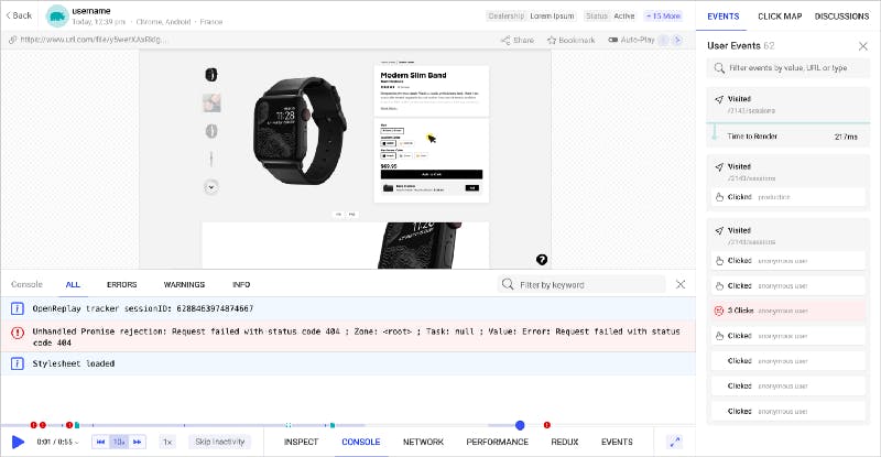
Start enjoying your debugging experience — start using OpenReplay for free.
What is React Joyride?
React Joyride is a popular library for creating guided tours for your React applications. It allows developers to select DOM elements and prompt a tooltip, pointing and explaining what that element is.
React Joyride was created by Gilbarbara and had its first version released in 2016. So far has amassed over 4.7k stars on Github.
Its primary objective is to introduce new users to your program or explain how new features work.
The library is continually updated, and assistance is available if you encounter any problems.
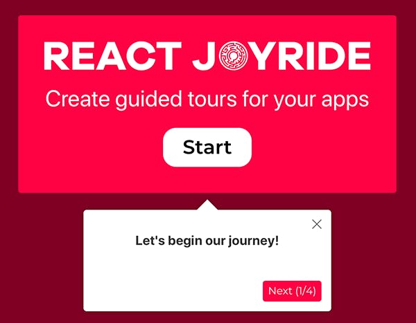
How does React Joyride work?
To carry out certain functionalities, the React Joyride library uses a variety of props that can be supplied into the joyride component.
Under the hood, it handles positioning and styling using react-floater.
Large web applications can benefit from its flexibility and customizability to meet their unique requirements.
The React Joyride library offers prebuilt UI components for easy setup, but you also have the option to utilize a custom UI component that best suits your requirements.
Here is an example of an onboarding tour below:
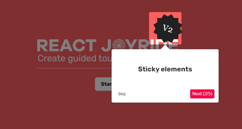
Adding User Onboarding Tour to Next.js App using React Joyride
We will build a simple onboarding tour with the props provided by the library and then will see how to take complete control of the tour using functions and not just props.
To keep the focus of this article entirely on React Joyride, I have set up a starter Next.js application.
Alternatively, you can choose any other Next.js application of your choice and follow along with it.
Let’s clone the starter branch.
Run the following code:
git clone -b starter [https://github.com/wisdomekpotu/nextjs-user-onboarding-tour.git](https://github.com/wisdomekpotu/nextjs-user-onboarding-tour.git)

cd nextjs-user-onboarding-tour
yarn install
The website ought to be accessible at localhost:3000.
Building the tour component
Let’s start by adding the new library. In your Node.js environment, run the following command:
yarn add react-joyride
First, we create the Tour.js file in the directory components.
Add the following code:
//Tour.js

import React from "react";
import JoyRide from "react-joyride";

// Tour step
const TOUR\_STEPS = \[
 {
  target: ".tour-logo",
  content: "This is the App logo",
 },
 {
  target: ".tour-login",
  content: "View the login button",
 },
 {
  target: ".tour-post",
  content: "here is the post card",
 },
 {
  target: ".tour-contact",
  content: "this is the contact form",
 },
 {
  target: ".tour-footer",
  content: "see our footer",
 },
];

// Tour component
const Tour = () => {
return (
  <>
     <JoyRide
     steps={TOUR\_STEPS}
    />
  </>
 );
};

export default Tour;
As previously mentioned, the props are the foundation of the React Joyride library. The steps props are the first and most significant props that we will employ. The steps prop is the only required one, which consists of an array of steps.
This array comprises two essential properties target and content.
- target: Here, we target the appropriate
classNamesof the elements we want to highlight in the tour. - content: The content is the information (text) displayed for the users.
After defining the array steps, we must pass it to the steps props in the Joyride component.
Dynamic Tour Component Import
Now go ahead and load the tour component, and we can do that anywhere on the page.
Quick Note: To avoid issues in more recent versions of Next.js, we will need to use dynamic imports.
I will be importing it into the index.js page.
Go to index.js and modify with the code below:
import Head from "next/head";
import Contact from "../components/Contact";
import Post from "../components/Post";
import Hero from "../components/Hero";
import Layout from "../components/Layout/Layout";
import dynamic from 'next/dynamic'

//dynamic tour component import
const Tour = dynamic(
  () => import('../components/Tour'),
  { ssr: false }
)

export default function Home() {
return (
   <>
      <Head>
        <title>VPN Best Landingpage </title>
        <link rel="icon" href="/favicon.ico" />
      </Head>
      <Tour />
      <Layout>
        <Hero />
        <Post />
        <Contact />
      </Layout>
    </>
  );
}
At this point, we have our simple tour up and running.
Click on the beacon (an animated dot) blinking to begin the tour.
Now you will notice that to continue to the next element, we must close the tour.

This is a really awful experience.
To solve this, we will use another prop called continuous.
Pass it into the Joyride component and set it to true.
const Tour = () => {
 return (
    <>
      <JoyRide
        steps={TOUR\_STEPS}
        continuous={true}
      />
    </>
  );
};
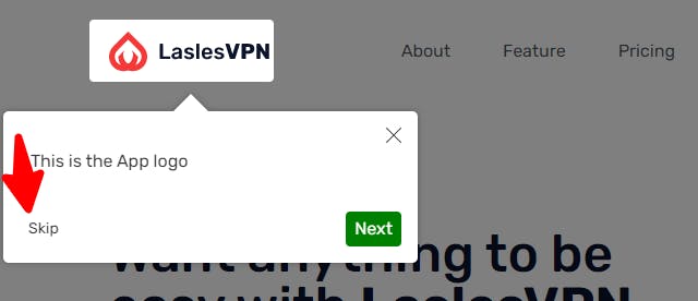
This will add a next button, and when the user reaches the end of the tour, it changes to last, which stops the tour.

Enabling the skip option at each step
Skip options are very important in your tour because some users might already be familiar with your application and would like to continue without it.
This is very simple to achieve with React Joyride.
We will make use of the showSkipButton prop. This prop will take in a boolean value true.
const Tour = () => {
  return (
    <>
      <JoyRide
        steps={TOUR\_STEPS}
        continuous={true}
        showSkipButton={true}
      />
    </>
  );
};
Show tour progress
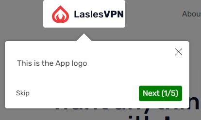
Now when a user is taking this tour, we need to show the user how many tour items/features they should expect. It will be in the format (e.g., 1/5).
We can include this by adding the showProgress prop to the Joyride Component. This prop is a boolean, which we will set to true.
This should be used together with the showSkipButton prop.
Adding custom styles
You might need to modify the default style of the tour card.
You can do this by simply adding the styles prop with your preferred customization to the Joyride component.
styles={{
 tooltipContainer: {
      textAlign: "left"
    },
 buttonNext: {
      backgroundColor: "green"
   },
 buttonBack: {
     marginRight: 10
    }
}}
In our code, we can see that the styles prop is an object. It also has other objects with unique keys and values.
- tooltipContainer: The key is
textAlign, and its value is left. - buttonNext: Its key is
backgroundColor, and its value is green. - buttonBack: Its value is 10px, and it has a key called
marginRight.
Auto start tour
You can choose to start the tour immediately after the page loads without clicking on the beacon.
Pass a prop called disableBeacon: true to the first step of the step array.
Conclusion
In this article, we looked at the React Joyride Library and how we can use it to add user onboarding tours in Next.js Applications. You can take this a step further and make the tour controlled by button clicks using EVENTS and ACTIONS provided by the library through a callback function.
Resources
- Here is the link to the complete source code.
- React Joyride Documentation
- https://react-joyride.com/

Originally published at blog.openreplay.com on September 12, 2022.
