


Tailwind CSS is a popular and versatile CSS framework developers use worldwide to build amazing user interfaces. While many developers are familiar with the commonly used Tailwind utilities, there are many more under the hood that are not as well known. This article will explore some of these lesser-known Tailwind CSS utilities that you may not have heard of, but are sure to make your development process easier and more efficient.
From text transformation utilities to margin and padding helpers, this article will cover a range of Tailwind CSS utilities that are often overlooked. We'll also look at some unique and creative ways in which these utilities can be used to build engaging and effective user interfaces.
Exploring the New Tailwind CSS Utilities
Tailwind CSS recently released new utilities to make styling and layout easier for developers. These utilities include the apply utility, extend utility, responsive utility, and variants utility. Each utility serves a unique purpose and can be combined to create powerful styles with minimal effort.
The apply utility
The apply utility in Tailwind CSS is used to quickly apply a set of pre-defined utility classes to a given element. This allows for easy and efficient styling without having to write custom CSS.
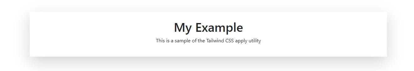
Here is an example of using the apply utility:
<div class="container mx-auto p-4 bg-gray-200 rounded-lg shadow-lg">
  <h1 class="text-3xl font-bold text-center text-gray-800">My Example</h1>
  <p class="text-lg text-center text-gray-700">
    This is a sample of the Tailwind CSS apply utility
  </p>
</div>
.container {
  @apply mx-auto p-4 bg-gray-200 rounded-lg shadow-lg;
}

.text-3xl {
  @apply font-bold text-center text-gray-800;
}

.text-lg {
  @apply text-center text-gray-700;
}
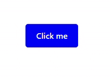
In the example above,
We first define the
.containerclass using the@applydirective to apply a set of pre-defined utility classes such asmx-auto(for center alignment),p-4(for padding),bg-gray-200(for background color),rounded-lg(for rounded corners), andshadow-lg(for a drop shadow).Next, we define the
.text-3xlclass, which appliesfont-bold,text-center, andtext-gray-800utility classes to the text.Finally, we define the
.text-lgclass, which applies thetext-centerandtext-gray-700utility classes to the text.
Using the apply utility, we can write clean and concise code that makes it easy to understand the styles applied to an element.
Here’s the result:
Overall, the apply utility in Tailwind CSS is a versatile and useful tool that can help you to write cleaner and more concise styles. Whether you're working with responsive styles, custom classes, or utility classes, the apply utility is a great way to streamline your code and make your styles easier to maintain.
The extend utility
The @extend utility in Tailwind CSS allows you to extend (inherit) the styles of one class into another. This can be useful when you want to reuse styles across multiple classes without having to rewrite them.
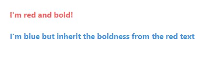
Here's an example:
<div class="text-red-500 font-bold">I'm red and bold!</div>
<div class="text-blue-500 font-bold extend-text-red-500">I'm blue but inherit the boldness from the red text</div>
.text-red-500 {
  color: #f56565;
}

.font-bold {
  font-weight: bold;
}

.extend-text-red-500 {
  @extend .text-red-500;
  color: #4299e1;
}
In the above example, the .extend-text-red-500 class extends the .text-red-500 class, meaning it inherits all its styles. However, it then overrides the color property to be blue instead of red. As a result, the second div element will be blue and bold, while the first div will be red and bold.
The extend utility is a powerful tool for keeping your styles organized and maintaining a clean, concise codebase. By using it in combination with other Tailwind CSS utility classes, you can quickly and easily create complex, custom styles for your projects.
The responsive utility
The @responsive utility in Tailwind CSS allows you to apply different styles based on screen sizes. The basic syntax for the @responsive utility is as follows:
@responsive {
  <breakpoint>: {
    <CSS class>
  }
}
Where <breakpoint> is the specific screen size you want to target, and <CSS class> is the corresponding Tailwind class you want to apply.
For example, to make a text block bold only on medium screens and above, you can write the following:
<p class="text-lg font-medium leading-tight @responsive md:font-bold">
  This text will be bold only on medium screens and above.
</p>
Tailwind provides several breakpoint sizes out of the box: sm, md, lg, xl, and 2xl.
md:- This prefix is used to apply styles to medium devices, such as tablets. For example, to increase the font size of a text element on medium devices, you can use the following code:
<p class="md:text-lg">This text will be larger on medium devices.</p>
lg:- This prefix is used to apply styles to large devices, such as laptops or desktop computers. For example, to set a width of 50% on large devices, you can use the following code:
<div class="lg:w-1/2">This div will have a width of 50% on large devices.</div>
xl:- This prefix is used to apply styles to extra-large devices, such as large desktop monitors. For example, to set a margin of 40px on extra-large devices, you can use the following code:
<div class="xl:my-40">
  This div will have a margin of 40px on extra large devices.
</div>
sm:- This prefix is used to apply styles to small devices, such as smartphones. For example, to hide an element on small devices, you can use the following code:
<div class="sm:hidden">This div will be hidden on small devices.</div>
sm:not(:- This prefix is used to apply styles to all devices except small devices. For example, to set a font size of 16px on all devices except small devices, you can use the following code:
<p class="sm:not(:text-lg)">
  This text will have a font size of 16px on all devices except small devices.
</p>
You can customize these breakpoints in your configuration file to fit your specific needs. Here's an example that changes the font-size of a text, based on screen size:
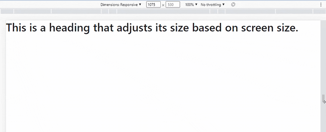
<h1 class="text-2xl font-medium @responsive md:text-3xl lg:text-4xl xl:text-5xl">
  This is a heading that adjusts its size based on screen size.
</h1>
In the above example, the heading starts as a text-2xl on small screens, becomes text-3xl on medium screens, text-4xl on large screens, and text-5xl on extra-large screens.
Note: @responsive utility can be combined with other Tailwind classes to create complex responsive styles.
variant utility
The @variant utility in Tailwind CSS is a way to extend and customize the pre-defined design styles that come with the framework. It allows you to add new styles to existing utility classes or create new ones.
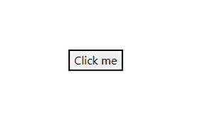
Here's an example of how you might use the @variant utility to extend a default button style to include a new style with a background color of red:
<!-- Tailwind CSS configuration file -->

<!-- Add the new button variant to the button utility class -->
@variant hover:focus {
  .btn-red:hover,
  .btn-red:focus {
    background-color: red;
  }
}
<!-- Use the new button variant class in your HTML -->
<button class="btn-red hover:bg-red-500">Click me</button>
In the configuration file, we use the @variant directive to extend the button utility class with a new variant, which will be triggered when the button is hovered or focused. The .btn-red:hover, .btn-red:focus selectors specify the styles to be applied when the button is hovered or focused.
In the HTML file, we use the new variant class .btn-red on the button element. The .hover:bg-red-500 utility class changes the background color of the button to red when it is hovered on.
The @variant utility is a powerful tool for customizing and extending the styles in Tailwind CSS, and it allows you to create new utility classes that match your specific design needs
This is just one example of utilizing the @variant utility. You can also use it to change the appearance of an element based on a specific context or condition. The following are the various variations of the variant utility:
Text Variants: This allows changing the text color,
font-weight,font-size, and letter spacing of an element. For example,text-sm font-medium text-gray-700 leading-tight.Background Variants: This allows changing the background color of an element. For example,
bg-gray-300.Border Variants: This allows changing the border style, width, color, and radius of an element. For example,
border-2 border-gray-500 rounded-md.Shadow Variants: This allows for adding shadows to an element. For example,
shadow-md.Spacing Variants: This allows adding spacing to an element as padding or margin. For example,
pt-2 pb-3 pl-4 pr-5.Flexbox Variants: This allows changing the display property of an element to flex and control the layout of its children. For example,
flex items-center justify-between.Grid Variants: This allows changing an element's display property to grid and controlling its children's layout. For example,
grid-cols-4 gap-4.Transform Variants: This allows transforming an element, such as rotating, scaling, or skewing. For example,
rotate-45.
These variations can be combined and customized to meet the specific design needs of a project.
Session Replay for Developers
Uncover frustrations, understand bugs and fix slowdowns like never before with OpenReplay — an open-source session replay suite for developers. It can be self-hosted in minutes, giving you complete control over your customer data.

Happy debugging! Try using OpenReplay today.
Use cases for the @apply utility:
Here are some use cases for the @apply utility in a web application:
1. Creating reusable UI components
The @apply utility makes it easy to create reusable UI components with consistent styling. For example, you could define a button style like this:
.btn {
  @apply px-4 py-2 rounded-md font-semibold text-white bg-blue-500 hover:bg-blue-600;
}
This creates a button with padding, rounded corners, bold text, and blue background-color. The @apply utility combines multiple existing Tailwind classes to create the button style. You can use the .btn class to style any button in the application.
2. Simplifying responsive design
Responsive design is a crucial aspect of web development, and Tailwind makes it easy with its responsive utilities. However, applying responsive styles can become repetitive and error-prone. The @apply utility simplifies this process by allowing developers to define responsive styles in a single class.
For example, you could create a responsive grid layout using the @apply utility like this:
.grid {
  @apply grid-cols-1 md:grid-cols-2 lg:grid-cols-3;
}
On small screens, this results in a grid layout with one column, two columns on medium screens, and three columns on large screens. The @apply utility merges the responsive grid classes into a single grid class that can be used anywhere in the application.
Use cases for the @extend utility
Here are some use cases for the @extend utility in a web application:
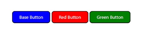
1. Reusing styles for variants of a component
Reusing styles for component variants is one of the most common use cases for the @extend utility in web applications. For example, you may want to use the same button component in different contexts but with slightly different styles. Instead of duplicating the styles for each variant, you can create a base class and then extend it to create each variant using the @extend utility.
<button class="base-button bg-blue-500 text-white py-2 px-4 rounded-lg">Base Button</button>
<button class="@extend base-button bg-red-500">Red Button</button>
<button class="@extend base-button bg-green-500">Green Button</button>
In the example above, the base-button class includes the common styles for all button variants, such as the background-color, color, padding, and border-radius. The red and green buttons extend the base-button class and add their respective background colors.
2. Creating Utility classes
Another use case for the @extend utility is the creation of utility classes that can be used to style elements quickly. Utility classes are frequently used to apply one-time styles that do not warrant the development of a new component or complex styling rule.
<div class="@extend font-bold text-lg text-red-500">Important message!</div>
The @extend utility is used in this example to create a utility class that can be used to quickly apply bold, large, and red text to an element.
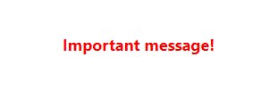
This class can be used to highlight important messages or call-to-action elements throughout the application.
3. Abstracting complex styles
The @extend utility can also be used to break down complex styles into smaller classes. This can be useful when you have a set of styles that are used in multiple components or pages, and you want to separate them to improve the code organization and maintainability.
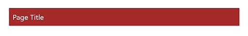
<div class="@extend page-header">Page Title</div>
The page-header class in this example includes complex page header styles such as large font size, a background color, and padding. This class can be extended into multiple components or pages to apply consistent styles throughout the application.
Use cases for the @responsive utility
The @responsive utility is used to add responsive styles to our components. It allows us to define styles that are specific to different screen sizes, such as mobile, tablet, or desktop.
Here are some examples of how you can use the @responsive utility in your web application:
1. Hide an element on smaller screens
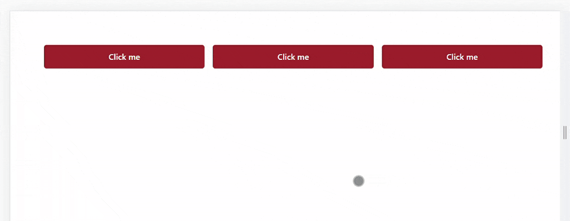
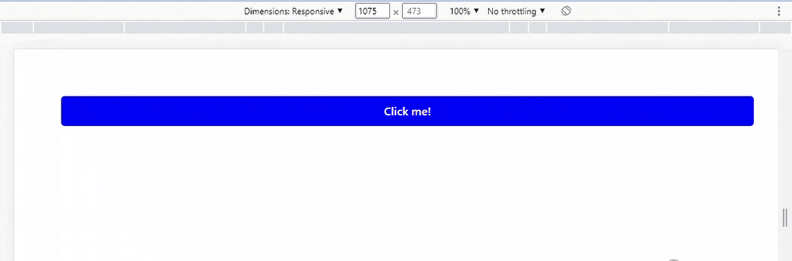
You can use the @responsive utility to hide an element on smaller screens. For example, you can hide a button on screens smaller than 640 pixels like this:
<button class="bg-blue-500 text-white p-2 rounded-md @responsive hidden sm:block">
  Click me!
</button>
2. Adjust font size on larger screens
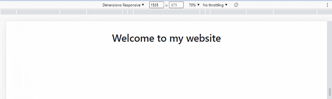
You can also use the @responsive utility to adjust the font size of an element on larger screens. You can increase the font size of a heading on screens larger than 1024 pixels like this:
<h1 class="text-4xl @responsive text-6xl xl:text-7xl">
  Welcome to my website
</h1>
3. Adjust column layout on different screen sizes
You can use the @responsive utility to adjust the layout of columns in a grid on different screen sizes. Here's how to change the layout of a two-column grid to a one-column layout on screens smaller than 768 pixels with Tailwind CSS's @responsive:
<div class="grid grid-cols-2 @responsive grid-cols-1 sm:grid-cols-2">
  <div class="p-4">Column 1</div>
  <div class="p-4">Column 2</div>
</div>
Use cases for the @variant utility
Here are some examples of how the @variant utility can be used in a web application:
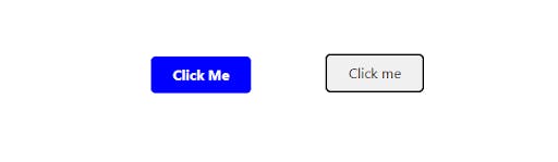
1. Styling buttons with different variants
Buttons are an essential part of any web application, and Tailwind CSS makes it easy to style buttons using the @variant utility. Here's an example:
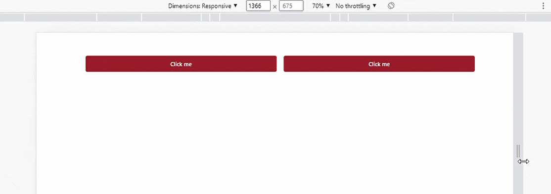
<button class="bg-blue-500 hover:bg-blue-700 text-white font-bold py-2 px-4 rounded">Click Me </button>
<button class="bg-blue-500 hover:bg-blue-700 text-white font-bold py-2 px-4 rounded @variant('disabled', 'bg-gray-400 cursor-not-allowed')">
    Click me
</button>
In the above example, there are two buttons. The @variant utility is used to apply a different background-color and cursor style to the other button when it is disabled. This can help to provide visual feedback to users and make it clear that the button cannot be clicked.
2. Displaying different styles for links
Links are another common element in web applications, and they can be styled using the @variant utility to provide additional context or feedback. Here's an example:
<a href="#" class="text-blue-500 hover:text-blue-700 @variant('active', 'text-blue-700 font-bold')">
  Click me
</a>
In the above example, the @variant utility is used to apply a bold font-weight to the link when it is active. This can help to make it clear to users which page they are currently on.

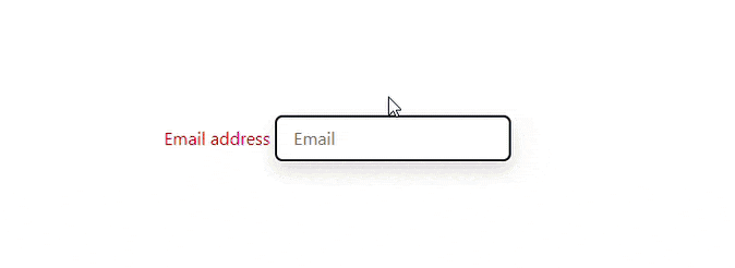
3. Styling form elements based on their state
Form elements are an essential component of many web applications, and they can be styled with the @variant utility to provide feedback to users based on their current state. Here's an illustration:
<label class="block text-gray-700 font-bold mb-2 @variant('error', 'text-red-500')">
  Email address
  <input type="email" class="shadow appearance-none border rounded w-full py-2 px-3 text-gray-700 leading-tight focus:outline-none focus:shadow-outline @variant('error', 'border-red-500')" placeholder="Email">
</label>
When there is an error with the user's input, the @variant utility is used to apply a different text color and border-color to the label and input element. This can help to provide users with clear feedback and reduce frustration.
Conclusion
Tailwind CSS is a powerful tool for web designers and developers that offers a wide range of utilities for styling and optimizing websites. The apply, extend, variants, and responsive utilities are just a few examples of the many functionalities available within Tailwind CSS. These utilities allow users to easily and efficiently apply styles, extend existing styles, create variants, and design responsive layouts. Whether you are a seasoned web developer or just starting, incorporating these Tailwind CSS utilities into your workflow can greatly improve the design and functionality of your website. You can access the official Tailwind CSS documentation for further information on these utilites and more.
Happy coding!