
Power your blog with Nuxt Content
Using Nuxt Content, a Git/File-based CMS


Table of contents
- Jamstack and Git/File-based CMSs
- Nuxt Content Module
- Building our blog
- Create the first post
- Using Markdown
- Customize page meta with Front-matter
- Vue components with MDC
- Content API
- Set page Meta with useHead()
- Open Source Session Replay
- Build Table of Content Component
- Build Previous and next article component
- List all articles
- Create Site header component
- Display articles by tags
- Create a Tags component
- Conclusion
- Resources & further reading
The Nuxt community has finally released the Nuxt Content (or simply Content) Module for Nuxt 3. Content v2 comes with several new features and DX enhancements that make using a File-Based CMS a piece of cake. This is important as it allows developers to manage content and build content-based sites like blogs and documentation without needing to manage a database.
In this article, we'll look at the Content v2 module, what's new, its use cases and applications, and how we can use it to power our Nuxt 3 blog with a Git/File-Based CMS. We will be building a simple blog, leveraging many of the fundamental and new features provided by Nuxt Content. You can view the deployed version of what we will be building here.
To follow along you should have:
- A basic understanding of HTML, CSS & JS, Vue and the Markdown syntax
- Node.js* (latest LTS version)
- Visual Studio Code
- Volar Extension, and either enable Take Over Mode (recommended) or add TypeScript Vue Plugin (Volar)
- VS Code MDC Extension
- A terminal; I recommend using VS Code's integrated terminal
PermalinkJamstack and Git/File-based CMSs
If you've heard of Jamstack, you should be familiar with how it has changed how we build modern websites and web applications. Jamstack uses static-site generators to offer prerendered markup, JavaScript for functionality, and APIs for data to create faster websites. You can learn more about it from the official Jamstack site.
There are many ways to provide content for a Jamstack site. Many websites use APIs that to get content pulled from a remote database. Most times, a headless CMS like Contentful provides these APIs. Server-Side Rendering tools like Gatsby then fetch this data at build time and render the pages as HTML files.
Instead of a Headless CMS to provide content for the site, we can use template files like Markdown. Popular static site generators use template files to provide content. Git/File based CMSs provide a way to manage the content in these template files and provide it to the frontend at build time without a database. The Nuxt Content module acts as a Git/File-based CMS for your SSR-enabled Nuxt application, allowing you to write your content in Markdown, YML, CSV, or JSON and query it in your components.
PermalinkNuxt Content Module
The Content Module reads the content/ directory in your Nuxt project, parses .md, .yml, .csv and .json files to create a powerful data layer for your application. It also allows you to use Vue components in Markdown with the MDC syntax.
Take a look at some of the new features of Content v2 highlighted on the official website
- Built for Nuxt 3: Take advantage of Nuxt 3 features: Vue 3, Auto-imports, Vite, and Nitro server.
- File-based CMS: Write your content in Markdown, YML, CSV, or JSON and query it in your components.
- Query Builder: Query your content with a MongoDB-like API to fetch the right data at the right time.
- MDC Syntax: Use your Vue components in Markdown files, supporting props, slots, and nested components.
- Code highlighting: Display beautiful code blocks on your website with the Shiki integration supporting VS Code themes.
- Deploy everywhere: Nuxt Content supports both static or Node server hosting.
An important feature introduced in this new version of Nuxt Content, apart from the fact that it now supports Nuxt 3, is the addition of the MDC syntax which allows you to add Vue components to your .md files. Nuxt Content v1 supports Vue components, but v2 comes with a slightly different syntax and more improvements.
We can use the Nuxt Content module to build any static site that requires content. It works great for websites like documentation and blogs with static content but not so great for websites where most of its content is dynamic or changes in real-time since the site will have to be built for changes in the file to take effect. It also works great for other static sites with dynamic content on the client-side with JavaScript. Sites like landing pages, portfolios, event sites, company websites, and more are good use cases for Nuxt Content.
Let's dive in and see how we can build a site of our own with Nuxt Content.
PermalinkBuilding our blog
We can create a new Nuxt content project or add it to an existing Nuxt 3 project. You can start a new Nuxt Content project with:
# with npm
npx nuxi init content-blog -t content
# with pnpm
pnpm dlx nuxi init content-blog -t content
Navigate to the newly created ./content-blog folder and install the dependencies:
# with yarn
yarn install
# with npm
npm install
# with pnpm
pnpm install --shamefully-hoist
Now you'll be able to start your Nuxt content app in development mode:
# with yarn
yarn dev
# with npm
npm run dev
# with pnpm
pnpm run dev
Awesome! A browser window should automatically open for http://localhost:3000.
You can add Nuxt Content at any time to an existing Nuxt 3 project by installing the @nuxt/content module:
# with yarn
yarn add --dev @nuxt/content
# with npm
npm install --save-dev @nuxt/content
# with pnpm
pnpm add -D @nuxt/content
Then, add @nuxt/content to the modules section of nuxt.config.ts:
// ./nuxt.config.ts
import { defineNuxtConfig } from 'nuxt'
// https://v3.nuxtjs.org/api/configuration/nuxt.config
export default defineNuxtConfig({
  modules: ['@nuxt/content'],
  content: {
    // https://content.nuxtjs.org/api/configuration
  }
})
⚠️ Content v2 requires Nuxt 3. If you are using Nuxt 2, check out Content v1 documentation
Let’s quickly install and setup Tailwind, Tailwind typography, and Hero Icons to style our project. We’ll be using the @nuxt/tailwind module. We'll also install the tailwind form plugin:
# with yarn
yarn add --dev @nuxtjs/tailwindcss @tailwindcss/typography @heroicons/vue
# with npm
npm install --save-dev @nuxtjs/tailwindcss @tailwindcss/typography @heroicons/vue
# with pnpm
pnpm add -D @nuxtjs/tailwindcss @tailwindcss/typography @heroicons/vue
Add it to the modules section in nuxt.config.ts:
// nuxt.config.ts
// ...
export default defineNuxtConfig({
  modules: ['@nuxt/content', '@nuxtjs/tailwindcss'],
  content: {
    // https://content.nuxtjs.org/api/configuration
  }
})
Create tailwind.config.js by running:
npx tailwindcss init
Add Tailwind typography plugin to tailwind.config.js
// tailwind.config.js
module.exports = {
  theme: {
    // ...
  },
  plugins: [
    require('@tailwindcss/typography'),
    // ...
  ],
}
Next, let’s create our /.assets/css/main.css file:
/* ./assets/css/main.css */
@tailwind base;
@tailwind components;
@tailwind utilities;
in the nuxt.config.ts file, enter the following:
// ./nuxt.config.ts
// ...
export default defineNuxtConfig({
  // ...
  tailwindcss: {
    cssPath: '~/assets/css/main.css',
  }
})
Start the app
# with yarn
yarn dev
# with npm
npm run dev
# with pnpm
pnpm dev
🚨 If you encounter an issue similar to the one described in this issue, you can go through the conversation there to fix it, at least until the next update.
PermalinkCreate the first post
Here's what our project structure should look like at this point:
content-blog
├─ .gitignore
├─ app.vue
├─ assets
│  └─ css
│     └─ main.css
├─ content
│  ├─ about.md
│  └─ index.md
├─ nuxt.config.ts
├─ package.json
├─ pages
│  └─ [...slug].vue
├─ pnpm-lock.yaml
├─ README.md
├─ tailwind.config.js
└─ tsconfig.json
However, if you are adding Nuxt Content to an existing Nuxt 3 project, you’ll have to manually create the ./content folder and create a ./content/index.md file:
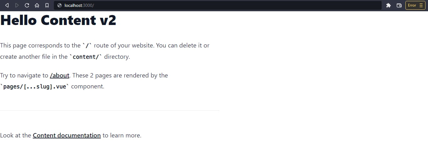
<!-- ./content/index.md -->
# Hello Content v2
This page corresponds to the `/` route of your website. You can delete it or create another file in the `content/` directory.
Try to navigate to \[/what\](/what). These 2 pages are rendered by the `pages/[...slug].vue` component.
---
Look at the \[Content documentation\](https://content-v2.nuxtjs.org/) to learn more.
Next, in order to display the content, create a ./pages/[…slug].vue which catches all routes and renders the <ContentDoc /> component.
<!-- ./pages/[…slug].vue -->

<template>
  <main>
    <article class="prose">
      <ContentDoc />
    </article>
  </main>
</template>
<ContentDoc> and <ContentRenderer> are two components provided by Content that render the body of a Markdown document in a rich-text format. If we navigate to http://localhost:3000/, we should get this:
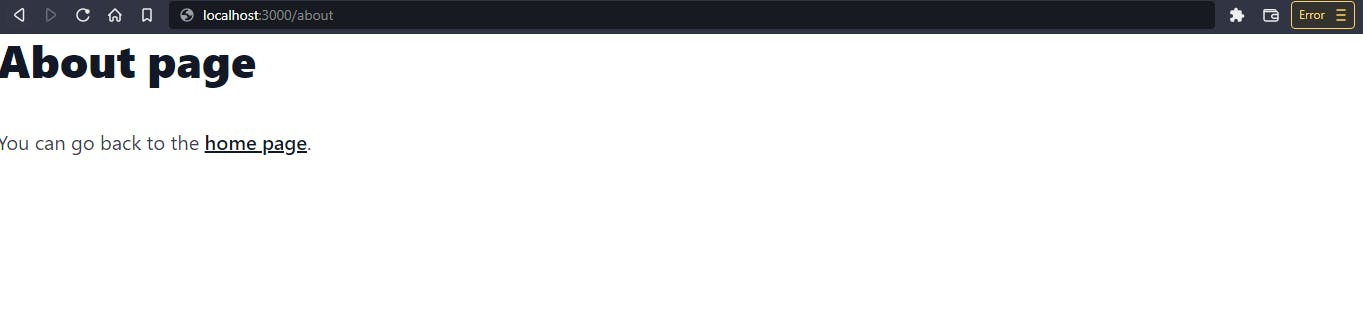
With <ContentDoc>, the fetching endpoint defaults to the current route ($route.path). That way, if we navigate to /about, it automatically renders the content in the ./content/about.md file. Create the ./content/about.md file:
<!-- ./content/about.md -->

# About page
You can go back to the \[home page\](/).
Now, if we click on the /about link on the home page, it'll route and display the rendered content from ./content/about.md.
Awesome. Now that we've seen how that works, let's structure our Nuxt application. First, replace the ./pages/[…slug].vue page with ./pages/index.vue, which will be the application's home page.
<!-- ./pages/index.vue -->
<template>
  <main>
    <section class="hero-section">
      <header>
        <h1 class="font-black text-8xl">Welcome to my site</h1>
        <p>Take a look at <NuxtLink to="/blog">my blog</NuxtLink></p>
      </header>
    </section>
  </main>
</template>

<style scoped> /* ... */ </style>
Next, create a new file ./pages/blog/[…slug].vue.
<!-- ./pages/blog/[…slug].vue -->

<template>
  <main>
    <article class="prose p-16 max-w-3xl m-auto">
      <ContentDoc />
    </article>
  </main>
</template>
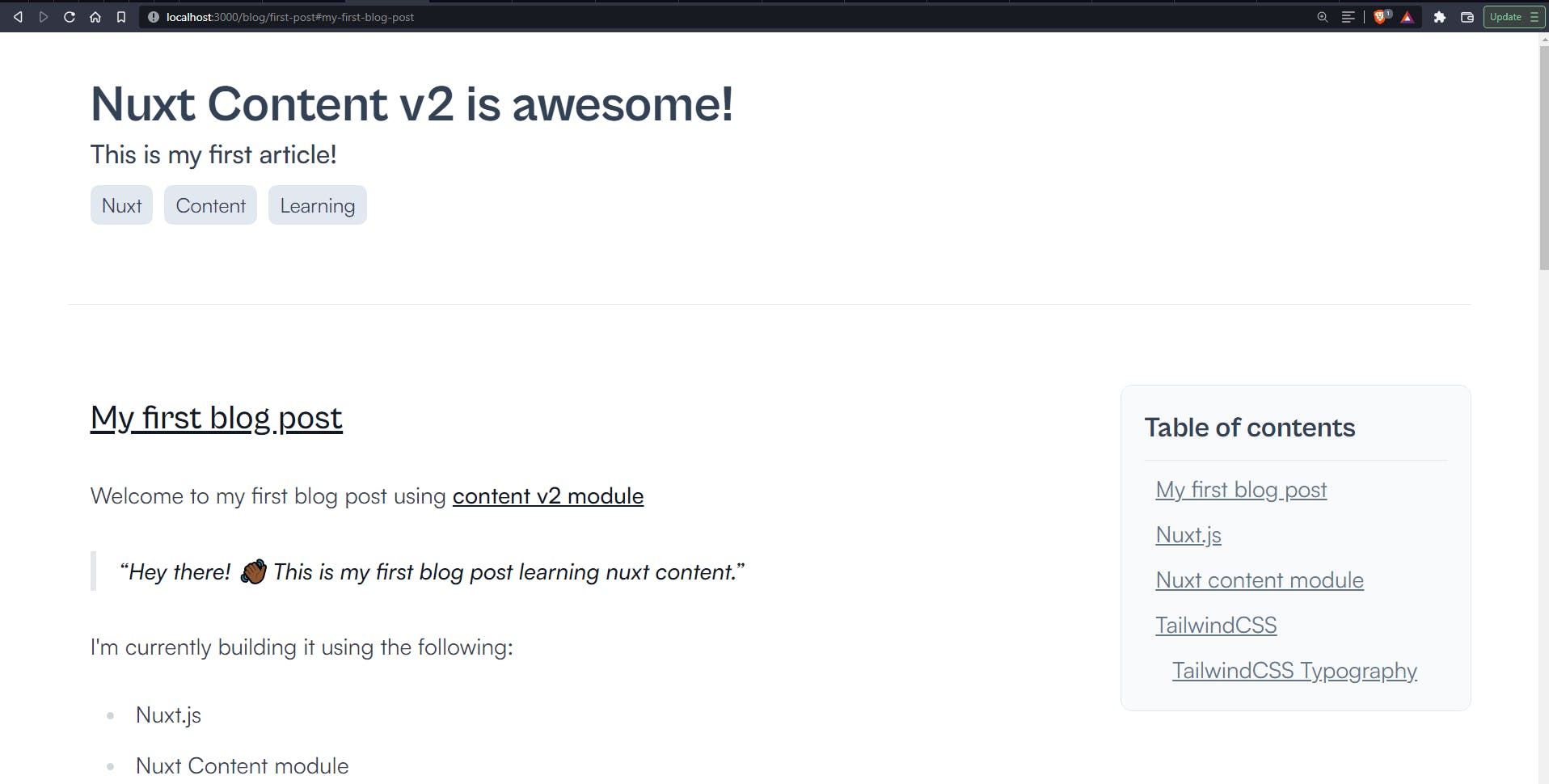
Notice the .prose class in <article class="prose">; this gives us basic typography styling for our article content. Now, let’s create our first blog post, ./content/blog/first-post.md.
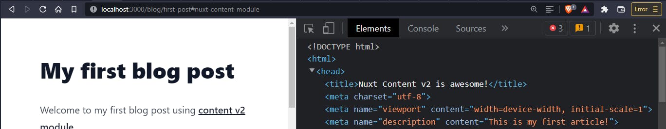
<!-- ./content/blog/first-post.md -->

# My first blog post
Welcome to my first blog post using content v2 module
Here's what our first blog post should look like:
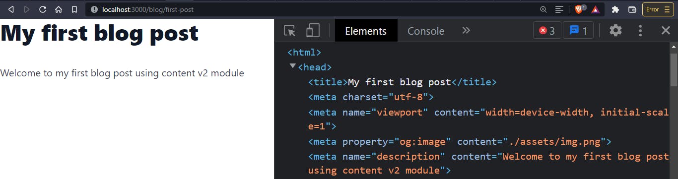
As you can see in the Devtools, the <title> of the page corresponds to the first <h1> of the page (or first # in the Markdown page). The <meta name="description"> corresponds to the first <p> in the page. These are the default values gotten from the Markdown content. Let's look at how we can further customize this using Markdown in Nuxt Content.
PermalinkUsing Markdown
So far, we've seen that with the <ContentDoc /> component, we can transform our markdown to valid HTML and style it using TailwindCSS Typography. Nuxt Content uses Prose components to render HTML tags from Markdown syntax. These components can further be customized as you see fit. TailwindCSS Typography also targets these Prose elements and styles them accordingly.
The ProseA component can be customized by creating a component file with the same name in your ./components/content/ directory. You have to use the same props in the original component for the component to work.
Let’s add some more content to our post - ./content/blog/first-post.md to see a few of these components in action:
<!-- ./content/blog/first-post.md -->
# My first blog post
Welcome to my first blog post using \[content v2 module\](https://content.nuxtjs.org/)
Hey there! 👋🏾
This is my first blog post learning nuxt content.
I'm currently building it using the following:
- Nuxt.js
- Nuxt Content module
- TailwindCSS
- TailwindCSS typography
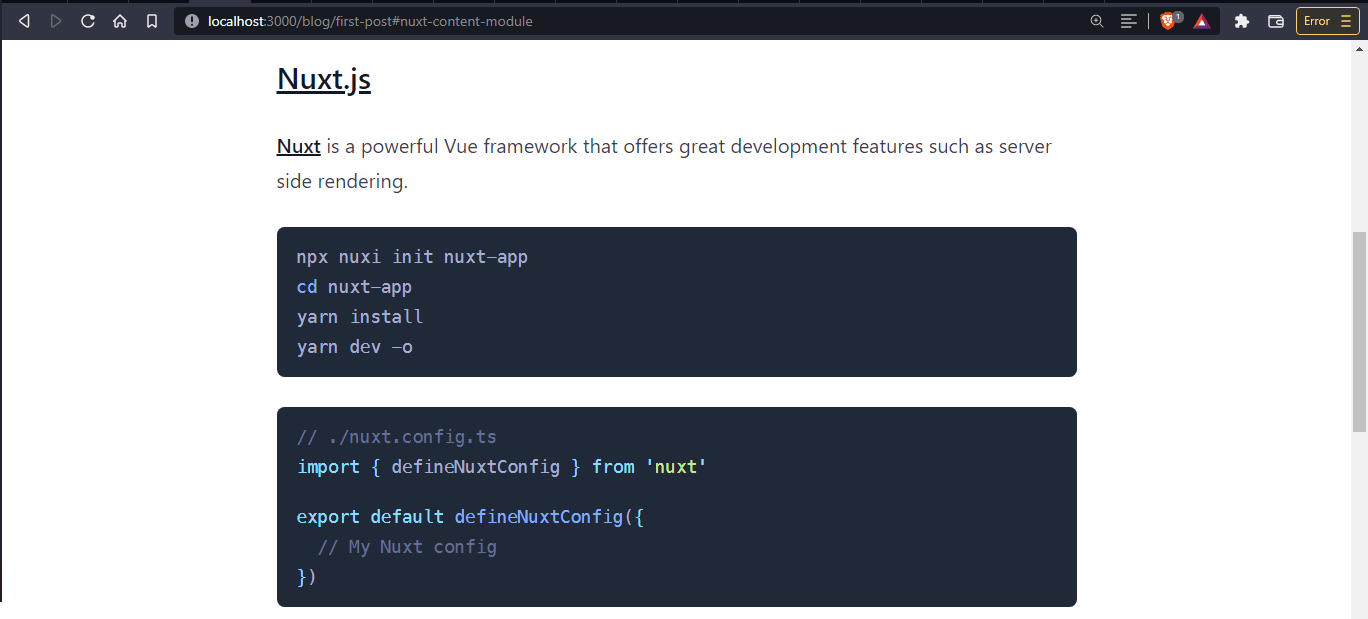
## Nuxt.js
\[Nuxt\](https://nuxtjs.org/) is a powerful Vue framework that offers excellent development features such as server-side rendering.
npx nuxi init nuxt-app
cd nuxt-app
yarn install
yarn dev -o
```
```javascript
// ./nuxt.config.ts
import { defineNuxtConfig } from 'nuxt'
export default defineNuxtConfig({
// My Nuxt config
})
```
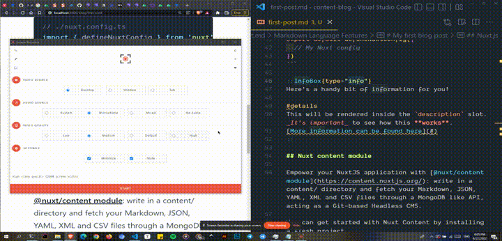
## Nuxt content module
Empower your NuxtJS application with \[@nuxt/content module\](https://content.nuxtjs.org/): write in a content/ directory and fetch your Markdown, JSON, YAML, XML, and CSV files through a MongoDB-like API, acting as a Git-based Headless CMS.
You can get started with Nuxt Content by installing a new project.
```
npx nuxi init content-app -t content
```
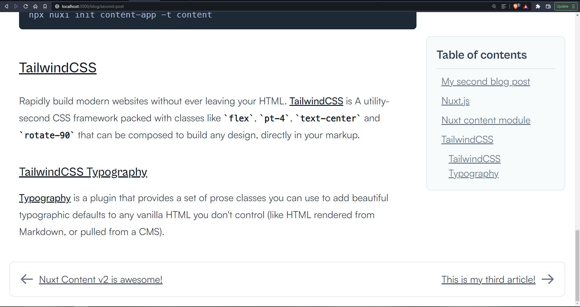
## TailwindCSS
Rapidly build modern websites without ever leaving your HTML. \[TailwindCSS\](https://tailwindcss.com/) is A utility-first CSS framework packed with classes like `flex`, `pt-4`, `text-center`, and `rotate-90` that can be composed to build any design directly in your markup.
### TailwindCSS Typography
\[Typography\](https://tailwindcss.com/docs/typography-plugin) is a plugin that provides a set of prose classes you can use to add beautiful typographic defaults to any vanilla HTML you don't control (like HTML rendered from Markdown or pulled from a CMS).
Once saved, we should see the changes and the rendered HTML with styling applied.

You can find more [details on Prose in the Nuxt Content docs](https://content.nuxtjs.org/guide/writing/markdown#prose).
## Syntax Highlighting
One very important Prose component we’ll look at is the [ProseCode](https://content.nuxtjs.org/api/components/prose#prosecode) component and `ProseCodeInline` component. Nuxt Content gives us syntax highlighting out-of-the-box with [Shiki](https://github.com/shikijs/shiki). To apply themes to our code blocks, we have to configure `./nuxt.config.ts`
```javascript
// ./nuxt.config.ts
import { defineNuxtConfig } from 'nuxt'
// https://v3.nuxtjs.org/api/configuration/nuxt.config
export default defineNuxtConfig({
// ...
content: {
// https://content.nuxtjs.org/api/configuration
highlight: {
theme: {
// Default theme (same as single string)
default: 'material-palenight',
// Theme used if `html.dark`
dark: 'github-dark',
}
}
},
// ...
})
Once the server restarts, we can see the default theme applied:
You can find more themes supported out-of-the-box. You can also add other VSCode themes.
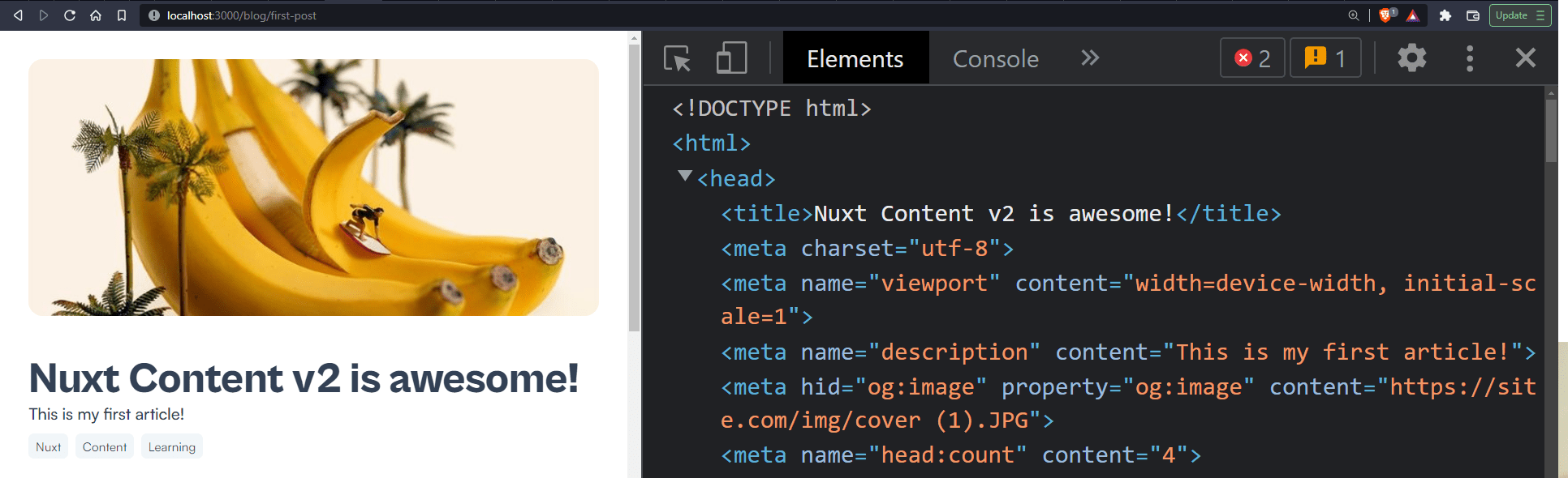
PermalinkCustomize page meta with Front-matter
We can also add and modify meta-data by adding a block of YAML front matter to our markdown file.
    ---
    title: 'Nuxt Content v2 is awesome!'
    description: 'This is my first article!'
    img: 'img/cover (1).JPG'
    tags: [Nuxt, Content, Learning]
    ---
This will be displayed on the page <head> instead of the default values.
We can achieve much more with Front-matter, which we'll dive into soon enough.
PermalinkVue components with MDC
MDC stands for MarkDown Components. It's a syntax we can use to insert Vue components directly in our Markdown. Any component in our application's components/content/ directory or made available globally can be used in Markdown files. To get started, create a new component in ./components/content/InfoBox.vue
<!-- ./components/content/InfoBox.vue -->

<script setup>
// import icons from HeroIcons
import { InformationCircleIcon, ExclamationIcon, BanIcon } from "@heroicons/vue/solid";
// define props in <script>
const props = defineProps(["type"]);
</script>
<template>
  <!-- Access `type` prop in Dynamic class  -->
  <div class="info-box not-prose" :class="[type]">
    <!-- Conditionally render icons based on prop -->
    <ExclamationIcon v-if="type == 'warning'" class="icon solid" />
    <BanIcon v-else-if="type == 'error'" class="icon solid" />
    <InformationCircleIcon v-else class="icon solid" />
    <details>
      <summary>
        <!-- Unamed Slot to render component content -->
        <slot />
      </summary>
      <div class="details pt-2">
        <!-- Named markdown component to render rich-text -->
        <Markdown :use="$slots.details" unwrap="p"></Markdown>
      </div>
    </details>
  </div>
</template>
<style scoped> /* ... */ </style>
View the complete code with styles here
Here we have a simple component that takes in type as a prop. In the <template>, we assign the type prop to a dynamic class in the div.info-box element. With this, whatever string we pass to the type prop from our Markdown will take effect in our component.
We also have a few icons conditionally rendered based on the value of the type prop.
To render component content, the component must contain either:
- A
<slot />to accept raw text or another component. - The
<Markdown />component to accept formatted text
Now, we're using an unnamed <slot/> element to render content right inside a a <summary/> element. Next, we use named <Markdown /> component to render some extra content right inside a div.details element. We use the **::** identifier to use a component in our Markdown file. In the ./content/blog/first-post.md file add the following code:
    <!-- ./content/blog/first-post.md -->
    <!-- ... -->
    ::InfoBox{type="error"}
    Here's a handy bit of information for you!

    #details
    This will be rendered inside the `description` slot. _It's important_ to see how this **works**.
    \[More information can be found here\](#)
    ::
    <!-- ... -->
Here, you can see that:
- The
{}identifier passes props to components in a terse way by using akey=valuesyntax. - The default slot renders the top-level content inside the block component.
- named slots use the
#identifier to render the content.
Here's our component in action:
But that's just the tip of the iceberg of what you can do with MDC. You can find more useful functionalities like Nested components, Inline components and spans, YAML props, and many more in the MDC Syntax page of the Nuxt Content docs.
PermalinkContent API
The new Nuxt Content allows you to create an entire website entirely from Markdown files with a new Document-driven mode. Document-driven mode creates a direct binding between your content/ directory and your pages. Content can now make queries from [route middlewares](v3.nuxtjs.org/guide directory-structure/middleware#middleware-directory). These queries resolve before your page renders and will give access to the useContent() composable anywhere in your app. You can find more information about the Document-Driven mode in the Nuxt Content Docs.
In our case, however, to add a blog to our site in cases where we might be trying to add a blog to an existing site, we would use the queryContent() function to dynamically fetch content from the ./content/ directory within any page or component of our application.
We also have access to REST API endpoints automatically generated by Nuxt Content to fetch documents from the ./content/ directory. The API root path is - /api/_content/query. It accepts parameters such as:
path-/api/_content/query?path=/helloGets the document with the definedpath-./content/hello.mdonly-/api/_content/query?only=titleGet the titles of the documentssort-/api/_content/query?sort=size:1Sort the list of documentswithout-/api/_content/query?without=bodyFetch documents without including thebodyin the response
We'll use more of the queryContent() function to fetch our documents. Let’s modify ./pages/blog/[…slug.vue] to use queryContent() to fetch our articles:
<!-- ./pages/blog/[…slug.vue] -->

<script setup>
const { path } = useRoute();
const { data } = await useAsyncData(`content-${path}`, async () => {

  // fetch document where the document path matches with the cuurent route
  let article = queryContent().where({ _path: path }).findOne();

  // get the surround information,
  // which is an array of documeents that come before and after the current document
  let surround = queryContent().only(["_path", "title", "description"]).sort({ date: 1 }).findSurround(path);
  return {
    article: await article,
    surround: await surround,
  };
});

// destrucure `prev` and `next` value from data
const [prev, next] = data.value.surround;

// set the meta
useHead({
  title: data.value.article.title,
  meta: [
    { name: "description", content: data.value.article.description },
    {
      hid: "og:image",
      property: "og:image",
      content: `https://site.com/${data.value.article.img}`,
    },
  ],
});
</script>
<template>
  <main id="main" class="article-main">
    <header v-if="data.article" class="article-header">
      <div class="img-cont h-72 mb-12">
        <img :src=`/${data.article.img}` :alt="data.article.title" class=" rounded-2xl" />
      </div>
      <h1 class="heading">{{ data.article.title }}</h1>
      <p class="supporting">{{ data.article.description }}</p>
      <ul class="article-tags">
        <li class="tag" v-for="(tag, n) in data.article.tags" :key="n">{{ tag }}</li>
      </ul>
    </header>
    <hr />
    <section class="article-section">
      <aside class="aside">
        <!-- Toc Component -->
      </aside>
      <article class="article">
        <!-- render document coming from query -->
        <ContentRenderer :value="data.article">
          <!-- render rich text from document -->
          <MarkdownRenderer :value="data.article" />
          <!-- display if document content is empty -->
          <template #empty>
            <p>No content found.</p>
          </template>
        </ContentRenderer>
      </article>
    </section>
    <!-- PrevNext Component -->
  </main>
</template>
<style scoped> /* ... */ </style>
You can view the full code with styles here
You can see that we're no longer using the <ContentDoc /> component to render our document. In <script>, we’re using useAsyncData to fetch the document with queryContent() based on the current path gotten from useRoute(). Within useAsyncData, we're making queries for two things:
articleis the document contentsurroundis an array of two documents that come before and after the current document. We'll use this to build our previous and next article functionality.
PermalinkSet page Meta with useHead()
Also, it's important to note that we are now populating the page <head> ourselves using useHead(). Something <ContentDoc /> did automatically. Now, we can use Nuxt's useHead() method to add metadata to our <head>.
// set the meta
useHead({
  title: data.value.article.title,
  meta: [
    { name: "description", content: data.value.article.description },
    {
      hid: "og:image",
      property: "og:image",
      content: `https://site.com/${data.value.article.img}`,
    },
  ],
});
You can see it in action here:
PermalinkOpen Source Session Replay
OpenReplay is an open-source, session replay suite that lets you see what users do on your web app, helping you troubleshoot issues faster. OpenReplay is self-hosted for full control over your data.
Start enjoying your debugging experience - start using OpenReplay for free.
PermalinkBuild Table of Content Component
Nuxt Content also provides a neat and customizable table of content data or simply toc. To build the component, create a new file ./components/Toc.vue.
<!-- ./components/Toc.vue -->

<script setup>
// define links prop
defineProps(["links"]);

// flatten TOC links nested arrays to one array
const flattenLinks = (links) => {
  let _links = links
    .map((link) => {
      let _link = [link];
      if (link.children) {
        // recursively flatten children links
        let flattened = flattenLinks(link.children);
        _link = [link, ...flattened];
      }
      return _link;
    })
    .flat(1);
  return _links;
};

</script>
<template>
  <nav class="toc">
    <header class="toc-header">
      <h3 class="text-xl font-bold">Table of contents</h3>
    </header>
    <ul class="toc-links">
      <!-- render each link with depth class -->
      <li v-for="link of flattenLinks(links)" :key="link.id" :class=`toc-link _${link.depth}`>
        <a :href=`#${link.id}`>
          {{ link.text }}
        </a>
      </li>
    </ul>
  </nav>
</template>
<style scoped> /* ... */ </style>
View full code with styles here
By default the toc object returned by queryContent() contains nested items within a children key. Here's an example:
{
    "title": "",
    "searchDepth": 5,
    "depth": 5,
    "links": [
        {
            "id": "my-first-blog-post",
            "depth": 2,
            "text": "My first blog post"
        },
        {
            "id": "nuxtjs",
            "depth": 2,
            "text": "Nuxt.js"
        },
        {
            "id": "nuxt-content-module",
            "depth": 2,
            "text": "Nuxt content module"
        },
        {
            "id": "tailwindcss",
            "depth": 2,
            "text": "TailwindCSS",
            "children": [
                {
                    "id": "tailwindcss-typography",
                    "depth": 3,
                    "text": "TailwindCSS Typography"
                }
            ]
        }
    ]
}
You can see that the " tailwindcss " link object contains" children, " which contains an array of links. To flatten the entire toc.links array into one flat array, we created a simple helper function flattenLinks(). We can now plug it into the page. In the ./pages/blog/[…slug].vue page, add the component and pass the links prop.
<!-- ./pages/blog/[…slug.vue] -->
<!-- ... -->

<template>
  <main id="main" class="article-main">
    <header v-if="data.article" class="article-header"> <!-- ... --> </header>
    <hr />
    <section class="article-section">
      <aside class="aside">
        <!-- Toc Component -->
        <Toc :links="data.article.body.toc.links" />
      </aside>
      <article class="article"> <!-- ... --> </article>
    </section>
  </main>
</template>
Here's what our component should look like
PermalinkBuild Previous and next article component
Let's see how we can create another component to help users navigate between posts easily. Create a new file ./components/PrevNext.vue
<!-- ./components/PrevNext.vue -->

<script setup>
// import icons
import { ArrowLeftIcon, ArrowRightIcon } from "@heroicons/vue/outline";
// define prev and next props
defineProps(["prev", "next"]);
</script>
<template>
  <ul class="prev-next-cont">
    <li class="link-item prev">
      <NuxtLink v-if="prev" :to="prev._path">
        <ArrowLeftIcon class="icon stroke" />
        <span> {{ prev.title }} </span>
      </NuxtLink>
    </li>
    <li class="link-item next">
      <NuxtLink v-if="next" :to="next._path">
        <span> {{ next.title }} </span>
        <ArrowRightIcon class="icon stroke" />
      </NuxtLink>
    </li>
  </ul>
</template>
<style scoped> /* ... */ </style>
Now, we can pass the prev and next data to the component in ./pages/[slug].vue
<!-- ./pages/blog/[…slug.vue] -->

<template>
  <main id="main" class="article-main">
    <header v-if="data.article" class="article-header"> <!-- ... --> </header>
    <hr />
    <section class="article-section"> <!-- ... --> </section>
    <!-- PrevNext Component -->
    <PrevNext :prev="prev" :next="next" />
  </main>
</template>
Let's create a few more articles and remove the documents that are no longer needed to see this in action. Here's what our ./content folder should look like this now:
├─ content
│  └─ blog
│     ├─ first-post.md
│     ├─ second-post.md
│     └─ third-post.md
And here's the <PrevNext /> component in our second blog post. You can see that the previous post is our first post, and the next post is our third post.
🎖 Nuxt content also allows you to order your content by adding numeric prefixes to files. Read more on ordering in the Nuxt Content docs
PermalinkList all articles
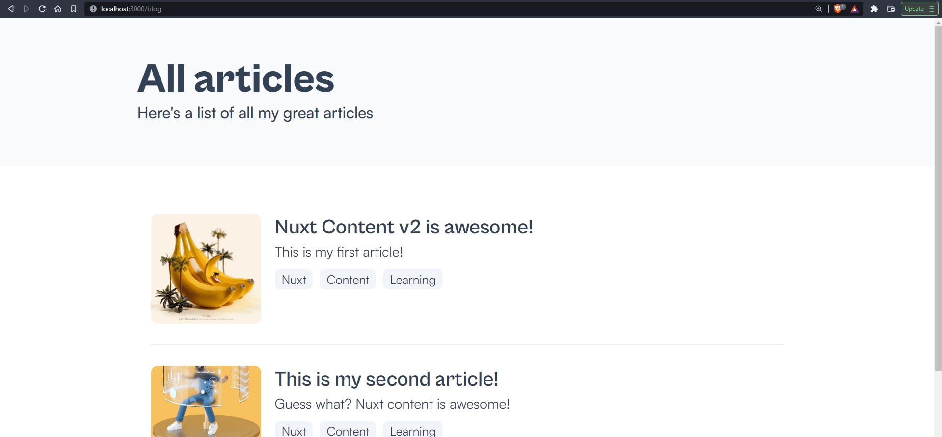
To list all the articles, create a new file ./pages/blog/index.vue. We'll be using the <ContentList /> component provided by Nuxt Content to list all the documents in the ./content/blog path.
<!-- ./pages/blog/index.vue -->
<script setup>
// set meta for page
useHead({
  title: "All articles",
  meta: [{ name: "description", content: "Here's a list of all my great articles" }],
});
</script>
<template>
  <main>
    <header class="page-heading">
      <div class="wrapper">
        <h1 class="text-5xl font-extrabold">All articles</h1>
        <p class="font-medium text-lg">Here's a list of all my great articles</p>
      </div>
    </header>
    <section class="page-section">
      <!-- Render list of all articles in ./content/blog using `path` -->
      <!-- Provide only defined fields in the `:query` prop -->
      <ContentList
        path="/blog"
        :query="{
          only: ['title', 'description', 'tags', '_path', 'img'],
        }"
      >
        <!-- Default list slot -->
        <template v-slot="{ list }">
          <ul class="article-list">
            <li v-for="article in list" :key="article._path" class="article">
              <NuxtLink :to="article._path">
                <div class="wrapper">
                  <div class="img-cont w-32">
                    <img :src=`/${article.img}` :alt="article.title" class="rounded-lg max-h-[8rem]" />
                  </div>
                  <header>
                    <h1 class="text-2xl font-semibold">{{ article.title }}</h1>
                    <p>{{ article.description }}</p>
                    <ul class="article-tags">
                      <li class="tag !py-0.5" v-for="(tag, n) in article.tags" :key="n">{{ tag }}</li>
                    </ul>
                  </header>
                </div>
              </NuxtLink>
            </li>
          </ul>
        </template>

        <!-- slot to display message when no content is found -->
        <template #not-found>
          <p>No articles found.</p>
        </template>
      </ContentList>
    </section>
  </main>
</template>
<style scoped> /* ... */ </style>
View full code with styles here
Here, we're passing two parameters to <ContentList />:
path: The path of the content to load from the content source. Here, we specified/blogsince we want to display content from the/blogdirectory.query: Query to be passed toqueryContent(). Since this component usesqueryContent()internally, we can pass queries to fine-tune results. For example, we used theonlyquery to fetch only a few fields returned by the component.
We used <template *v-slot*``="{ list }"> to display content and <template *#not-found*``> for fallback when no content is found. We should have something like this:
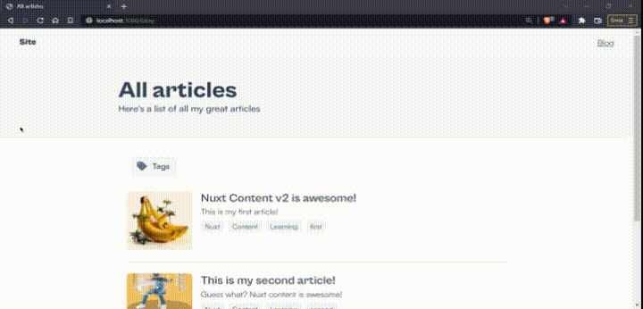
Awesome. Now let's quickly create a <SiteHeader /> component for our blog to help us navigate to this page easily.
PermalinkCreate Site header component
Create a new file ./components/SiteHeader.vue
<!-- ./components/SiteHeader.vue -->
<template>
  <header class="site-header">
    <div class="wrapper">
      <NuxtLink to="/" class="no-underline">
        <figure class="site-logo">
          <h1>Site</h1>
        </figure>
      </NuxtLink>
      <nav class="site-nav">
        <ul class="links">
          <li class="link">
            <NuxtLink to="/blog">Blog</NuxtLink>
          </li>
        </ul>
      </nav>
    </div>
  </header>
</template>
<style scoped> /* ... */ </style>
View full code with styles here
Now, add the component in ./app.vue
<!-- ./app.vue -->
<template>
  <div>
    <SiteHeader />
    <NuxtPage />
  </div>
</template>
PermalinkDisplay articles by tags
One last thing we can add to our blog is the ability to display articles under certain conditions. We'll create a dynamic tags page we'll use to display articles by their tags.
Create a new slug page ./pages/blog/tags/[slug].vue
<!-- ./pages/blog/tags/[slug].vue -->

<script setup>
// get current route slug
const {
  params: { slug },
} = useRoute();

// get array of filters by generating array from separating slug`,`
const filter = slug.split(",");

// set meta for page
useHead({
  title: `All articles with ${slug}`,
  meta: [{ name: "description", content: "Here's a list of all my great articles" }],
});
</script>
<template>
  <main>
    <header class="page-heading">
      <div class="wrapper">
        <h1 class="text-5xl font-extrabold">All articles with "{{ slug }}"</h1>
        <p class="font-medium text-lg">Here's a list of all my great articles</p>
      </div>
    </header>
    <section class="page-section">
      <!-- Render list of all articles in ./content/blog using `path` -->
      <!-- Provide only defined fieldsin the `:query` prop -->
      <ContentList
        path="/blog"
        :query="{
          only: ['title', 'description', 'tags', '_path', 'img'],
          where: {
            tags: {
              $contains: filter,
            },
          },
          $sensitivity: 'base',
        }"
      >
        <!-- Default list slot -->
        <template v-slot="{ list }">
          <ul class="article-list">
            <li v-for="article in list" :key="article._path" class="article-item">
              <NuxtLink :to="article._path">
                <div class="wrapper">
                  <div class="img-cont w-32">
                    <img :src=`/${article.img}` :alt="article.title" class="rounded-lg max-h-[8rem]" />
                  </div>
                  <header>
                    <h1 class="text-2xl font-semibold">{{ article.title }}</h1>
                    <p>{{ article.description }}</p>
                    <ul class="article-tags">
                      <li class="tag" v-for="(tag, n) in article.tags" :key="n">
                        <NuxtLink :to=`/blog/tags/${tag}` class="underline"> {{ tag }} </NuxtLink>
                      </li>
                    </ul>
                  </header>
                </div>
              </NuxtLink>
            </li>
          </ul>
        </template>
        <!-- Not found slot to display message when no content us is found -->
        <template #not-found>
          <p>No articles found.</p>
        </template>
      </ContentList>
    </section>
  </main>
</template>
This page is very similar to our ./pages/blog/index.vue page. In this page, we added a :query prop and passed this query:
{
  only: ['title', 'description', 'tags', '_path', 'img'],
  where: {
    tags: {
      $contains: filter,
    },
  },
  $sensitivity: 'base',
}
This query allows us to list articles with tags containing the one specified in filter.
Now, to ensure that users can easily navigate through the website and explore every tag, we need a way to get all the tags from all the articles.
To do this, we'll have to create a <Tags /> component.
PermalinkCreate a Tags component
This component will use queryContent() to fetch the tags from every article and display them as links that will route to the /tags/[slug] page with the tag as the slug. Create a new component ./components/Tags.vue:
<!-- ./components/Tags.vue -->

<script setup>
// import icon
import { TagIcon } from "@heroicons/vue/solid";

// tag list state
const expanded = ref(false);

// helper function to flatten tags array
const flatten = (tags, key) => {
  let _tags = tags
    .map((tag) => {
      let _tag = tag;
      if (tag[key]) {
        let flattened = flatten(tag[key]);
        _tag = flattened;
      }
      return _tag;
    })
    .flat(1);
  return _tags;
};

// function to toggle expanded state
const toggleExpand = () => {
  expanded.value = !expanded.value;
};

// get only tags data from `/blog`
const { data } = await useAsyncData("tags", () => queryContent("blog").only(["tags"]).find());

// generate array without duplicates from flattened array
const articleTags = [...new Set(flatten(data.value, "tags"))];
</script>
<template>
  <div class="tag-list" :class="{ active: expanded }">
    <!-- Button to toggle expand -->
    <button @click="toggleExpand" class="cta w-icon">
      <TagIcon class="icon solid" />
      <span>Tags</span>
    </button>
    <ul class="article-tags" :class="{ expanded: expanded }">
      <!-- list out tags with links -->
      <li v-for="(tag, n) in articleTags" :key="n" class="tag">
        <NuxtLink :to=`/blog/tags/${tag}` class="font-semibold"> {{ tag }} </NuxtLink>
      </li>
    </ul>
  </div>
</template>
<style scoped>/* ... */</style>
View full code with styles here
Here, we use queryContent() to fetch the tags from all articles, we flatten it using the flatten() helper function, generate an array from a Set of the flattened array to remove duplicates, and assign it to articleTags.
Then, in the <template>, we render a list of <NuxtLink /> which routes to /blog/tags/${tag}. If we click on a tag of Nuxt, it'll route us to /blog/tags/Nuxt, which lists out all the articles with that tag on that page.
Add this component to the ./pages/blog/index.vue page
<!-- ./pages/blog/index.vue -->

<template>
  <main>
    <header class="page-heading"> <!-- ... --> </header>
    <section class="page-section">
      <Tags />
      <!-- ... -->
    </section>
  </main>
</template>
and the ./pages/blog/tags/[slug].vue page.
<!-- ./pages/blog/tags/[slug].vue -->

<template>
  <main>
    <header class="page-heading"> <!-- ... --> </header>
    <section class="page-section">
      <Tags />
      <!-- ... -->
    </section>
  </main>
</template>
Great! Let's see it in action.
Nice! You can view the deployed version here.
PermalinkConclusion
So far, we've managed to build a blog with Nuxt 3 and the Nuxt Content v2 module. We've created a /blog route where all our blog posts and articles live.
Currently, all our documents are in the ./content/ folder. Content displayed in the /blog route of our website renders documents from the ./content/blog folder of our project.
We can also create more pages on our website by creating a new subfolder in the ./content/ folder.
Say we want to have a /snippets route where we have short documents about some useful code snippets, we can easily create a new subfolder ./content/snippets/ and create documents in that folder. Then we can do something similar for the /snippets route as we did for our page's /blog route and create a dynamic page like ./pages/snippets/[slug].vue. We can use the <ContentDoc /> component to render content for each document or we use queryContent() directly.
This shows how we can easily display content on our site without having to manage an external database or API to manage content.
We can further add more features and functionality to our Nuxt Content powered project by going through the API documentation, guides, configuration and examples.
The advanced section in the Nuxt Content documentation is helpful as it shows how hooks allow you to further control and customize the experience.
An example in the advanced section shows how to use the first picture in the document as a cover image.
So far, we've managed to cover the basics, and there's much more you can do with some research. Happy coding!
PermalinkResources & further reading
You can view the code for the project and the live example:
As for further reading,
- The Content guide is a great way to learn about the module.
- Multiple examples on using Content

Written by


A designer & developer from Nigeria. Passionate about crafting beautiful experiences ✨
A designer & developer from Nigeria. Passionate about crafting beautiful experiences ✨
Published on
Open Replay's Technical Blog
Tech blog for OpenReplay. Quality content by developers for developers interested in JavaScript and related front-end technologies.
Tech blog for OpenReplay. Quality content by developers for developers interested in JavaScript and related front-end technologies.