

In React, we have the Component hierarchy. It refers to the tree of components in a page and how a React page is structured. The component hierarchy has a mother-child relationship between elements, meaning the child elements are displayed within their parent container.
When creating a modal dialog in React using conventional methods instead of React Portals, the modal component is passed to its mother element, where it will be rendered. This practice results in an issue: the parent element’s content still gets stacked on top of the modal.
ReactPortal was introduced to solve this issue. ReactPortals makes it possible to render a child element outside its parent hierarchy while maintaining the parent-child relationship.
Let’s see how to create a modal in React, and then we will compare it to when a modal is created with the createPortal method from React Portal.
Create a Pop-up in React
Create a new React project by running the command below in your terminal:
npx create-react-app reactPortal
After a few minutes, a new React app will be created. Your app’s name is reactPortal Navigate into your project’s folder by running the command line below.
cd reactPortal
Open the project on localhost:3000 using the command below.
npm start
Open the project in your IDE to see your codebase.
Now that we have our app running on localhost: 3000 in our browser and our project open in our Integrated Development Environment (IDE), we can proceed by making some edits and removing the unwanted files. Then we will create new components for our project. Now we have what is in the image below.
Create a Conventional React Pop-up
In our App.js component, we will add these lines of code. This React function contains a simple demo, which we will work on in this article.
Copy and paste this into your IDE; remember to add import React from react at the top of each component.
function App() {
return (
<div className="App" style={BACKGROUND_STYLES} >
<div className="Text" style={CONTENT_WRAPPER_STYLES} >
<h1>Interesting facts about pop-ups</h1>
<ul>
<li>The user can not miss a pop-up</li>
<li>Great marketing strategy</li>
<li>It's best to build them using ReactPortal</li>
</ul>
</div>
<button>Open Modal</button>
<Modal>
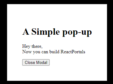
<h1>A Simple pop-up</h1>
<p>Hey there, <br />
Now you can build ReactPortals</p>
</Modal>
</div>
);
}
We have some text content, a button, and a modal in the code above.
We want the button to open up the modal when clicked. For that, we will pass the modal into a separate component as a child element.
The Modal Component
Within our Modal.Js component, we will paste the code below. This is where our modal will be displayed, as it has been passed here.
function Modal({children}) {
 return (
   <div>
     <div>
         {children}
     </div>
   </div>
 )
}
On line 1 in the code above, we have {childre} passed as an argument and rendered in line 5. This means that modal is a child of the component where it is currently located, and I want it to display here.
In the App.js component, we will call Modal Component by pasting import Modal from './Modal' at the top. Now we have our modal showing in the browser.
Activate the Open Pop-up Button
Here we need to change the state of the button from non-active to active, which can be done using useState.
In our App.js, we will import useState from React and use it in our code by pasting the code below at the top of our file.
import React, { useState } from 'react';
Still in App.js, paste the code below after the function declaration and the return keyword.
const [isOpen, setIsOpen] = useState(false)
useState is set to an initial state of false and assigned to isOpen and setIsOpen. Paste this in the App.js file right above the return.
<button onClick={( ) => setIsOpen(true)}>Open Modal</button>
<Modal open={isOpen} onClose={() => setIsOpen(false)}>
   <h1>A Simple pop-up</h1>
   <p>Hey there, <br />
   Now you can build ReactPortals</p>
</Modal>
In the App.js file, update the button and modal with the code above. The button has an onClick function that changes the state of setIsOpen to true. In the modal, open is set to isOpen. Now the modal knows to open when it is clicked.
The onClose function will close the modal when it is clicked. The next step is to connect this logic to our modal component.
function Modal({open, children, onClose}) {
 if (!open) return null
 return (
   <div>
    <div style={OVERLAY_STYLES} />
     <div style={MODAL_STYLES}>
         {children}
         <button onClick={onClose}>Close Modal</button>
     </div>
   </div>
}
Let’s replace the content of the function in our modal file with the code above. On the modal function, we have called the open and onClose functions. These are the functions we defined in the parent component.
On the second line, nothing is expected to happen if it’s not open. If it is open, we need a way to close it. On line eight, we have a button where the onClose function is activated.
Session Replay for Developers
Uncover frustrations, understand bugs and fix slowdowns like never before with OpenReplay — an open-source session replay tool for developers. Self-host it in minutes, and have complete control over your customer data. Check our GitHub repo and join the thousands of developers in our community.
Add Some Styles
Now that we have created a React modal, let’s add some styles.
To do this, add these styles at the top of each component.
const CONTENT_WRAPPER_STYLES = {
 position: 'relative',
 zIndex: 1
}
const BACKGROUND_STYLES = {
 position: 'relative',
 zIndex: 2,
 backgroundColor: 'gray',
 padding: '20px',
 margin: '25px'
}
App.js styles
const MODAL_STYLES = {
 position: 'fixed',
 top: '50%',
 left: '50%',
 transform: 'translate(-50%, -50%)',
 backgroundColor: '#FFF',
 padding: '50px',
 zIndex: 1000
}
const OVERLAY_STYLES = {
 position: 'fixed',
 right: 0,
 top: 0,
 left: 0,
 bottom: 0,
 backgroundColor: 'rgba(0, 0, 0, 7)',
 zIndex: 1000
}
Modal.js styles
Issues Encountered when Creating Portal in React the Conventional Way
Now our model is complete, but there is a stacking issue that makes the contents of the site display on pop-ups. This stacking issue is a result of the CSS zIndex attribute. The zIndex place containers on each other depending on their numbers; you can read more on this here
The content of our page is stacked on the overlay of our portal. This proved to be a problem for developers that had no lasting solution.
Luckily, React Portal was introduced; this was a tested and trusted solution to this problem. Developers could now build pop-ups and not worry about the stacking issue.
Let us see how we can create our pop-ups using React Portal.
Create Pop-ups Using React Portal
React Portal allows rendering our modal outside of the root element.
It is common knowledge that React is a Single Page Application (SPA). Everything within our app is rendered in the root node. For our portal to display above everything else on our page, we will create another element within which the modal will be rendered.
 <body>
   <div id="root"></div>
   <div id="portal"></div>
 </body>
In the Index.html file, we have the body of our app with two divs in it.
The first div with an id of the root is where the entire app is running. The second div with the id of portal is where our modal will run.
The next step is to connect our modal with this element. To do this, we will import ReactDom.
Install React DOM
React components are rendered into the HTML DOM (Document Object Model) using the JavaScript library ReactDOM. Creating user interfaces (UIs) for React apps is its intended usage. ReactDOM links the web page’s actual HTML DOM node elements and the React tree (hierarchy) of components; this property has the method for creating our ReactPortal.
import ReactDOM from 'react-dom'
Let’s paste this code at the top of our Modal.js component. Wrap Modal Component in ReactDOM.createPortal() ReactDom has numerous properties, and we will use the createPortal property to connect our modal component to the portal element.
return ReactDOM.createPortal(
   <div>
     <div style={OVERLAY_STYLES} />
     <div style={MODAL_STYLES}>
         {children}
         <button onClick={onClose}>Close Modal</button>
     </div>
   </div>,
   document.getElementById('portal')
 )
On the first line, we are returning ReactDom.createPortal() within which is the component it will be creating, which in this case is our modal component
document.getElementById('portal') connects the modal to an HTML element where we want it displayed, which in this case is the div tag with an id of the portal. This is similar to the ReactDOM.render() method.
Our portal now appears above every other piece of content in the app. Below is an image of what our portal looks like in the browser.
Use Case of a React Portal
React Portals provide a powerful mechanism for rendering components outside the standard React component tree, enabling greater flexibility and control over the DOM structure of your application. There are use cases for ReactPortal; let’s list a few.
Concern division: Portals can be beneficial for dividing concerns among various components of an application. For instance, you can use a portal to render the video player component outside the main component’s DOM hierarchy if your complicated UI component necessitates rendering a distinct component for a particular capability (such as a video player)
Tooltip and popover components: By using them, even if the target element is deeply nested within the component tree, the tooltip or popover will always appear in the proper location.
Overlays and modal dialogs: Portals are frequently used to make overlays and dialog boxes. No matter where the parent component is in the DOM hierarchy, you can guarantee that the modal component will be rendered at the top level via a portal.
Third-party integrations: Portals can render the appropriate components at the desired location in the DOM tree when interacting with third-party libraries or widgets that demand a specific DOM structure.
Best Practices for Building React Portals
By following these best practices, you can implement your React Portals effectively and provide the intended functionality while maintaining code clarity and a good user experience.
Handle events appropriately: We must make sure that our portal component’s event handlers are configured correctly to catch and react to events, even if they occur outside the portal’s DOM hierarchy.
Maintain encapsulation: To guarantee that the portal component can work properly regardless of where it is in the DOM, avoid relying on external styles or global states.
Identify the appropriate mounting point: Choose the proper location in the DOM hierarchy by taking the context and purpose of the component you are presenting into account.
Consider Accessibility: A good user experience depends on accessibility. Consider keyboard usability and screen reader compatibility while developing portals.
Test and debug thoroughly: Make sure it acts as expected and doesn’t cause any unforeseen problems or conflicts. To find and fix any potential problems, use debugging tools and procedures.
Conclusion
In this article, we have covered how to build a pop-up in React. We first looked at how to build pop-ups the regular way (without using ReactPortals) and then proceeded to build them using Portals. We also discussed the issues developers encountered that led to the introduction of ReactPortals, and how this problem has finally been solved.
In my opinion, ReactPortals is the best way to create pop-ups in React. The event delegation and separation of concerns with ReactDOM.createPortal() are incredible.
I hope you gained knowledge from reading this article. If you get curious and want to further your understanding of React, you can visit react official website to improve your skills.