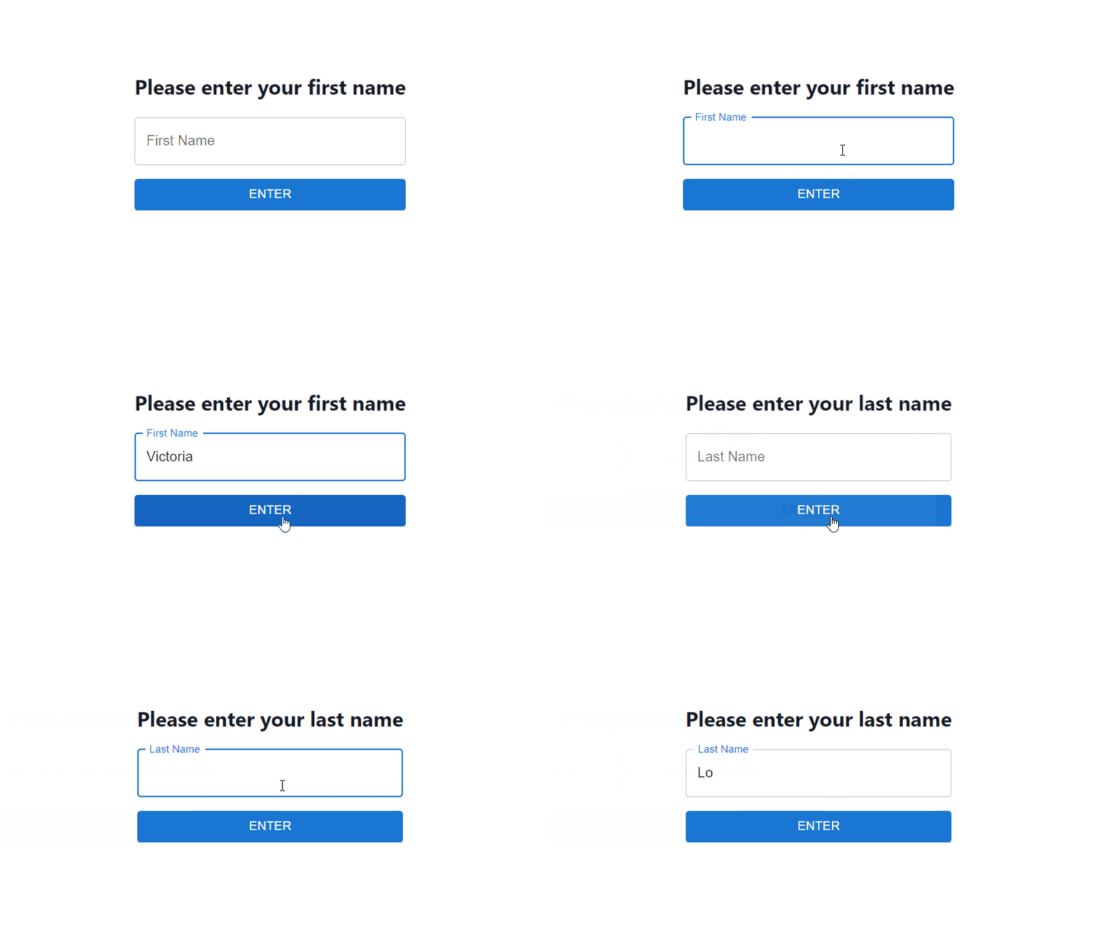
How to Add Animations with React Transition Group for Beginners
Are you React newbie but want to have awesome animations in your app? Then, this is the article for you!
If you are a beginner in React, it may be difficult to include animations within your app. After all, there are many approaches to add animations; and some have higher learning curves than others.
In this article, I'll introduce React Transition Group and how to use it to add/trigger animations in your React app. Even if you're a React beginner, you will be able to liven up your app with animations for a better user experience.
Prerequisites
Before we get started, I recommend that you have these prerequisites to follow along:
- Basic React knowledge
- Basic CSS knowledge
- Code editing software
Introduction: What is React Transition Group
React Transition Group is developed by the React developers themselves and is basically a set of components designed to animate React components on mounting and unmounting.
Just to be clear, it is not an animation library. It simply exposes transition stages so that it is easier to manage classes and handle animations when a component is entering or exiting.
The React Transition Group has 4 components that you can use to help you manage and trigger animations: Transition, CSSTransition, SwitchTransition and TransitionGroup. Let's walk through them all.
Setup & Installation
Assuming you have a React app already initialized, let's first install the react-transition-group package using the line below.
npm install react-transition-group
Then, we import the 4 components from the package.
import {Transition, CSSTransition, SwitchTransition, TransitionGroup} from "react-transition-group";
1. Transition component
Now let's take a look at the Transition component first. It is a component that tracks when a component is mounted or unmounted (enter or exit). In particular, it tracks these 4 main states:
- 'entering'
- 'entered'
- 'exiting'
- 'exited'
We can pass any values and effects to these states to trigger animations of our component.
The most important prop for the Transition component is the in prop. This prop can be toggled to control when the component begins its 'entering' or 'exiting' state. Take a look at the example code below.
const duration = 300;

const defaultStyle = {
  transition: `opacity ${duration}ms ease-in-out`,
  opacity: 0,
  padding: 20,
  display: "inline-block",
  backgroundColor: "#b3d0ff"
};

const transitionStyles = {
  entering: { opacity: 0 },
  entered: { opacity: 1 },
  exiting: { opacity: 1 },
  exited: { opacity: 0 },
};

function App() {
  const [inProp, setInProp] = useState(false);
  return (
    <div>
      <button onClick={() => setInProp(!inProp)}>Click to Show</button>
      <Transition in={inProp} timeout={300}>
        {(state) => (
          <div
            style={{
              ...defaultStyle,
              ...transitionStyles[state]
            }}
          >
            I'm a component that gets a Fade transition!
          </div>
        )}
      </Transition>
    </div>
  );
}
As seen in the code above, the button will toggle the in prop, which will switch the component to trigger 'entering' or 'exiting' states.
The timeout prop is the duration from the triggered 'entering' or 'exiting' state to the 'entered' or 'exited' state. Hence, it is also the duration of the transition.
So let's recap. When the button is clicked, the in prop is toggled and will set the component to its 'entering' state if true, or 'exiting' state if false. Once in the 'entering' or 'exiting' states, the component will remain in this state for the duration of the timeout then it will automatically shift to 'entered' or 'exited' state.
The code above will show a fade animation as specified in our transitionStyles object. Let's look at the result below.

For more information on what props you can pass in the Transition component, feel free to read the documentation.
2. CSSTransition component
This component is built upon the Transition component so it inherits all its props. The CSSTransition component is useful for applying CSS-based animations for your transitions.
First, we need to create 4 CSS classes as shown below:
.example-enter {
  opacity: 0;
  transform:translateX(-100%);
}
.example-enter-active {
  opacity: 1;
  transform:translateX(0);
  transition: opacity 300ms, transform 300ms;
}
.example-exit {
  opacity: 1;
  transform:translateX(0);
}
.example-exit-active {
  opacity: 0;
  transform:translateX(-100%);
  transition: opacity 300ms, transform 300ms;
}
Let me explain what each of them does.
example-enteris applied when the component begins its 'entering' stateexample-enter-activeis applied when the component transitions from 'entering' to 'entered' stateexample-exitis applied when the component begins its 'exiting' stateexample-exit-activeis applied when the component transitions from 'exiting' to 'exited' state
Now, we create the component to as follows:
function Example() {
  const [showMessage, setShowMessage] = useState(false);

  return (
    <div>
       <Button onClick={() => setShowMessage(!showMessage)}>
          Show Message
        </Button>
       <CSSTransition in={showMessage} timeout={300} classNames="example" unmountOnExit>
          <p>Hello, I am a message that animates with CSSTransition!</p>
      </CSSTransition>
    </div>
  );
}
And the result will look like:

For more information on what props you can pass in the CSSTransition component, feel free to read the documentation.
3. SwitchTransition component
The SwitchTransition is a pretty cool component that allows you to control rendering between 2 child components. It has 2 modes: out-in or in-out.
out-in is where the first child leaves first, then is replaced by the next child component. For example:

in-out is where the next child comes in first, then the first child leaves. For example:

Typically, a SwitchTransition is used in conjunction with the Transition or CSSTransition component. Let's create an example using both the SwitchTransition and CSSTransition component.
First, we have our CSS classes.
.fade-enter{
   opacity: 0;
}
.fade-exit{
   opacity: 1;
}
.fade-enter-active{
   opacity: 1;
}
.fade-exit-active{
   opacity: 0;
}
.fade-enter-active,
.fade-exit-active{
   transition: opacity 500ms;
}
For this example, we will use the out-in mode. Our App component will have the following:
function App() {
  const [state, setState] = useState(false);
  return (
    <SwitchTransition mode={"out-in"}>
      <CSSTransition
        key={state ? "Goodbye, world!" : "Hello, world!"}
        addEndListener={(node, done) => node.addEventListener("transitionend", done, false)}
        classNames='fade'
      >
        <button onClick={() => setState(state => !state)}>
          {state ? "Goodbye, world!" : "Hello, world!"}
        </button>
      </CSSTransition>
    </SwitchTransition>
  );
 }
The result will be:

For more information on what props you can pass in the SwitchTransition component, feel free to read the documentation.
4. TransitionGroup component
Last but not least, we have the TransitionGroup component. As the name suggests, this component does not handle the animations itself. Instead, it groups Transition or CSSTransition components and manages the mounting and unmounting of these components in a list.
For example, I have an array of fruits and I want to animate every list item when it appears. So first, I can use the map() function to display every fruit in the array. Every fruit in the array should have a CSSTransition component to handle their animations individually. I can then use TransitionGroup to wrap the list.
The code is shown below (some borrowed from MUI docs).
function App() {
  const [items, setItems] = useState([
    '🍏 Apple',
    '🍌 Banana',]);

  const FRUITS = [
    '🍏 Apple',
    '🍌 Banana',
    '🍍 Pineapple',
    '🥥 Coconut',
    '🍉 Watermelon',
    '🍓 Strawberry',
    '🍈 Melon',
    '🥝 Kiwi',
    '🍒 Cherry',
    '🍑 Peach'
  ];

  const handleAddFruit = () => {
    const nextHiddenItem = FRUITS.find((i) => !items.includes(i));
    if (nextHiddenItem) {
      setItems((prev) => [ ...prev, nextHiddenItem]);
    }
  };

  return (
    <div className="App">
    <TransitionGroup>
      <h2>Shopping List</h2>
      {items.map(( item, index ) => (
            <CSSTransition key={index} timeout={500} classNames="fade">
                <p>{item}</p>
            </CSSTransition>
          ))}
        <button onClick={handleAddFruit}>
          Add Fruit
        </button>
    </TransitionGroup>
    </div>
  );
 }
And the result will show every fruit added to the array with a nice animation!

Open Source Session Replay
Debugging a web application in production may be challenging and time-consuming. OpenReplay is an Open-source alternative to FullStory, LogRocket and Hotjar. It allows you to monitor and replay everything your users do and shows how your app behaves for every issue. It's like having your browser's inspector open while looking over your user's shoulder. OpenReplay is the only open-source alternative currently available.

Happy debugging, for modern frontend teams - Start monitoring your web app for free.
Conclusion
In this article, we have covered some of the basics of React Transition Group. I hope you've learned something valuable from this article.
React Transition Group is a highly flexible yet simple way to add animations to your React app. If you are comfortable with CSS, it won't be hard to create stunning animations and implement them using React Transition Group.
Thanks for reading! Do share and give a like if this article has helped you in understanding React Transitiong Group. Cheers!
