


To improve user experience, animations and micro-interactions are essential to many digital products today, and they bring more than just delight to users.
Informative animations accompanying loading states, navigation, and others significantly improve the user's experience using digital products like websites and applications.
Many simple animations on websites can be achieved with CSS, but more immersive animations that respond to user interactions are best achieved using JavaScript and JavaScript libraries. There are already hundreds of animation libraries, each with pros and cons.
Today, we will look at the most popular and easy-to-use animation library in React, Framer motion. We'll see how we can easily add it to our React application and create amazing animations in a few steps.
At the end of this tutorial, we will introduce the Framer motion library for React and cover the basics of animations in React with Framer.
What is Framer Motion
Framer Motion is an open-sourced, production-ready React animation library that provides users with a non-complex API to easily create animations, manage animation properties, and handle user gestures such as clicks and drag. With the Framer Motion library, developers can create eye-catching animations with little to no CSS styles and can only use the library with JavaScript to create animations; Framer Motion takes away the complexities involved in building animations. Animations can be created without having to write numerous lines of CSS, allowing users to replicate animations of choice with a few lines of code.
As an animation library, it excels at creating awesome animations and interactions. Below are reasons why you should consider using Framer Motions:
Framer Motion is simple and easy to integrate. It doesn't make your code bulky, as it can easily be added to elements with the
motionprefix, and animation properties can be specified.Framer Motion is an animation library provided by Framer. As a result, it can be used alongside the Framer X design tool to easily build and animate smoother user interfaces. With this tool, developers can test how animations will behave during prototyping and apply these same animations when developing their applications.
Framer Motions has a rich documentation and developer community where you can easily find solutions to whatever issues you encounter.
Set up Framer in React
To make use of Framer Motions, we will first be required to have a working React application. If you do not have one, you can install an instance of React on your local machine using the CLI with the following command:
npm create-react-app framer
With the React application created, we can proceed to install the Framer Motion dependency:
npm i framer-motion
The above command adds the Framer Motion dependency to our React application. Before creating animations with Framer Motion, let us first discuss some important terms.
The Motion component
The Motion component is a core factor in adding animations with Framer Motions. To add animation properties with the Motion component, we need to append the prefix motion to whatever jsx element you wish to animate, e.g., motion.div. With the motion prefix added to the element, we can create different animation types by specifying the animation property. Some examples of animation properties include: - Animate: The animate property lets us carry out different Transformation animations on the specified objects, such as translate on the X and Y axis, rotation, scale, and change the level of opacity. To specify an animation with the animate property, follow the below syntax:
    <motion.div
      animate={{ x: 200, y: 80, scale: 2 }}
    ></motion.div>
In the code block above, we used the animate property to move the div 200px on the x-axis and 60px on the y-axis, and we also increased the object's scale by 2.
- Initial: This property lets us specify the object's starting position to be animated. This could be its position on the y and x axes, rotation, and scale. We can specify the
initialproperty as shown below:
initial={{x:50, y:40, rotate: 220}}
The remaining motion properties will be discussed later in this article.
The AnimatePresence component
When items are removed from the React component tree, e.g., checklists, carousels, etc., the items disappear or are replaced. This action, most of the time, is not visually appealing. To improve UX, developers frequently add fading or translation effects to let the user know what items are being removed or replaced. The AnimatePresence component is used to create exit animations for items removed from the component tree. With AnimatePresence, when components are to be unmounted, it puts off this process until a specific indicated action is carried out on the component, in this case, an exit animation.
// first we will need to add an import for the Animate Presence component alongside the motion component
import { motion, AnimatePresence } from "framer-motion";
// For this example we will create a cube and use the useState hook to toggle its visibility while adding the exit animation to it
import { useState } from "react";
function App() {
// State to toggle visibility
const [show, setShow] = useState(true);
<div
style={{
display: "flex",
flexDirection: "column",
gap: "20px",
alignItems: "center",
}}
>
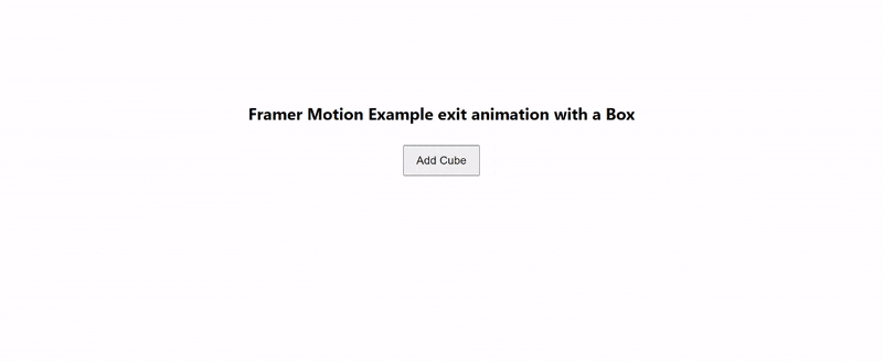
<h1 style={{ position: "relative", marginTop: "200px" }}>
Example exit animation with a Box
</h1>
//Added Animate Presence component
<AnimatePresence>
//If show is true, the following will be returned
{show && (
<motion.div
//Note that the AnimatePresence component requires a key prop to identify the choice element in the React component tree
key= "a box"
initial={{ opacity: 0, x: 50 }}
animate={{ opacity: 1, x: 100 }}
//Specified Exit animation
exit={{ opacity: 0, x: -150 }}
style={{
height: "140px",
width: "140px",
background: "blue",
position: "relative",
}}
></motion.div>
)}
</AnimatePresence>
//Button to toggle the show state
<button onClick={() => setShow(!show)} style={{padding:"15px 24px", fontSize:"22px"}} >{show? "Remove Cube": "Add Cube"}</button>
</div>
The code above, when run, will produce the following result:
Types of Animations
In this section, we'll demonstrate different animation types provided by Framer Motion. We will also build basic sliders and options to modify the properties of the animations. In the App.js component, make the following modifications:
const [setScale, changeSetScale] = useState(1);
const [setRotate, changeSetRotate] = useState(0);
const [setX, changeSetX] = useState(0);
const [setY, changeSetY] = useState(0);
const [setOpacity, changeSetOpacity] = useState(1);
const [currentShape, setCurrentShape] = useState([
  { shape: "Rectangle"},
  { shape: "Square"},
  { shape: "Triangle"},
]);
const [currentShapeIndex, setCurrentShapeIndex] = useState(0);
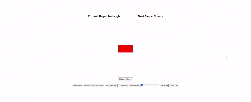
In the code block above, we create states to manage the scale, rotation, opacity, and translation for our animation property on the X and Y axis. We also created an array currentShape, which we will use to indicate the name of the current shape being animated. We will have three shapes: a rectangle, a square, and a triangle.
// continues from earlier code above
  return (
    <div
      style={{
        display: "flex",
        flexDirection: "column",
        gap: "20px",
        alignItems: "center",
        marginTop: "80px",
      }}
    >
      <div style={{ display: "flex", gap: "120px" }}>
        {/* current Shape */}
        <motion.h3>
          Current Shape: {currentShape[currentShapeIndex].shape}
        </motion.h3>
        <motion.h3>
          Next Shape:{" "}
          {currentShapeIndex === currentShape.length - 1
            ? currentShape[0].shape
            : currentShape[currentShapeIndex + 1].shape}
        </motion.h3>
      </div>
The code above indicates the name of the current shape being shown and that of the next shape.
<div
        style={{
          minHeight: "50vh",
          display: "flex",
          justifyContent: "center",
          alignItems: "center",
        }}
      >
        {/* current shape to be displayed */}
        {(() => {
          switch (currentShapeIndex) {
            case 0:
              return (
                <motion.div
                  style={{
                    width: "100px",
                    height: "50px",
                    backgroundColor: "red",
                  }}
                  animate={{
                    scale: setScale,
                    rotate: setRotate,
                    x: setX,
                    y: setY,
                    opacity: setOpacity,
                  }}
                ></motion.div>
              );
              break;
            case 1:
              return (
                <motion.div
                  style={{
                    width: "100px",
                    height: "100px",
                    backgroundColor: "blue",
                  }}
                  animate={{
                    scale: setScale,
                    rotate: setRotate,
                    x: setX,
                    y: setY,
                    opacity: setOpacity,
                  }}
                ></motion.div>
              );
              break;
            case 2:
              return (
                <motion.div
                  style={{
                    width: "0",
                    height: "0",
                    borderLeft: "50px solid transparent",
                    borderRight: "50px solid transparent",
                    borderBottom: "100px solid green",
                  }}
                  animate={{
                    scale: setScale,
                    rotate: setRotate,
                    x: setX,
                    y: setY,
                    opacity: setOpacity,
                  }}
                ></motion.div>
              );
              break;
            default:
              return <h1>Can't figure out a shape</h1>;
              break;
          }
        })()}
      </div>
Here, we are using a switch statement to determine what shape will be displayed. The switch statement is dependent on the value of the index. To change the index, we will make use of a button.
<div>
  {/* change Shapes */}
  <button
    onClick={() => {
      if (currentShapeIndex === 2) {
        setCurrentShapeIndex(0);
      } else {
        setCurrentShapeIndex(currentShapeIndex + 1);
      }
    }}
  >
    Change Shape
  </button>
</div>
Finally, we will add buttons to control values of the scale, x-axis, y-axis, opacity, and rotate values of our animation property:
<div>
        {/* value controllers */}
        <button
          onClick={() => {
            changeSetX(setX - 100);
          }}
        >
          Move Left
        </button>
        <button onClick={() => changeSetX(setX + 100)}>Move Right</button>
        <button onClick={() => changeSetY(setY - 100)}>Move Up</button>
        <button onClick={() => changeSetY(setY + 100)}>Move Down</button>
        <button onClick={() => changeSetScale(setScale + 1)}>Scale Up</button>
        <button onClick={() => changeSetScale(setScale - 1)}>Scale Down</button>
        {/* <button onClick={() => changeSetRotate(setRotate + 10)}>Rotate</button> */}
        <input type="range" min="0" max="360" value={setRotate} onChange={(e) => {
          changeSetRotate(parseFloat(e.target.value))
          }} />
        <button onClick={() => changeSetOpacity(setOpacity + 0.5)}>
          Fade In
        </button>
        <button onClick={() => changeSetOpacity(setOpacity - 1)}>
          Fade Out
        </button>
      </div>
  </div>
To run the application, enter the npm start command in the CLI and open up the result in your browser. You will get a result similar to the GIF below:
Gesture-type animations
This section will cover gesture-type animations on user actions, such as click-to-drag, hover, tap, and pan.
Drag animations
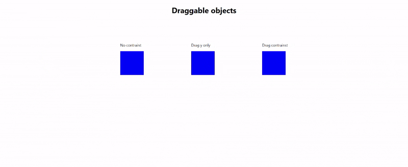
To carry out a drag animation on an object, we need to add the keyword drag as a motion property. Also, an object can be constrained to the x or y axis by setting drag= "x ||y "to prevent an object from being dragged off screen or beyond a certain limit, we can set a maximum value in any direction, e.g dragConstraints={{ left: 0, right: 100 }}`. This will set the maximum drag distance on the x-axis to 0 pixels on the right axis to 100 pixels. We can illustrate this animation type with the example below:
return (
    <>
      <h1 style={{ marginBottom: "100px", textAlign: "center" }}>
        Draggable objects
      </h1>
      <div
        style={{
          display: "flex",
          flexDirection: "row",
          gap: "200px",
          alignItems: "center",
          justifyContent: "center",
          marginTop: "80px",
        }}
      >
        <div>
          <p>No contraint</p>
          <motion.div
            style={{
              width: "100px",
              height: "100px",
              backgroundColor: "blue",
            }}
            drag
          ></motion.div>
        </div>
        <div>
          <p>Drag y only</p>
          <motion.div
            style={{
              width: "100px",
              height: "100px",
              backgroundColor: "blue",
            }}
            drag= "y"
          ></motion.div>
        </div>
        <div>
          <p>Drag contrainst</p>
          <motion.div
            style={{
              width: "100px",
              height: "100px",
              backgroundColor: "blue",
            }}
            drag
            dragConstraints={{ left: 0, right: 100 }}
          ></motion.div>
        </div>
      </div>
    </>
  );
If you open the results in your browser, you will get a result similar to the GIF below:
Hover and tap animations
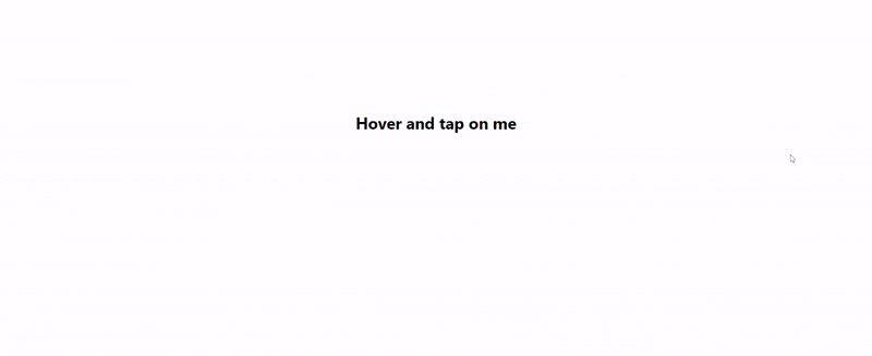
To create hover animations, we need to add a whileHover and whileTap properties to the motion component.
return (
    <div style={{textAlign:"center", paddingTop:"200px"}} >
      {/* tap and hover */}
      <motion.h1 whileTap={{ scale: 0.9 }} whileHover={{ scale: 1.1 }}>
        Hover and tap on me
      </motion.h1>
    </div>
  );
In the code block above, we are animating the scale property based on a tap or hover gesture. This will produce the following result:
Now let's try out a more complex hover and tap animation. Here we will create an expandable card that opens when clicked on.
import { motion } from "framer-motion";
import { useState } from "react";
function App() {
  const [showCard, setShowCard] = useState(false);
  return (
    <div
      style={{
        display: "flex",
        justifyContent: "center",
        alignItems: "center",
        height: "100vh",
        background: "grey",
      }}
    >
      <motion.div
        style={{
          background: "#fff",
          padding: "3rem 2rem",
          borderRadius: "8px",
          boxShadow: "0 0 10px rgba(0,0,0,0.2)",
        }}
        //hover
        whileHover={{
          scale: 1.1,
          boxShadow: "0 0 10px rgba(0,0,0,0.4)",
        }}
        transition={{
          layout: {
            duration: 1,
            type: "spring",
          },
        }}
        layout
        onClick={() => setShowCard(!showCard)}
      >
        <motion.h4 layout="position">Hover or click</motion.h4>
        {showCard && (
          <motion.p
            style={{ width: "600px" }}
            initial={{ opacity: 0 }}
            animate={{
              opacity: 1,
            }}
          >
            Lorem ipsum dolor, sit amet consectetur adipisicing elit. Nostrum
            error reiciendis iure architecto qui magni, excepturi voluptatum
            repudiandae nihil rerum eveniet pariatur ipsa velit similique et
            aliquam, deserunt totam explicabo.
          </motion.p>
        )}
      </motion.div>
    </div>
  );
}
export default App;
Here, we used a state showCard to toggle the display of our card's content. Normally, this creates a non-visual appealing effect as the component is mounted and dismounted. The layout property allows elements to animate automatically when there's a change in the shape or size of their container as they move to their new position. With transition, we can modify the behavior of other properties. We also added a hover animation that changes the scale and box-shadow of the object. Below is the output of the code with and without animations attached: Without animations:

With animations:

Scroll animations
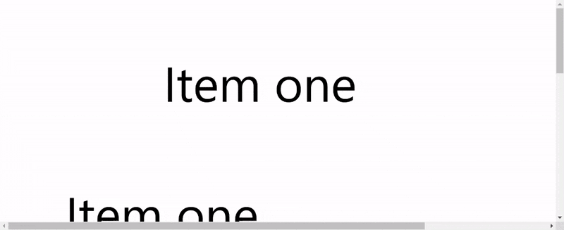
With Framer Motion, animations can also occur as the desired element comes into the display or leaves the viewport. Example below:
return (
    <div style={{ minHeight: "250vh" }}>
      <motion.p initial={{ opacity: 0, x:0  }} whileInView={{ opacity: 1, x:500 }} style={{fontSize:"150px", marginBottom:"200px"}}>
        Item one
      </motion.p>
      <motion.p initial={{ opacity: 0, x:700 }} whileInView={{ opacity: 1, x:200 }} style={{fontSize:"150px", marginBottom:"200px"}}>
        Item one
      </motion.p>
      <motion.p initial={{ opacity: 0 }} whileInView={{ opacity: 1 }} style={{fontSize:"150px", marginBottom:"200px"}}>
        Item one
      </motion.p>
      <motion.p initial={{ opacity: 0 }} whileInView={{ opacity: 1 }} style={{fontSize:"150px", marginBottom:"200px"}}>
        Item one
      </motion.p>
      <motion.p initial={{ opacity: 0 }} whileInView={{ opacity: 1 }} style={{fontSize:"150px", marginBottom:"200px"}}>
        Item one
      </motion.p>
    </div>
  );
In the code block above, we have initial and whileInView properties. We started our app's initial animation property and defined animations to be carried out when the item comes into the viewport in the whileInView property.
Here the element displays its whileInView animation property when it comes into the viewport, and when we scroll past it, it reverts to its initial state.
Open Source Session Replay
OpenReplay is an open-source, session replay suite that lets you see what users do on your web app, helping you troubleshoot issues faster. OpenReplay is self-hosted for full control over your data.
Start enjoying your debugging experience - start using OpenReplay for free.
Transitions
The Framer Motion Transition property lets us specify how we want animations to occur. With Transition, we can define an animation's duration and delay and repeat an animation. Framer Motion Transition prop has 3 provided behavior types by default: tween, spring, and inertia.
The
tweenproperty is used for animations that we wish to have a specific duration for its completion;tweenanimates the object uniformly from start to finish within a specified interval.The
springbehavior type emulates a bounce-like physic material. Here the animated element behaves like an elastic material.The
inertiabehavior type applies physics such as friction or gravity to specified elements.
<div
  style={{
    display: "flex",
    justifyContent: "center",
    alignItems: "center",
    height: "100vh",
    background: "grey",
    flexDirection: "column",
    gap: "2rem",
  }}
>
  <motion.div
    style={{
      width: 200,
      height: 200,
      background: "white",
      borderRadius: 20,
      display: "flex",
      justifyContent: "center",
      alignItems: "center"
    }}
    // we will add transition with tween
    animate={{
      x: 500,
      transition: {
        duration: 2,
        type: "tween",
      },
    }}
  >Tween</motion.div>
  <motion.div
    style={{
      width: 200,
      height: 200,
      background: "white",
      borderRadius: 20,
      display: "flex",
      justifyContent: "center",
      alignItems: "center"
    }}
    // inertia transition
    animate={{
      x: 800,
      transition:{
        duration: 2,
        type: "inertia",
        velocity: 800
      }
    }}
  >Inertia</motion.div>
  <motion.div
    style={{
      width: 200,
      height: 200,
      background: "white",
      borderRadius: 20,
      display: "flex",
      justifyContent: "center",
      alignItems: "center"
    }}
    // spring transition
    animate={{
      x: 500,
      transition:{
        duration: 2,
        type: "spring",
        bounce: 0.5
      }
    }}
  >Spring</motion.div>
</div>
In the code above, we have three cubes to which we will apply the different transition behaviors. Running the code will produce the following output:
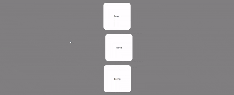
In the first box, we applied tween behavior. The second has a velocity value specified for the object and slows down towards the end of the animation due to its inertia behavior type. For the third box, we used spring and specified a bounce value of 0.5. A high bounce value with making the cube bounce to and fro multiple times before finally coming to rest.
Wrapping up
Apart from specifying specific animation values for properties, Framer Motions also lets us specify multiple values using an array. This way, we can have multiple values for an animation applied to the object in one animation.
<div
  style={{
    display: "flex",
    justifyContent: "center",
    alignItems: "center",
    height: "100vh",
    flexDirection: "column",
    gap: "2rem",
  }}
>
  {/* closing addition */}
  <motion.div
    style={{
      height: "200px",
      width: "200px",
      background: "blue",
    }}
    animate={{
      x: [100, 200, 400, 150],
      y: [100, 200, -300, 150],
      scale: [1, 1.2, 1.4, 1, 1],
      rotate: [0, 0, 270, 270, 0],
      transition: {
        duration: 2,
        repeat: Infinity,
      },
      borderRadius: ["20%", "20%", "50%", "50%", "20%"],
    }}
  ></motion.div>
</div>
In the code block above, we specified multiple values for: x and y' axis positions, scale, rotation, and borderRadius. We also created an infinite animation by setting the repeat property of the transition` to infinity. Running the code will produce the below result:

Additional Framer Motion Components
LayoutGroup: This component is used to group motion components that will have layout changes. The components will carry out layout animations when the container changes. As specified earlier, motion components with alayoutprop automatically animate to adjust to changes when the component is mounted to the React tree.MotionConfig: This component is used to specify configurations for different child motion components.LazyMotion: This component reduces the bundle size and speeds up a web application's loading process and performance. This is done by synchronous and asynchronous loading motion features as required.
Conclusion
In this tutorial, we discussed the Framer Motions animation library, its benefits and features, and how it can be applied to create animations with a React application.
Resources & further reading
3d animations with Framer Motion Adding animation controls in Framer Motion Track motion in Framer animations
A TIP FROM THE EDITOR: Check out other libraries for animations in React by reading My Favorite 3 React Animation Libraries and Doing Animations With React Reveal.