


Form validation is critical for preventing malicious attacks or incorrect data from being inputted into an application. The React Final Form zero-dependency library is a form validation tool that provides form management for validating forms in react applications. It is written in core JavaScript, which means it can be used in other JavaScript frameworks. In this article, we will look at this library and how to use it in a web application.
Getting started with React Final Form
In this section, we will create a React Application by running the following command in your project terminal:
npx create-react-app react-final-form
cd react-final-form
We will install React Final Form by using either of the code blocks below:
yarn add final-form react-final-form final-form-focus
or
npm install final-form react-final-form final-form-focus
To style our application, replace the code in App.css by pasting the entire code block from this link
Validating Forms with React Final Form
It is very simple to validate forms using the React Final Form library; we will look at record-level validation, field-level validation, and error-focused validation.
To make use of the library, use the code block below:
import './App.css';
import React from 'react'
import { Form, Field } from 'react-final-form'
const App = () => {
const logValues = values => {
window.alert(JSON.stringify(values, 0, 2))
}
return (
<div className='App'>
<main >
<h1>React Final Form</h1>
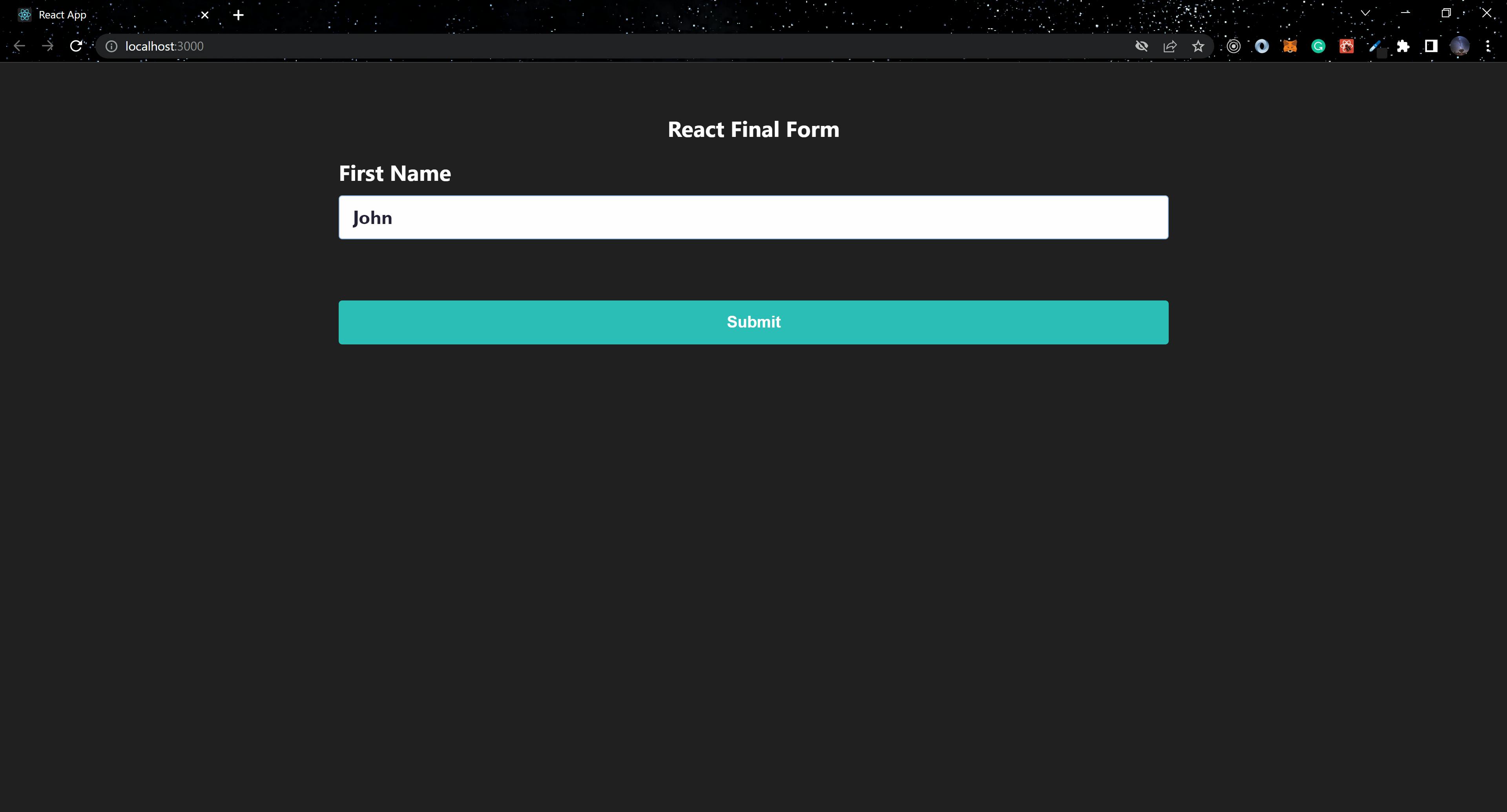
<Form
onSubmit={logValues}
initialValues={{ firstName: "John"}}
>
{({ handleSubmit }) => (
<form className="form" onSubmit={handleSubmit}>
<div>
<label>First Name</label>
<Field
name="firstName"
component="input"
type="text"
placeholder="First Name"
className="Input"
/>
</div>
<div className="button-container">
<button type="submit">
Submit
</button>
</div>
</form>
)}
</Form>
</main>
</div>
)
}
export default App;
We imported Form and Field from react-final-form into the above code block. The only required prop for the Form component is the onSubmit prop. The initialValues and render props are optional; the render prop can be passed to the Form component as a child. It provides the handleSubmit function via the render prop, passed to the HTML form onSubmit. We will then create a Field component with the required/optional props.
Record level validation
Record-level validation utilizes a validate prop on the Form component, which contains all form values and returns an object containing the structure of the values in the Form component.
...
  return (
    <div className="App">
      <main>
        <h1>React Final Form</h1>

        <Form
          onSubmit={logValues}
          validate={(values) => {
            const errors = {};
            if (!values.username) {
              errors.username = "required";
            }
            if (!values.password) {
              errors.password = "Required";
            }
            if (!values.confirm) {
              errors.confirm = "Required";
            } else if (values.confirm !== values.password) {
              errors.confirm = "Must match";
            }
            return errors;
          }}
        >
          {({ handleSubmit, submitting, form, pristine }) => (
            <form onSubmit={handleSubmit}>
              <Field name="username">
                {({ input, meta }) => (
                  <div>
                    <label>Username</label>
                    <input
                      {...input}
                      type="text"
                      className="Input"
                      placeholder="Username"
                    />
                    <span className="errorMsg">
                      {meta.error && meta.touched && <span>{meta.error}</span>}
                    </span>
                  </div>
                )}
              </Field>
              <Field name="password" type="password">
                {({ input, meta }) => (
                  <div>
                    <label>Password</label>
                    <input
                      {...input}
                      className="Input"
                      type="password"
                      placeholder="Password"
                    />
                    {meta.error && meta.touched && <span>{meta.error}</span>}
                  </div>
                )}
              </Field>
              <Field name="confirm" type="password">
                {({ input, meta }) => (
                  <div>
                    <label>Confirm</label>
                    <input {...input} className="Input" placeholder="Confirm" />
                    {meta.error && meta.touched && <span>{meta.error}</span>}
                  </div>
                )}
              </Field>
              <div className="button-container">
                <button type="submit" disabled={submitting}>
                  Submit
                </button>
                <button
                  type="button"
                  onClick={form.reset}
                  disabled={submitting || pristine}
                  className="reset"
                >
                  Reset
                </button>
              </div>
            </form>
          )}
        </Form>
      </main>
    </div>
  );
...
Using the validate prop on the Form component, we can check if the values passed into the Form are valid or invalid in the above code block. Other useful values in the render prop we destructured include submitting, form, and pristine, which we can use to validate the form when we click the submit or reset button.
The Field components have a fieldState that contains the input and meta properties. These are destructured from fieldState, and we added the HTML input element as a child to the Field component, spreading the input from the fieldState to the HTML input. meta is a helpful property from feildState, it has a few values that are used to keep track of the state of the field, this can be used to display helpful error messages on the form using meta.touched and meta.error.
Session Replay for Developers
Uncover frustrations, understand bugs and fix slowdowns like never before with OpenReplay — an open-source session replay suite for developers. It can be self-hosted in minutes, giving you complete control over your customer data
Happy debugging! Try using OpenReplay today.
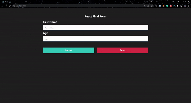
Field-level validation
The Field component has a validate prop to which we can directly pass validation rules; if the value is valid, it returns undefined; otherwise, it returns the error message.
Using the Field-level validate prop, we can successfully define custom validation rules.
...
const App = () => {
...

  const required = (value) => (value ? undefined : "Required");

  const mustBeNumber = (value) =>
    isNaN(value) ? "Must be a number" : undefined;

  const minValue = (min) => (value) =>
    isNaN(value) || value >= min ? undefined : `Should be greater than ${min}`;

  const composeValidators =
    (...validators) =>
    (value) =>
      validators.reduce(
        (error, validator) => error || validator(value),
        undefined
      );
...

  return (
    <div className="App">
      <main>
        <h1>React Final Form</h1>

        <Form
          onSubmit={logValues}
          validate={(values) => {
            const errors = {};
            if (!values.username) {
              errors.username = "required";
            }
            return errors;
          }}
        >
          {({ handleSubmit, submitting, form, pristine }) => (
            <form onSubmit={handleSubmit}>
              <Field name="firstName" validate={required}>
                {({ input, meta }) => (
                  <div>
                    <label>First Name</label>
                    <input {...input} className="Input"  type="text" placeholder="First Name" />
                    {meta.error && meta.touched && <span>{meta.error}</span>}
                  </div>
                )}
              </Field>
              <Field
                name="age"
                validate={composeValidators(
                  required,
                  mustBeNumber,
                  minValue(18)
                )}
              >
                {({ input, meta }) => (
                  <div>
                    <label>Age</label>
                    <input {...input} className="Input"  type="text" placeholder="Age" />
                    {meta.error && meta.touched && <span>{meta.error}</span>}
                  </div>
                )}
              </Field>
              <div className="button-container">
                <button type="submit" disabled={submitting}>
                  Submit
                </button>
                <button
                  type="button"
                  onClick={form.reset}
                  disabled={submitting || pristine}
                  className="reset"
                >
                  Reset
                </button>
              </div>
            </form>
          )}
        </Form>
      </main>
    </div>
  );
};
...
Four sets of field-level validation rules were created in the preceding code block: required, mustBeNumber, minValue, and composeValidators. To validate a component, the composeValidators can accept multiple validation rules. We can combine record and field-level validations to add validation to a form.
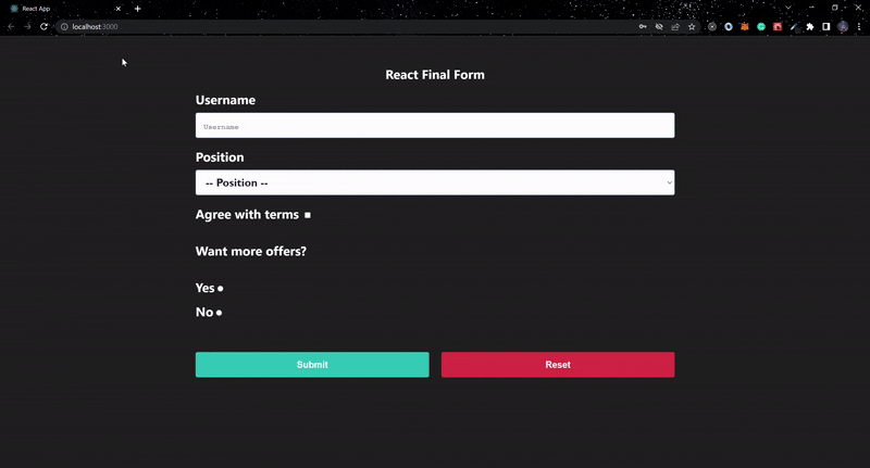
Error-focused validation
We can validate other input fields, select, checkbox, and radio buttons using record-level validation. You can also add the decorators prop to the Form component if you have a large form and want to easily help a user auto-detect where validation failed when submitting a form.
...
import createDecorator from "final-form-focus";
...
const App = () => {
...
  const focusOnError = createDecorator();
...
  return (
    <div className="App">
      <main>
        <h1>React Final Form</h1>
        <Form
          decorators={[focusOnError]}
          onSubmit={logValues}
          validate={(values) => {
            const errors = {};
            if (values.username === undefined) {
              errors.username = "Required";
            }
            if (values.position === undefined) {
              errors.position = "Required";
            }
            if (!values.terms) {
              errors.terms = "Required";
            }
            if (!values.interested) {
              errors.interested = "Required";
            }

            return errors;
          }}
        >
          {({ handleSubmit, submitting, form, pristine }) => (
            <form className="form" onSubmit={handleSubmit}>
              <Field name="username">
                {({ input, meta }) => (
                  <div className={meta.active && "active" }>
                    <label>Username</label>
                    <input
                      {...input}
                      className="Input"
                      type="text"
                      placeholder="Username"
                    />
                    {meta.error && meta.touched && <span>{meta.error}</span>}
                  </div>
                )}
              </Field>
              <Field name="position" type="select">
                {({ input, meta }) => (
                  <div className={meta.active && "active" }>
                    <label>Position</label>
                    <select {...input}>
                      <option value="">-- Position --</option>
                      <option value="writer">Writer</option>
                      <option value="engineer">Engineer</option>
                      <option value="analyst">Analyst</option>
                      <option value="hr">HR</option>
                    </select>
                    {meta.error && meta.touched && <span>{meta.error}</span>}
                  </div>
                )}
              </Field>
              <Field name="terms" type="checkbox">
                {({ input, meta }) => (
                  <div className={meta.active && "active" }>
                    <label>Agree with terms</label> <input {...input} />
                    {meta.error && meta.touched && <span>{meta.error}</span>}
                  </div>
                )}
              </Field>
              <h3>Want more offers?</h3>
              <Field name="interested" type="radio" value="interested">
                {({ input, meta }) => (
                  <div className={meta.active && "active" }>
                    <label>Yes</label>
                    <input {...input} />
                    {meta.error && meta.touched && <span>{meta.error}</span>}
                  </div>
                )}
              </Field>
              <Field name="interested" type="radio" value="not-interested">
                {({ input, meta }) => (
                  <div className={meta.active && "active" }>
                    <label>No</label>
                    <input {...input} />
                    {meta.error && meta.touched && <span>{meta.error}</span>}
                  </div>
                )}
              </Field>
              <div className="button-container">
                <button type="submit" disabled={submitting}>
                  Submit
                </button>
                <button
                  type="button"
                  onClick={form.reset}
                  disabled={submitting || pristine}
                  className="reset"
                >
                  Reset
                </button>
              </div>
            </form>
          )}
        </Form>
      </main>
    </div>
  );
};
...
To know when a field is active, meta.active is set to true. We also used the createDecorator function from final-form-focus and assigned it to focusOnError, which we passed to the decorators prop on the Form component. This helps to auto-detect when a field is invalid upon submitting the form.
Conclusion
It is incredibly simple and straightforward to manage a form's state and validate it using React Final Form. Using the library in a React application, you may create straightforward intricate forms.
For additional details on the library, check the official documentation. To examine the complete code, check out this GitHub repository.