Creating drop-down menus with CSS in 2023

The navbar of every website is a very important part of the site's accessibility and functionality. Ideally, Navbars should have links to all parts of the website, but putting all that information in one line may make your navbars look congested. That's where dropdown menus come in.
Dropdown menus are an essential part of website navigation in 2023. They can be used to simplify the user experience and improve your overall website, and as a developer, you must know how to create them.
In this blog post, we'll discuss the latest techniques for creating effective dropdown menus that are both user-friendly and aesthetically pleasing. From choosing the right design elements to exploring new technologies, this post will provide all the information you need to create an intuitive and beautiful dropdown menu in 2023.
CSS Dropdown Menu Basics
To create a dropdown menu, let's create a simple navbar for a demo company. Here's the HTML for that.
<<html lang="en">
<head>
    <meta charset="UTF-8">
    <meta http-equiv="X-UA-Compatible" content="IE=edge">
    <meta name="viewport" content="width=device-width, initial-scale=1.0">
    <link rel="stylesheet" href="style.css">
    <title>Document</title>
</head>
<body>
    <header>
        <nav>
            <ul>
                <li><a href="#">Home</a></li>
                <li><a href="#">Blog</a></li>
                <li><a href="#">About</a>
                    <div class="dropdown">
                        <ul>
                            <li><a href="">Vision</a></li>
                            <li><a href="">Mission</a></li>
                            <li class="goals"><a href="">Goals</a></li>
                        </ul>
                    </div>
                </li>
                <li><a href="#">Socials</a></li>
            </ul>
        </nav>
    </header>
</body>
</html>
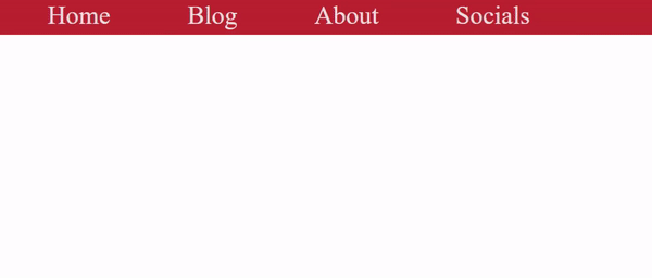
Here's what that looks like right now without adding any styles.
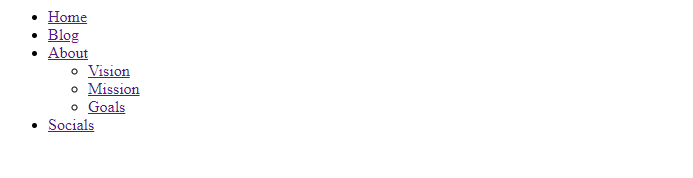
Next, you have to add some styling to it. First, target the header and nav tags.
header{
  position: fixed;
  top: 0;
  right: 0;
  left: 0;
  display: flex;
  align-items: center;
  justify-content: space-between;
  z-index: 1000;
  background-color: #c52e2e;
  height: 60px;
 }

nav{
  text-align:center;
  width: 100%;
  background-color: #c52e2e;
  padding: 0;
  margin: 0;
  height: 60px;
  position: relative;
}
The code for styling the nav element itself is very straightforward, but it's important to note that the position attribute is set to relative. That way, we can absolutely position the dropdown content inside it. Next, let's style the ul, li, and a tags.
nav ul {
  background-color: #c52e2e;
  display: inline-flex;
  padding: 0;
  margin: 0;
  list-style: none;
}

nav ul li {
  display: inline-block;
}

nav ul li a {
  color:#ebe1e1;
  padding:0px 60px;
  text-decoration:none;
  line-height: 60px;
  font-size: 40px;
}
Now, for the icing on the cake: the dropdown. First, we'll target the dropdown class and set the display to none to ensure it doesn't show unless clicked upon or hovered. Then we'll set the position to absolute to ensure it's absolutely positioned inside the link it's attached to.
.dropdown {
  display: none;
  position: absolute;
}
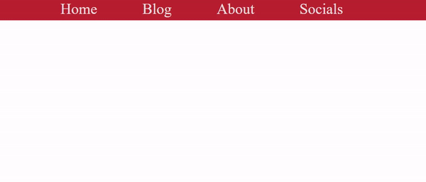
Here's what our navbar looks like right now.

The dropdown menu is not visible right now because we set the display to none, but we'll make it visible next with hover effects.
Enhancing Dropdown Menus with CSS3
Now for our next trick, let's use hover effects to make our dropdown menu appear when we hover the mouse on the "About" link. To do that, we have to input the following code.
nav ul li:hover {
  background: #e7dede;
}

nav ul li:hover > a{
    color:#000000;
    height: 60px;
}

nav ul li:hover .dropdown{
  background: #ece2e2;
  display: block;
  position: absolute;
}

nav ul li:hover .dropdown ul{
  display: flex;
  flex-direction: column;
}
Here's what our dropdown menu looks like now.
As you can see, our dropdown menu works perfectly. Next, let's add some animation to the dropdown to make it look smoother. Adding transitions to dropdown menus is usually done via javascript, but since this article is focused mainly on CSS, we'll try to achieve the same effect without javascript.
To do that, we'll be using some advanced CSS styling. This will be a combination of transforms, opacity, and the clip property. We'll also remove the display: none; value, as they're harder to transition alongside all auto values.
Here's what our code for the dropdown will look like now.
nav li ul{
  clip: rect(1px, 1px, 1px, 1px);
    opacity: 0.1;
    transition: transform 0.9s cubic-bezier(0.2, 0, 0.2, 1), opacity 0.2s cubic-bezier(0.2, 0, 0.2, 1);
    transform: translateY(-10px) scaleY(0.5);
    transform-origin: top;
    box-shadow: 5px 5px 5px rgba(black, 0.3);
    list-style: none;
    margin: 0;
    padding: 0;
    position: absolute;
    top: 100%;
    width: 221px;
}

nav li:hover .dropdown ul{
  clip: auto;
  opacity: 1;
  transform: translateY(0) scaleY(1);
  display: flex;
  flex-direction: column;
}
Here's what our dropdown menu will look like now.
As you can see, we've added a falling transition to our dropdown. Again, this can be more easily done with javascript, but that's beyond the current scope of this article.
Session Replay for Developers
Uncover frustrations, understand bugs and fix slowdowns like never before with OpenReplay — an open-source session replay suite for developers. It can be self-hosted in minutes, giving you complete control over your customer data
Happy debugging! Try using OpenReplay today.
Responsive Dropdown Menus
Responsive dropdown menus are a crucial element of modern website design. They allow users to easily navigate through a site's content, regardless of the device they are using. With the increasing popularity of mobile devices, websites must be optimized for different screen sizes and orientations.
A responsive dropdown menu adjusts its layout and functionality based on the user's device or browser window size. This ensures the menu is easy to use and read, regardless of whether the user views the site on a desktop computer, tablet, or smartphone.
There are several techniques for creating a responsive dropdown menu, including:
Using CSS media queries to change the display property of the menu at different screen sizes.
Using JavaScript or jQuery to toggle the visibility of the menu when the screen size is below a specific breakpoint.
Using a responsive navigation library or framework, such as Bootstrap or Foundation, which includes pre-built responsive navigation components.
Using Flexbox and Grid to lay out the menu items and make them responsive.
Using CSS to hide/show the dropdown items based on the screen size and user interactions.
Here are a couple of examples that use other techniques to create dropdown menus
It's important to note that the best approach depends on the project's specific requirements and the developer's skills. Now let's make the navbar and dropdown menu we created responsive using media queries.
First, return to the HTML file and create a checkbox and label inside the header, just above the nav.
<input type="checkbox" id="menu-bar">
<label for="menu-bar">Menu</label>
Next, let's add some styling to the label and checkbox.
#menu-bar{
  display: none;
}

header label{
    font-size: 40px;
    color: white;
    cursor: pointer;
    display: none;
 }
Finally, let's add the media queries.
@media(max-width: 991px){
  header{
    padding: 20px;
  }

  header label{
    display: initial;
  }

  header nav{
    position: absolute;
    top: 100%;
    left: 0;
    right: 0;
    background-color: #c52e2e;
    border-top: 1px solid black;
    width: 100%;
    display: none;
  }

  header nav ul{
    display: block;
    left: 0;
  }

  #menu-bar:checked ~ nav{
    display: initial;
  }
}
Here's what our navbar and dropdown will look like now. As you can see, it's perfectly optimized and responsive for large and small screens, and you can make the nav appear by clicking on the menu. Bear in mind that the "Menu" only appears on smaller screens.

Advanced Dropdown Menu Techniques
Now, let's talk about some advanced dropdown menu techniques that you can use to enhance your dropdown.
Creating multilevel dropdown menus
Creating a multilevel dropdown menu is as simple as adding a dropdown menu to one of the links in your parent dropdown menu and then adding a bit of styling.
Let's look at our current dropdown menu and add another level to the "Goals" link. First, we must add another ul inside the Goals li in our HTML file.
<li class="goals"><a href="">Goals</a>
    <div class="dropdown-2">
        <ul>
            <li><a href="">Yacht</a></li>
            <li><a href="">Lamborghini</a></li>
            <li><a href="">Vacation</a></li>
            <li><a href="">Family</a></li>
        </ul>
    </div>
</li>
Next, let's add some styling to it the extra level.
.dropdown-2{
  display: none;
}

.goals:hover .dropdown-2{
  position: absolute;
  display: block;
  margin-left: 230px;
  margin-top: -60px;
}
Here's what the second level of our dropdown menu looks like.
Using CSS grid and flexbox to create complex dropdown menu layouts
If you have a lot of content in your dropdown menu, using flexbox and grid to style it will make your site look better than having long menus that fill up the page and create terrible UX. You just have to style the content in the dropdown like you would a card, and it'll work perfectly.
Let's look at our navbar example. For the first dropdown, we set the flex direction to column. However, we can change that to row, giving us a shorter and broader dropdown menu.
nav ul li:hover .dropdown ul{
  display: flex;
  flex-direction:row;
}
Here's what that will look like.

If you'd like to learn how to do that and create a more complex dropdown menu, click here.
Integrating dropdown menus with CSS frameworks such as Bootstrap
Many people won't admit it, but the easiest way to create responsive dropdown menus is using Bootstrap. Making a dropdown menu with Bootstrap is as easy as copying the code in the docs and pasting it into your HTML file, but the best thing about creating dropdowns with Bootstrap is the customizability it gives you.
As you can see here, you can create dropup, dropdown, dropend, and dropstart menus among others. All of these can be used to create beautiful multilayered dropdown menus, as Simon Kohler did here.
Conclusion
In conclusion, responsive dropdown menus are essential to modern website design. They provide a user-friendly and accessible way for users to navigate through a site's content, regardless of the device they are using. Developers can create a responsive dropdown menu that provides a great user experience by designing for different screen sizes and incorporating touch-friendly controls.
I hope this article has been helpful to you and will become a cheat sheet for you when you want to create dropdown menus.