Front-end developers are always searching for new tools and frameworks to help them build faster and better websites. CSS frameworks make it even easier by taking away the hassle of designing the layout for their applications, letting them focus on the core functionalities.
This post will compare two CSS frameworks, Bulma and Semantic UI, for building responsive and beautiful user interfaces. In this article, we'll compare these two CSS libraries based on their ease of use, performance, pros and cons, etc. At the end of this article, you will learn which frameworks best suit your project and in what cases Bulma should be used over Semantic UI and vice versa.
What is Semantic UI
Semantic UI is a free and open-source UI (user interface) library, just like Bootstrap, with built-in components like buttons, layouts, etc., for building appealing websites. It is powered by the LESS CSS compiler and jquery. It enables developers to create nice-looking, lightweight, and responsive applications. It is often called a copy-and-paste framework.
Installation
The easiest way to install SemanticUI is via NPM. Its NPM package has unique install scripts that make setup intuitive and update seamlessly.
According to documentation:
SemanticUI uses Gulp to provide command-line tools for building themed versions of the library with just the components you need.
This means that we'll need to install Gulp. It is important to note that Gulp is an NPM module and must be installed globally like so:
npm install -g gulp
Then we can now install SemanticUI using NPM like so:
    npm install semantic-ui --save
    cd semantic/
    gulp build
You can alternatively add SemanticUI as a CDN to your HTML like so:
<link rel="stylesheet" type="text/css" href="semantic/dist/semantic.min.css">
<script
    src="https://code.jquery.com/jquery-3.1.1.min.js"
    integrity="sha256-hVVnYaiADRTO2PzUGmuLJr8BLUSjGIZsDYGmIJLv2b8="
    crossorigin= "anonymous">
</script>
<script src="semantic/dist/semantic.min.js"></script>
What is Bulma
Bulma is an open-source CSS framework with ready-to-use components for building responsive user interfaces with no required CSS knowledge. Bulma is built on Flexbox, a CSS layout model that adjusts a page element's width based on its container's width. Released in 2016, Bulma has gained popularity among front-end developers so much that it compares to other popular CSS frameworks like Bootstrap.
Installation
Bulma allows you to either use the pre-compiled CSS file or install the SASS files to tailor the styles to your specific needs. Bulma is available as a package on npm, the package manager for JavaScript. It is also available as a package on Yarn. Bulma can be installed using npm or Yarn like so:
# using npm
npm install bulma
# using yarn
yarn add bulma
Alternatively, you can add Bulma as a CDN in your HTML,
<link rel="stylesheet" href="https://cdn.jsdelivr.net/npm/bulma@0.9.4/css/bulma.min.css">Conclusion
There're a few other ways to install Bulma. To learn more, you should check out their documentation.
Why Semantic UI
Semantic UI is incredible, specifically for building small projects with unique designs. Although there're multiple advantages to using the framework, it still has some drawbacks. Below are some of its advantages and disadvantages.
Pros
It offers a variety of themes that you can choose from.
Semantic UI lets you choose different elements from different themes. For example, you can have a form from one theme and a button from another.
Semantic UI is based on natural language principles, making it completely intuitive. To get three buttons or dropdown, you can write classes like "three buttons" or "dropdown" to get three buttons or dropdown, respectively.
Cons of Semantic UI
Semantic UI has less browser compatibility. For example, it doesn't support Internet Explorer 7.
Semantic UI is not actively developed and updated. Back in 2018, it caused some worry for some of Its users as the development of Semantic UI almost seems to be neglected.
Why Bulma
Since Bulma is built on flexbox, it makes tasks like creating grids super easy. There're a lot of advantages to using Bulma, notably:
Pros of Bulma
Bulma is frequently updated with new features, making it relevant to the latest development trends.
Bulma is modular, meaning you can use only the pieces you need and omit the rest.
Bulma is highly responsive
Cons of Bulma
Since Bulma is CSS only, adding a feature in Bulma that requires JavaScript, such as toggle, will require you to write a custom script.
Bulma runs very slow on the Internet Explorer web browser
Creating simple components with both libraries
Well, it will never be a complete article without seeing a sample code snippet of Semantic UI and Bulma. In this section, we will create a simple button and a card component with both libraries to familiarize you with the syntax. We'll create these elements inside a simple React component.
Note: Semantic UI and Bulma offer third-party libraries such as semantic-ui-react and react-bulma-components that provide React components for Semantic UI and Bulma, respectively, to simplify integration, these CSS libraries can be used with any front-end framework and even plain HTML.
Semantic UI button with React
To use Semantic UI in your React project, you'll need to install the semantic-ui-react and semantic-ui-css libraries by running "npm install semantic-ui-react semantic-ui-css "in your project's directory. Then you'll import the Semantic UI CSS file in your app's entry file (the index.js file) using import 'semantic-ui-css/semantic.min.css';. You can now use the components provided by the semantic-ui-react library in your React components, just like any other React component. Here is an example of creating a simple button using Semantic UI with React:
import React from 'react';

function MyButton() {
    return (
        <div className='app'>
          <button className="ui blue button">This is a blue button</button>
          <button className="ui black button">This is a black button</button>
        </div>
    );
}

export default MyButton;
In this example, we import the Button component from the semantic-ui-react package and use it to create a simple button with a "Click me" label. The className properties, "ui blue button``` and "ui black button``` are used to apply the primary colors Blue and Red to the buttons, respectively. And you can use it in your JSX like so:
<MyButton />
If you followed this correctly, you should have two buttons like so:

To learn more about the different props and features of the Button component and other components that Semantic UI offers, you should check the Semantic UI React documentation.
Bulma button with React
Similarly to Semantic UI, to use Bulma in your React app, you must first install the Bulma CSS framework by running npm install bulma in your project's directory. Then import the Bulma CSS file in your app's entry file (the index.js file) using import 'bulma/css/bulma.css';. You can apply the class names Bulma provided in your HTML elements to apply its styles. Here is an example of a simple button component using Bulma for React:
import React from 'react';

const MyButton = () => {
    return (
        <div className='app'>
          <button className=" button is-primary">
            This is a primary button
          </button>
          <button class=" button is-danger">
            This is a warning button
          </button>
        </div>
    )
}

export default MyButton;
We use the button HTML tag in this example and apply the is-primary`" and is-dangerous" classes. The Bulma framework provides the ```is-primary" class to give the button the primary styling with a green background and the "is-danger" class to give the button a red background. Here's the result of the above code snippet:

You can find more information about the different classes and features of the button component and other components that Bulma offers in the Bulma CSS documentation. Bulma and Semantic UI offer many robust components, such as buttons, cards, accordions, and dropdowns, providing outstanding styling options for your projects.
Session Replay for Developers
Uncover frustrations, understand bugs and fix slowdowns like never before with OpenReplay — an open-source session replay suite for developers. It can be self-hosted in minutes, giving you complete control over your customer data

Happy debugging! Try using OpenReplay today.
Creating a simple card
Creating a card is a common task in web development and can be done using various CSS libraries. Using Bulma and Semantic, you can compare the process of creating a card and the resulting design. This can help you understand each library's strengths and weaknesses and decide which is best suited for your project.
Simple card with Semantic UI
Let's create a simple card with Semantic UI and React
import React from "react";
export default function App() {
    return (
        <div className="App">
          <div className="ui cards">
            <div className="card">
              <div className="content">
                <div className="header">A Semantic UI card</div>
                <div className="description">
                  Elliot Fu is a film-maker from New York.
                </div>
                <span>31st January 2023</span>
              </div>
              <div className="ui  segment">
                <button className="ui positive button">Save</button>
                <div className="ui negative button" tabindex="0">
                  Delete
                </div>
              </div>
            </div>
          </div>
        </div>
      );
    }
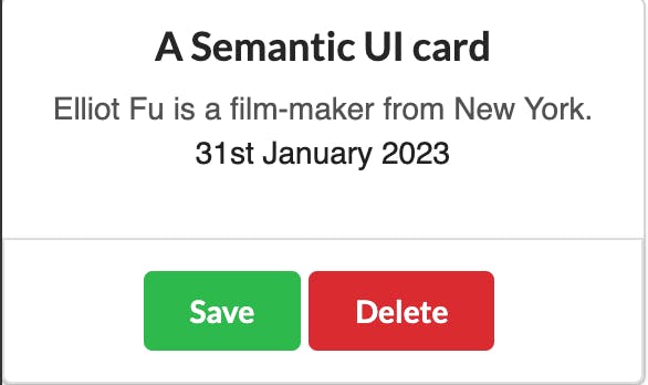
Within the App component, we created a card element with the class ui card, which creates a card container. Inside the card div, we created another div element with a class name of card that creates the card itself.
The card has a header and description, created with the header and description classes, respectively.
Lastly, we created an additional segment to the card with the ui segment, which contains two buttons, a save button, and a delete button, created with the save and delete classes, respectively.
Overall, the code defines a Semantic UI card with a header, description, and buttons to save or delete the card contents.

Simple card with Bulma
Let's create a simple card component with Bulma and React.
import React from "react";
export default function App() {
    return (
        <div className="App">
          <div className="card has-background-primary-light">
            <header className="card-header ">
              <p className="card-header-title is-centered">A Bulma card</p>
              <button className="card-header-icon" aria-label="more options">
                <span class="icon">
                  <i class="fas fa-angle-down" aria-hidden="true"></i>
                </span>
              </button>
            </header>
            <div class="card-content">
              <div class="content">
                This is a simple card built with Bulma and React as an Open Relay
                article exmple.
                <br />
                <time datetime="2016-1-1">31st, Jan 2023</time>
              </div>
            </div>
            <footer className="card-footer">
              <p href="#" className="card-footer-item has-text-primary">
                Save
              </p>
              <p href="#" className="card-footer-item has-text-danger">
                Delete
              </p>
            </footer>
          </div>
        </div>
    );
}
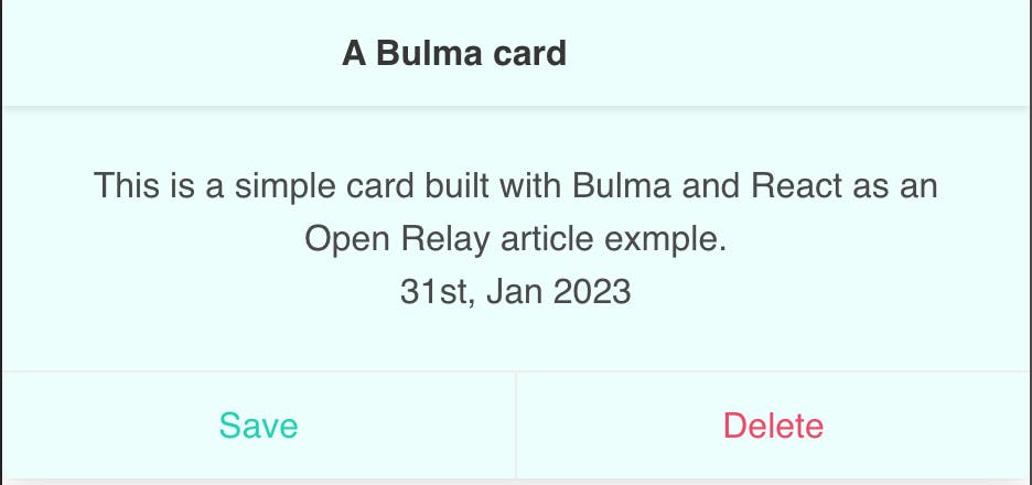
Within the "App" div, we created a div with a class of card has-background-primary-light, which creates a card component with a light blue background color. The header of the card is created using the "card-header" class provided by Bulma and contains the title "A Bulma card" with a class of "card-header-title is-centered". The is-centered class places the title centered on the card. The body of the card is created using the card-content class and contains some random text and a date. The footer of the card is created using the card-footer class and contains two buttons, one with a class of card-footer-item has-text-primary, which saves the content, and another with a class of card-footer-item has-text-danger, which deletes the content.
Overall, this component displays a sample card with a light blue background, a header with a centered title, a body with some text and a date, and a footer with two buttons.

Key differences
Both Semantic UI and Bulma come with unique features that meet different requirements. It will be cumbersome to compare them feature by feature. For this reason, we'll only compare them based on popularity, ease of use, and performance.
Popularity
There are no statistics to tell if Bulma is more popular than Semantic UI or vice versa. However, one way to tell is based on their forks and stars on GitHub. Bulma has 3.1k forks and 46.5k stars on GitHub, while Semantic UI has 5.1k forks and 50.3k stars on GitHub. With these GitHub interactions, we can assume that Semantic UI is more popular than Bulma.
Ease of use
Bulma's documentation is extremely intuitive as it gives elements with examples, code examples, and a detailed explanation for every component. Also, Bulma's website includes starter templates and interactive tutorials to get you started in no time. Semantic UI has great documentation as well. Also, Semantic UI is very intuitive. As mentioned earlier, its classes are named in readable formats like "three buttons," "two columns," etc., meaning you could easily write out these classes by intuition.
Performance
Among the CSS libraries available, Semantic UI has one of the largest file sizes at 730 KB uncompressed, and 95 KB gzipped. Unlike Semantic UI, Bulma is CSS only, meaning it doesn't include inbuilt JavaScript. Bulma is 25kb, and considering you don't have to pull in JavaScript; it is more lightweight than Semantic UI. If speed is part of the factors you consider for choosing a framework, then Bulma is the right tool. Firstly, because of its size and its modularity, it lets you remove the part(components) you don't need.
Semantic UI or Bulma: Which is better?
As the case has always been in comparing two similar tools, choosing a CSS framework over another highly depends on your project. Based on the aforementioned points, the debate is now relatively easy; Semantic UI for projects with custom designs, especially if you're not concerned with speed, and Bulma, if customization is not a key factor for your project and speed, is.
Conclusion
Designing the user interface of your websites shouldn't be as difficult as programming the functionalities. CSS frameworks make this possible by providing you with prebuilt components like buttons, layout, nav bars, etc., with which you can quickly build amazing user interfaces for your web apps. This post compared two powerful CSS frameworks, Bulma and Semantic UI, for building beautiful, eye-catching web apps. We compared them based on their performance, ease of use, and popularity. Ultimately, choosing which best fits your project's demand is up to you.

