The CSS Grid system is the most modern, complete, and easiest way of building layouts; for user interfaces that interact well on all screen sizes and devices, responsive design is utilized, and this is where the use of the CSS grid system comes in handy. With CSS Grid, we can quickly specify the grid, element sizes, and their placements inside the grid for each breakpoint we designate. The screen resolution determines each section's size, location, and visibility inside the UI. Also, columns, gaps, and spaces can be adjusted as pleases the developer.
CSS grid is currently compatible with multiple worldwide used browsers. Keep your browsers up to date, and there is nothing to worry about. For more information on browser compatibility, visit caniuse.com/css-grid and view all browser compatibility for CSS grid.
This tutorial covers the fundamentals of the CSS grid systems and gives a detailed use case of the CSS grid system in building responsive web UI.
Use cases for the CSS grid system
The grid system can be employed when you want to build websites with 2-dimensional layouts on webpages. The CSS grid system is best used in building simple yet classy designs that need to be detailed in whatever screen resolution they are on. CSS grid is best for building relatively simple webpages to adjust to different screen sizes or resolutions using the CSS grid system. Users are provided with a neat-looking and well-organized layout by the arrangement of block-like patterns of designs, which adapts to changes relatively fluidly and effortlessly.
Below are use cases that demonstrate the use of CSS grid systems
Layouts
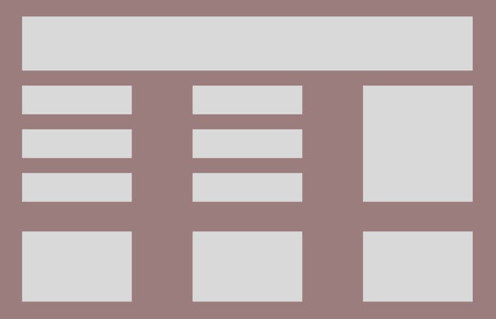
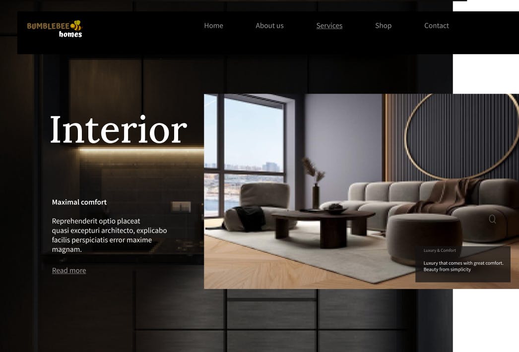
Layouts in a layout
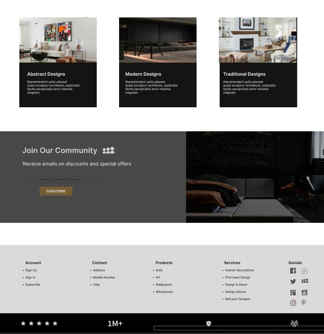
A grid layout is mainly employed to control the connection and ratios of items on a web page. Because of this, you must alter the grids to suit your design requirements by customizing the rows and columns.
Creating the Grid Container
Creating or setting up a simple grid container is very easy; to do this, we first write a simple HTML and then set up the grid container with CSS.
<div class="container">
  <div class="box-1">Box 1</div>
  <div class="box-2">Box 2</div>
  <div class="box-3">Box 3</div>
  <div class="box-4">Box 4</div>
  <div class="box-5">Box 5</div>
  <div class="box-6">Box 6</div>
</div>
First, set the box-sizing of the entire display to border-box in our CSS
box-sizing: border-box;
Now we set the display of the container we want to grid, and voila! We have a grid container.
.container{
  display: grid;
}
The grid system comprises the grid container and the grid items, and above is how a grid container is set up.
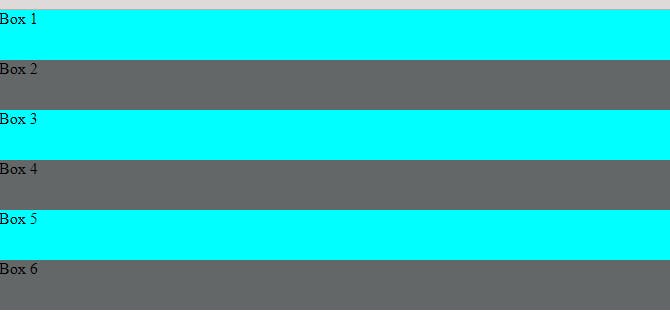
Although setting the container's display to grid does not make any physical difference, CSS has now recognized that the container is a grid container and that the items in the div container are grid items.
There are other properties of the CSS grid system, which we will discuss later in this tutorial.
Gutters/gaps and spaces
Specifying the gaps, otherwise known as gutters, is a very easy step, and it is written thus;
gap: 50px;
As we go further in this tutorial, more discussion on the gap property will come.
Defining Rows/Columns
The properties for specifying the rows and columns are grid-template-rows: and grid-template-columns:. In defining the rows and columns, the number of values you specify to a property automatically arranges the number of boxes you have to fit the number of rows and columns. For example, if we want three columns, we specify a 3 value in our grid-template-columns: and the same goes for grid-template-rows:.
Below is a use case.
CASE 1
.container{
  display: grid;
  grid-template-columns: 200px 200px 200px;
}
CASE 2
.container{
  display: grid;
  grid-template-columns: 200px 200px 200px 200px;
}
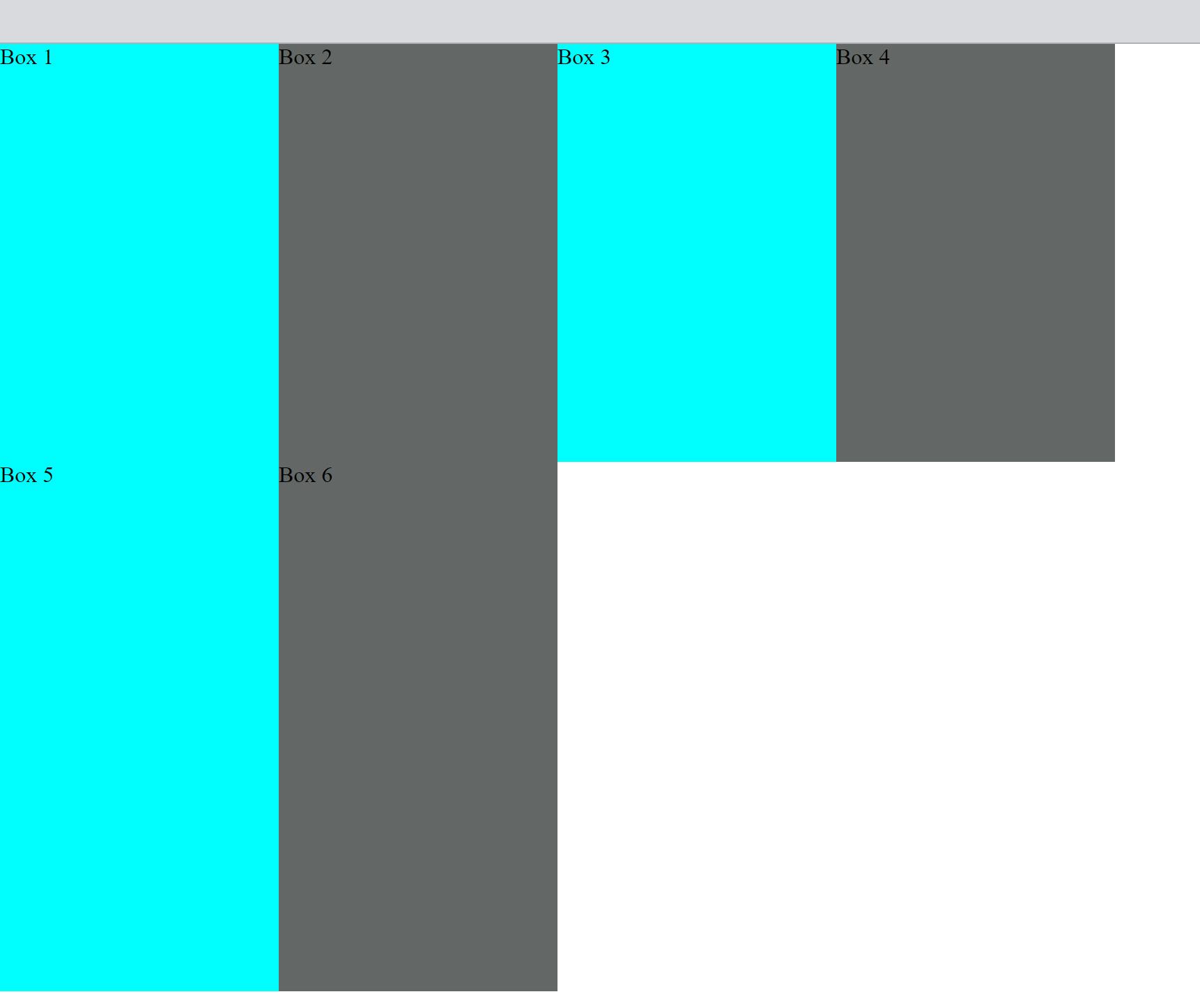
If you specify 3 values in the grid-template-columns for 6 boxes, you get 2 boxes per generated column. If you specify 4 columns, you get 2 boxes left automatically added to the first and second columns. Both instances generate 2 rows automatically, which is necessary to take in all the boxes we have.
OUTPUT 1

OUTPUT 2

The syntax used for defining columns is also used in defining rows, but the only difference is that instead of writing columns, we write rows, and it is written thus;
.container{
  display: grid;
  grid-template-columns: 200px 200px 200px 200px;
  grid-template-rows: 300px 380px;
}
This gives the boxes the height specified in the grid-template-rows property.
OUTPUT
Gaps/Gutters
Having discussed this earlier, we can quickly look at an output of a specified gap in the CSS grid system, using 50px as the gap property value, as stated earlier.
.container{
...
  gap: 50px;
}
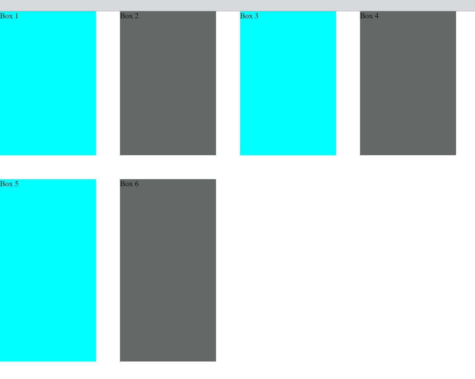
In addition to what has been said, it is important to note that the gap property specifies both the gap for the rows and the columns; If you want to specify the gap for the row and the columns differently, you can use the row-gap or column-gap properties in different cases noting that the syntax does not change.
column-gap:------;

row-gap:-------;
Open Source Session Replay
OpenReplay is an open-source, session replay suite that lets you see what users do on your web app, helping you troubleshoot issues faster. OpenReplay is self-hosted for full control over your data.
Start enjoying your debugging experience - start using OpenReplay for free.
Justifying/Aligning contents in the grid
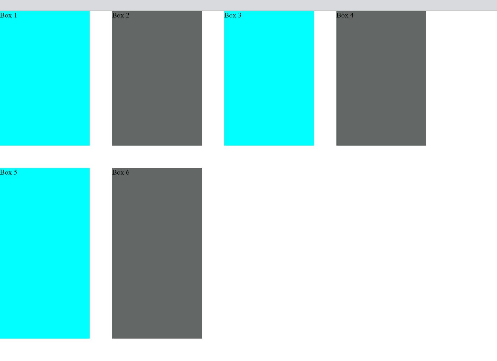
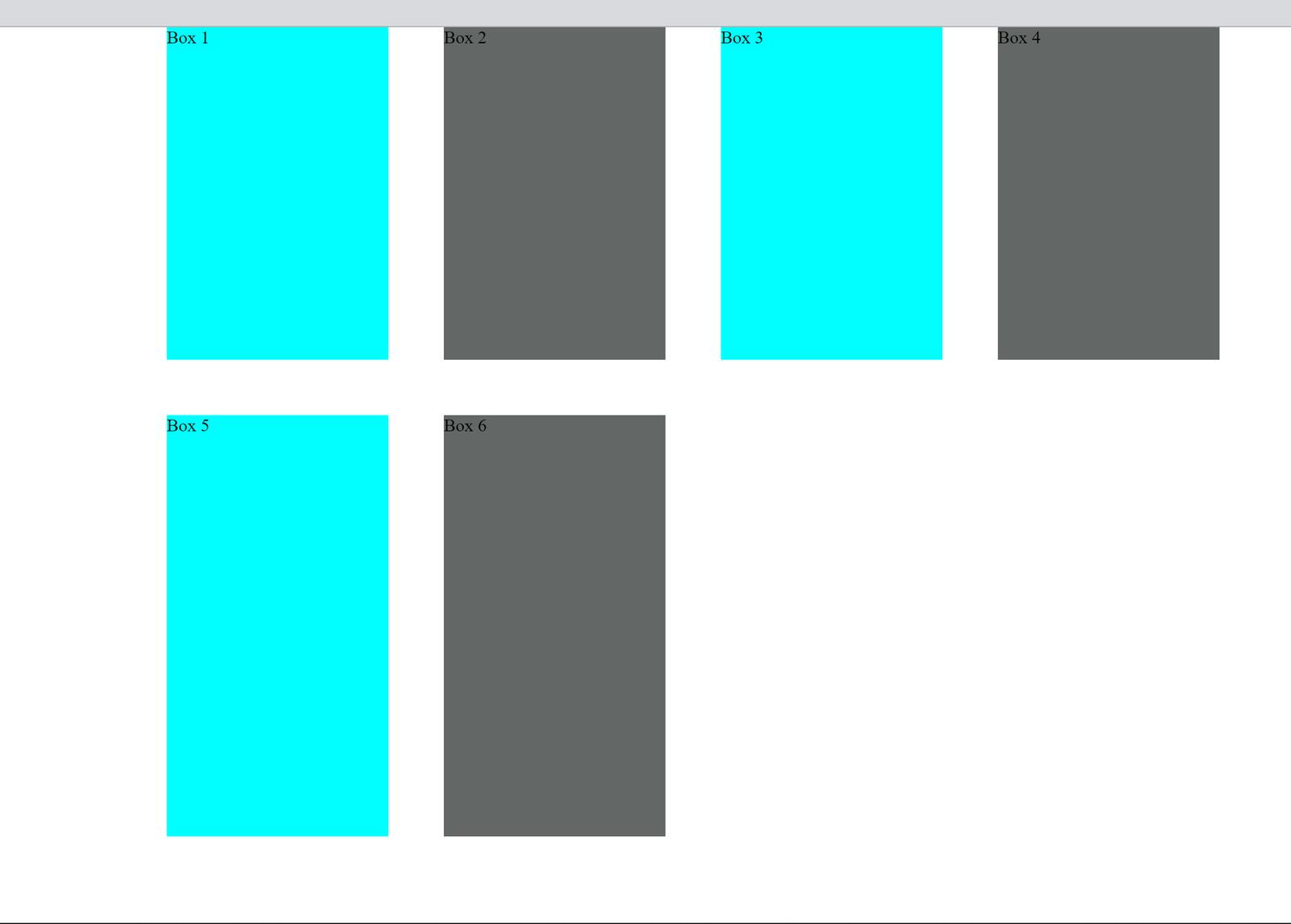
Syntax: justify-content: and align-content: - This property is for the alignment of all the grids inside the grid container. Let us try one of these properties and see the difference it makes in the UI
.container{
...
  justify-content: center;
}
By using the justify-content, the items in the container are all justified to wherever you may want them to be. For instance, the specified property is to justify-content to the center, which is exactly what it does.
Before
After
Justifying/Aligning items in the grid
They are both used for the alignment of items in the rows and the columns, and they have many specifications depending on what you want for your webpage. Here is what it looks like;
.container{
...
  justify-items: center;
}
Output
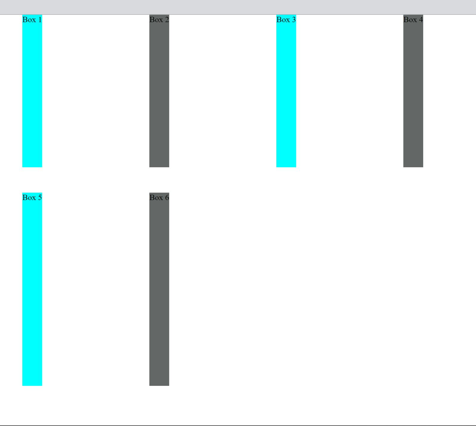
Again, note that: justify-content and align-content are used for aligning items in the grid, while justify-items and align-items are used in aligning items in the rows and columns.
Some other relevant properties are:
Grid-colums/rows: This property is employed when you want to place an item into a specific cell based on where it is.
Justify/Align-self: They are used to justify or item only single items/boxes in this case.
Using the fractional unit (fr)
Using the fr unit instead of px makes for a more responsive UI because it makes the rows and columns more flexible. See an example
.container{
...
  grid-template-columns: 1fr 1fr 1fr 1fr;
...
}
Output

Setting the column values to 1fr, which is 1 fraction each, means that they will all fit 1 fraction each in the available space, no matter the space.
Creating different layouts for different sections
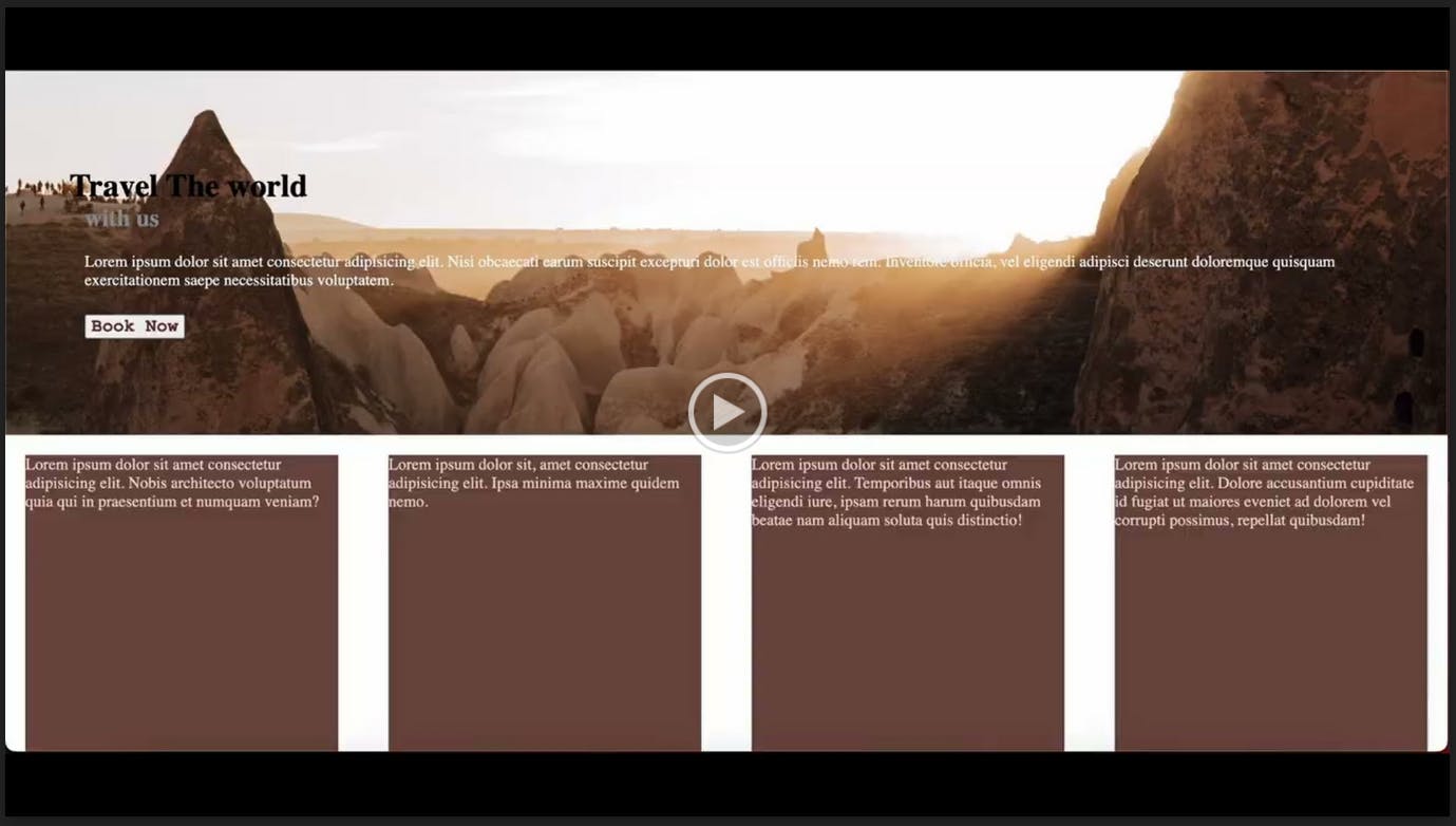
Now that we have seen the different properties of the grid system, we can look at building a very simple layout using just the grid keyword. We can use the grid properties in many different layouts, but this use case will show what the layout looks like using the grid properties. One remarkable thing about the CSS grid system is that it uses simple HTML and clearer CSS.
First, we write the HTML and define different classes for the different layouts or sections.
<div class="grid">
  <h1>Travel The world</h1>
  <div>
    <h2>with us</h2>
    <p>Lorem</p>
  </div>
  <button>Book Now</button>
</div>
<div class="container">
  <div class="box-1">Lorem</div>
  <div class="box-2">Lorem</div>
  <div class="box-3">Lorem</div>
  <div class="box-4">Lorem</div>
</div>
.grid {
  ...
  display: grid;
  grid-template-columns: 1fr;
  ...
}
.container{
  display: grid;
  grid-template-columns: 1fr 1fr 1fr 1fr;
  gap: 50px;
  justify-content: center;
  padding: 20px;
  grid-template-rows: 300px;
...
}
OUTPUT
Conclusion
The CSS grid system is one of the best accessories used in building responsive web user interfaces and is employed in building layouts. It is also recognized as one of the principles to follow in building responsive UI. The CSS grid system is ideally used to create 2-dimension layouts to build responsive web interfaces. I hope this tutorial helped you understand the basics of the CSS grid system.
A TIP FROM THE EDITOR: Check out A Complete Guide To CSS Fundamentals for more on CSS basic concepts.

