Webpages have made advances over the years in terms of look and feel, and different forms of customization have emerged to make websites look more attractive and engaging to users. In recent times, websites now contain more visual-appealing dynamic content, as opposed to their static look in time past.
In this article, we will discuss design areas where appearances can be further developed using CSS animation. Our webpage will be much more exciting and interactive when we add some cool-looking animations to it to make it more attractive to our visitors and, therefore, more appealing to them.
What are Animations?
Animation is a method in which figures are manipulated to appear as moving images. In traditional animation, images are drawn or painted by hand on transparent celluloid sheets to be photographed and exhibited on film. Today, most animations are made with computer-generated imagery (CGI). Computer animation can be very detailed 3D animation. In contrast, 2D computer animation (which may have the look of traditional animation) can be used for stylistic reasons, low bandwidth, or faster real-time renderings.
In particular, CSS animation allows us to animate a sequence of HTML element states over a given period. An animation lets an element gradually change from one style to another. You can change as many CSS properties as you want, as often as you wish. To use CSS animation, you must first specify some keyframes for the animation; Keyframes hold what styles the element will have at certain times.
Properties of CSS animations
In this section, let's look at some CSS animations' properties.
@keyframes: @keyframes are used for animations. It offers you greater manipulation over the animation you need to perform. The animation is created by using step-by-step conversion from one fashion to another. You can extrude the CSS patterns as usually as you need.
@keyframes [name]{
      from{
        [styles];
      }
      to{
        [styles];
      }
- The [name] value defines the animation's name, and you can call it whatever you want.
- The [styles] value defines the CSS style properties. "From" and "to" are rule sets describing the animation's start and end state.
CSS syntax for @keyframe:
@keyframes [Animation name] {keyframes-selector {css-styles;}}
animation-duration: The animation-duration property defines how lengthy an animation must take to complete one cycle.
{
  animation-duration: 5s;
}
CSS syntax for animation duration:
animation-duration: time|initial|inherit;
animation-delay: The animation-delay property specifies the delay between an element loading and the start of an animation sequence and whether the animation should start immediately from its beginning.
{
  animation-delay: 3s;
}
CSS syntax for animation-delay:
animation-delay: time|initial|inherit;
animation-iteration-count: The animation-iteration-count property specifies the number of times an animation is allowed to repeat or to be played.
{
  animation-iteration-count: 5;
}
animation-timing-function: The animation-timing-function property specifies how an animation transforms through keyframes by establishing acceleration curves of an animation making the animation change smoothly.
{
  animation-timing-function: linear|ease|ease-in|ease-in-out|ease-out|cubic-benzier();
}
- Linear: Linear animations occur at a constant speed, from start to finish. No variations occur in the animation timing behavior from start to finish as the animation proceeds at the same pace.
- Ease: Animations with this timing function start slowly, speed up, and slow down as they reach the end of the animation cycle. By default, the animation-timing-function is set to
easeif not specified by the developer. - Ease-in and Ease-out: Animations with Ease-in start slowly and speed up until the animation cycle is complete, while Ease-out does the opposite, starting quickly and slowing down until the animation is completed.
Ease-in-out: This timing function starts slowly, speeds up, and ends slowly. It sounds similar to
ease, but here is the difference; unlikeease,ease-in-outhas the same speed during the starting and ending stage, unlikeeasewhere the speed towards the end of the animation is not uniform with the speed at the beginning.animation-direction: The animation-direction property sets the duration of time an animation takes to complete one cycle.
{
  animation-duration: 5s;
}
A short demo
Now that we are done explaining the properties of CSS animation, let's demonstrate the CSS animation properties with a clip.

.box{
  background-color: blue;
  width: 200px;
  height: 200px;
  position: relative;
  display: inline-block;
  animation-name: example;
  animation-duration: 4s;
  animation-iteration-count: infinite;
  animation-timing-function: linear;
}
@keyframes example {
  0% {background-color: blue;}
  25% {background-color: red;}
  50% {background-color: green;}
  75% {background-color: yellow;}
  100% {background-color: blue;}
}
In the code block above, we created a square with sides of 200 pixels and a background color of blue. We added an animation called example, with a duration of 4 seconds, which occurs infinitely along a linear timing function.
In our @keyframes rule, we defined background color properties that take effect at different stages in the animation, specified in percentages. Adding different colors for the background will produce a color-switching effect, as shown in the output above.
Open Source Session Replay
_OpenReplay is an open-source, session replay suite that lets you see what users do on your web app, helping you troubleshoot issues faster. OpenReplay is self-hosted for full control over your data._
Start enjoying your debugging experience - start using OpenReplay for free.
Examples of CSS Animation
Now let's get our hands dirty by making cool-looking animations with CSS.
First, we will create two types of text animations to make our webpage and project more interactive.
Bouncing Text Animation
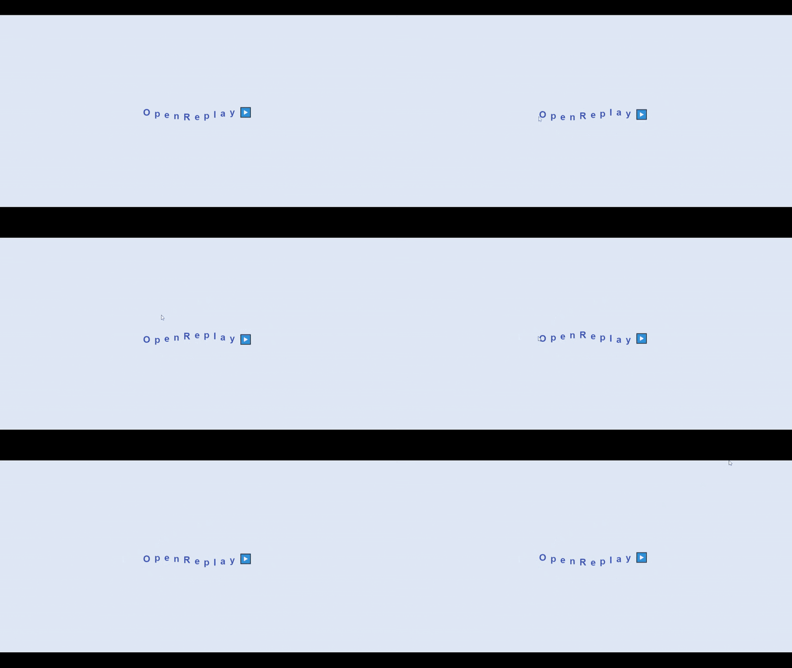
To create the bouncing text animation, follow the steps below.
<div class="text">
  <span style="--i:1">O</span>
  <span style="--i:2">p</span>
  <span style="--i:3">e</span>
  <span style="--i:4">n</span>
  <span style="--i:5">R</span>
  <span style="--i:6">e</span>
  <span style="--i:7">p</span>
  <span style="--i:8">l</span>
  <span style="--i:9">a</span>
  <span style="--i:10">y</span>
  <span style="--i:11">▶️</span>
</div>
In the code above, we created a div with a class name of the text, and span tags for each character in the text, as we will animate them separately.
CSS
In the code below, we styled our .text class and our span tag,
.text{
  font-size: 2rem;
  letter-spacing: 0.2rem;
  font-weight: 700;
  position: relative;
}
span{
  font-family: sans-serif;
  color: rgba(23, 58, 172, 0.822);
  position: relative;
  display: inline-block;
  animation: bounce 1s linear infinite;
  animation-delay: calc(.1s * var(--i));
}
Above, we have styles defining the appearance of our text. For our spans, we have added an animation called bounce occurring infinitely in linear time. For the animation-delay, we are using the variable we attached to the style in our spans to produce different delays. Below, we used the @keyframe property to add the bounce animation to our text. This is done by translating our text along the Y-axis at different intervals of the animation:
@keyframes bounce{
  0%{
    transform: translateY(0);
  }
  50%{
    transform: translateY(20px);
  }
  100%{
    transform: translateY(0);
  }
}
Typing Text Animation
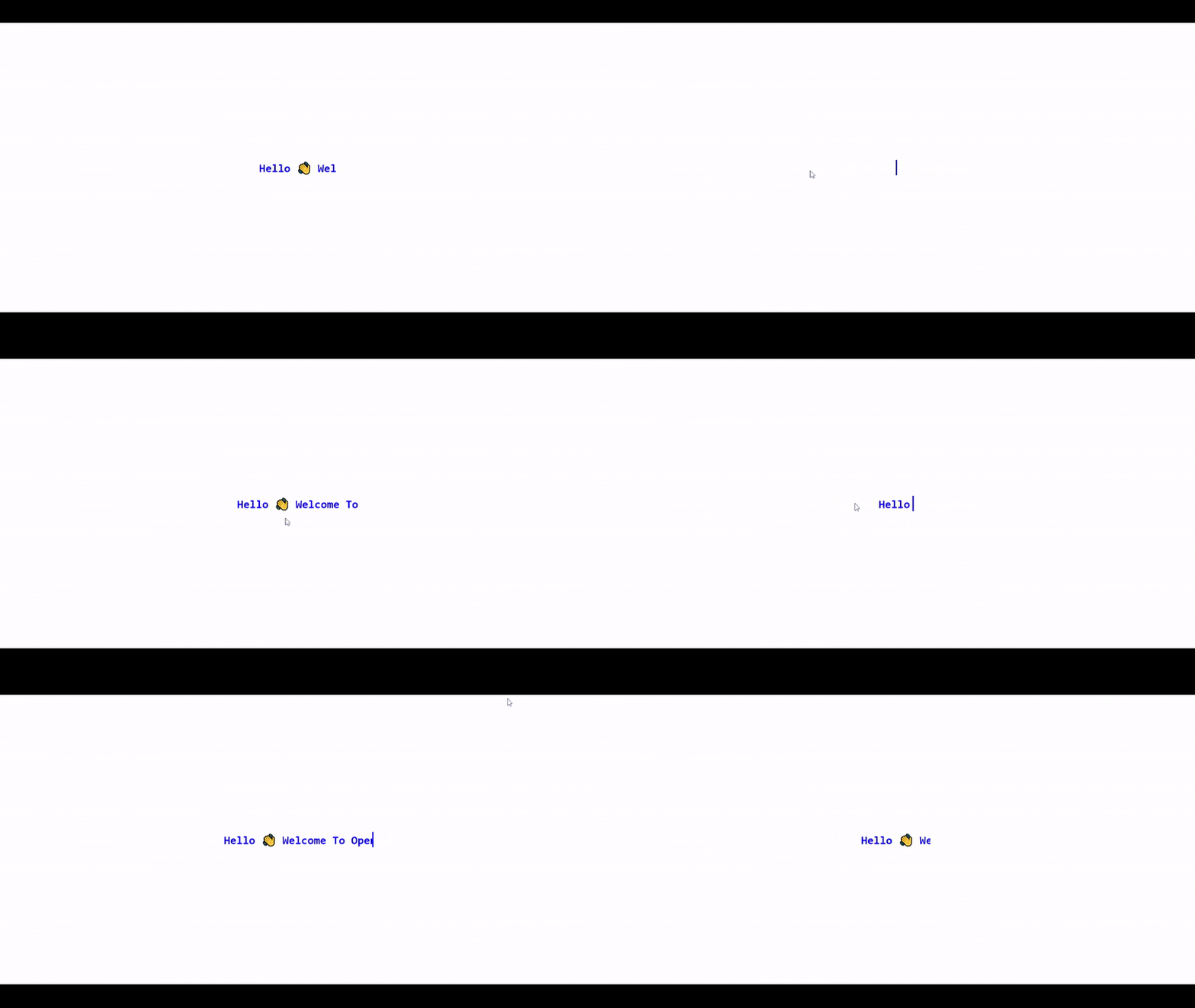
In the typing text animation, the width of our text element will change from 0 to 100%, step by step, using the CSS steps() function. Blink animations will be used to animate the cursor that types the text.
<div class="container">
  <div class="typing">
    Hello 👋 Welcome To OpenReplay
  </div>
</div>
In the HTML code above, we created two divs with class names of container and typing. We will use the container class to position our text. And apply the animation itself to the class typing.
Styling Text
.container {
  height: 100vh;
  display: grid;
  place-items: center;
}

.typing{
  width: 31ch;
  white-space: nowrap;
  overflow: hidden; //make content hidden till animation
  border-right: 3px solid; //typing cursor
  font-size: 2em;
  color: blue;
  animation: typing 4s steps(22), blink 2s step-end infinite alternate;
  animation-iteration-count: infinite;
}

@keyframes typing {
  from {
    width: 0
  }
}

@keyframes blink {
  50% {
    border-color: transparent
  }
}
Here, we set steps() to 22, defining 22 different intervals that make up our animation. Within these intervals, we gradually increased the width of the displayed text. We also added a blinking cursor effect, which takes a color of transparent value, halfway into the animation.
Neon Animation
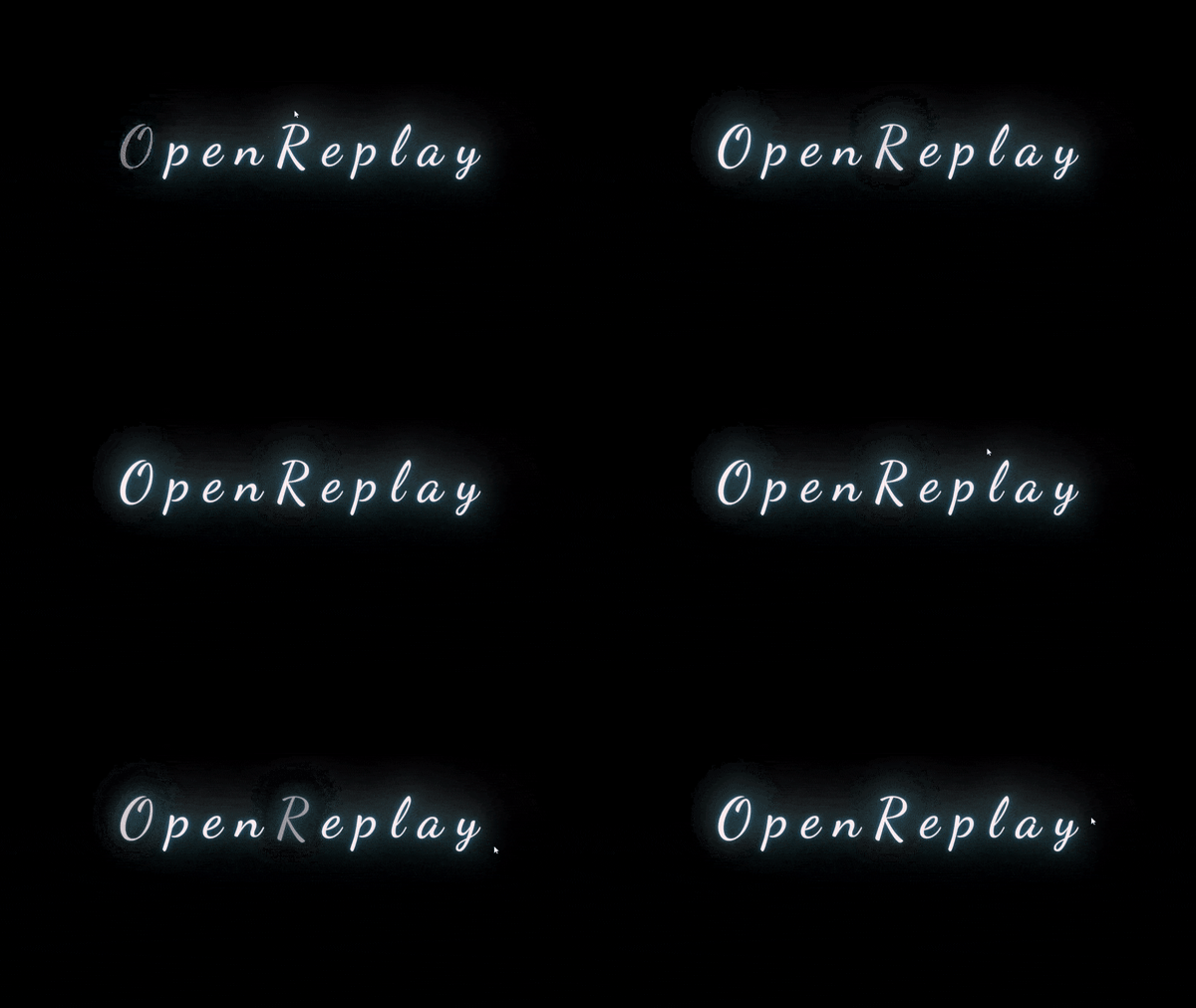
To give any website a nice, futuristic touch, neon animation can be added as a fascinating element. In this tutorial, we'll explore how to add glowing effects to animation and examine various ways to animate neon signs using CSS and keyframes.
<div class="text">
  <span>O</span>
  <span>p</span>
  <span>e</span>
  <span>n</span>
  <span>R</span>
  <span>e</span>
  <span>p</span>
  <span>l</span>
  <span>a</span>
  <span>y</span>
</div>
The code block above shows our HTML. We created a div with the class name of text.
Styling Text
.text {
  font: 400 19vh "Dancing Script";
  color: #fee;
  text-shadow: 0 -40px 100px, 0 0 2px,
        0 0 1em #47b3ce,
        0 0 0.5em #47b3ce,
        0 0 0.1em #1b73bb,
        0 10px 3px #000;
}
Here we added a text-show to give the text a lighting effect making it resemble a neon sign.
Adding Blinking Animation
We added blinking animation to the span:nth-child 1 and 5;
.text span:nth-child(1){
  animation: blink linear infinite 2s;
}
.text span:nth-child(5){
  animation: blink linear infinite 3s;
}
Below, we added @keyframes for the neon blinking animation,
@keyframes blink {
  78% {
  color: inherit;
  text-shadow: inherit;
  }
  79%{
    color: #333;
  }
  80% {

  text-shadow: none;
  }
  81% {
  color: inherit;
  text-shadow: inherit;
  }
  82% {
  color: #333;
  text-shadow: none;
  }
  83% {
  color: inherit;
  text-shadow: inherit;
  }
  92% {
  color: #333;
  text-shadow: none;
  }
  92.5% {
  color: inherit;
  text-shadow: inherit;
  }
}
Loading Animation
Loading animation can reassure users that the webpage is handling their request. A loading animation is displayed until the process is completed,

Now follow the steps below to create the loading animation.
<div class="loading">
  <div></div>
  <div></div>
  <div></div>
  <div></div>
  <div></div>
  <div></div>
  <div></div>
  <div></div>
  <div></div>
  <div></div>
  <div></div>
  <div></div>
</div>
Adding CSS Animations to the div we created above,
.loading {
  color: blue;
  display: inline-block;
  position: relative;
  width: 80px;
  height: 80px;
  position: absolute;
  left: 50%;
  top: 50%;
}
.loading div {
  transform-origin: 40px 40px;
  animation: loading 2.5s linear infinite;
}
.loading div:after {
  content: " ";
  display: block;
  position: absolute;
  top: 3px;
  left: 37px;
  width: 6px;
  height: 18px;
  border-radius: 20%;
  background: rgb(5, 54, 128);
}
.loading div:nth-child(1) {
  transform: rotate(0deg);
  animation-delay: -1.1s;
}
.loading div:nth-child(2) {
  transform: rotate(30deg);
  animation-delay: -1s;
}
.loading div:nth-child(3) {
  transform: rotate(60deg);
  animation-delay: -0.9s;
}
.loading div:nth-child(4) {
  transform: rotate(90deg);
  animation-delay: -0.8s;
}
.loading div:nth-child(5) {
  transform: rotate(120deg);
  animation-delay: -0.7s;
}
.loading div:nth-child(6) {
  transform: rotate(150deg);
  animation-delay: -0.6s;
}
.loading div:nth-child(7) {
  transform: rotate(180deg);
  animation-delay: -0.5s;
}
.loading div:nth-child(8) {
  transform: rotate(210deg);
  animation-delay: -0.4s;
}
.loading div:nth-child(9) {
  transform: rotate(240deg);
  animation-delay: -0.3s;
}
.loading div:nth-child(10) {
  transform: rotate(270deg);
  animation-delay: -0.2s;
}
.loading div:nth-child(11) {
  transform: rotate(300deg);
  animation-delay: -0.1s;
}
.loading div:nth-child(12) {
  transform: rotate(330deg);
  animation-delay: 0s;
}
@keyframes loading {
  0% {
  opacity: 1;
  }
  100% {
  opacity: 0;
  }
}
By arranging each div in a circular pattern and changing the opacity of each div along with an animation-delay property, we can create a loader animation that seems to be moving circularly as the opacity of the following div gets set to 1 while the current is set to zero. Without the animation-delay, all divs will have the same opacity and at the same time and will produce an instead blinking effect.
SVG Animation
A scalable Vector Graphic (SVG) is a graphic used to make graphic animations. There are several ways of getting SVG files, but I recommend Manny pixels to download our SVG file. We can also use Figma to create and edit the downloaded SVG files.
The file above is an SVG file. Now let animation our SVG file,

#OpenReplay{
    stroke-dasharray: 670;
    stroke-dashoffset: 670;
    animation: start 3s linear forwards;
    animation-iteration-count: infinite;
    animation-duration: alternate;
}
[stroke-dasharray](https://developer.mozilla.org/en-US/docs/Web/SVG/Attribute/stroke-dasharray) and [stroke-dashoffset](https://developer.mozilla.org/en-US/docs/Web/SVG/Attribute/stroke-dashoffset) are both attributes of SVG animation for defining the length and pattern of strokes and gaps in an SVG.
Now we add @keyframes to stroke-dashoffset,
@keyframes open{
  0%{
    stroke-dashoffset: 670;
  }
  100%{
    stroke-dashoffset: 0;
  }
}
Conclusion
In this article, we looked at what animation is and how to perform animations in CSS, like text animations, loading animations, and navigation bar animations. We looked at how the animation and @keyframes styles work.
You can use the codes above or even tweak them to your liking. There are lots of resources out there on the internet that can help you with CSS animation. With all this said, have fun animating in CSS.
A TIP FROM THE EDITOR: Use animations in the most popular frameworks, as explained in our Modern Web Animations With Gsap And Vue 3 and Mastering CSS Transitions With React 18 articles.
