


When you hear about Responsive web design, what is the first thing that comes to mind? Does it mean making the website have functionalities? Of course not, it may sound that way for people who just began their journey in web development, but the responsivity of a website has nothing to do with its functionality.
When we talk about responsivity, we are talking about how scalable a website is on different devices. Today, people are using various kinds of devices to view content on the internet; they could be mobile devices, iPads, tablets, or even watches. And a very important job of a web developer is to ensure that a web application can be viewed properly regardless of the kind of device it is being viewed from.
Building a website that does not take cognizance of the different devices of the users is bad practice and results in a negative user experience. In turn, users may never revisit that sort of website, which eventually leads to poor SEO for that website.
To build a responsive website, you need a tool. Media queries are tools used to override specific parts of our global CSS Codes, eventually leading to a website's responsiveness. Media queries enable developers to style their CSS based on device types or screen resolution.
In this article, I will educate you on how best to utilize media queries to achieve responsiveness for your website. Before we proceed, let us look at a few keywords you need to understand when working with media queries.
Media type: refers to the kind of device the website would be displayed on, including print, screen, speech, or all. By default, the media type is always as 'all' except stated otherwise; this means that whatever styles you use in your media queries will apply to print, screen, or speech.
The print media type refers to websites that will be printed out in magazines or newspapers.
The speech media type refers to websites requiring screen readers for the visually impaired.
The screen media type is for websites we can see on our screens, such as laptops and mobile phones. For this article, I will focus on the screen media type, which is most relevant to developers and beginners.
Breakpoint: This refers to pixel values (e.g., 500px) defined in CSS to let the developer know at what point the styles should be included in the media query we applied.
Feature: This refers to the website property you may want to alter using media queries. Such properties include width, color, orientation, etc.
Value: This denotes what the media query feature stands for.
Below is the most common syntax of media query you will use as a developer to make your website responsive.
@media media-type and (feature:value){
    /*styles*/
}


@media screen and (min-width:1080px){
    h1{
        background-color: yellow;
    }
}
Choosing Breakpoints from Large Screens to Small Screens
Some developers prefer to build a website desktop first. If you're building from a desktop first, it is natural that you want to scale it down to the smallest device size, mobile phones.
For larger screen sizes, it is best practice to use max-width for your media feature and begin from the larger to the smallest ( descending order of screen sizes ).
The reason why you should want to start from the most significant size to the smallest size is so that you do not have to repeat media queries. Let us take examples below.
You have a div with a background color of red on a desktop screen. Your goal is to make that div's background color green on a tablet version and yellow on a mobile. If you begin to write from the smaller size down to the largest screen size, the only color change we will see would be on the tablet screen, turning the background color to green; the changes on the small screen will not apply. Let us see this in practice
<body>
        <div class="box-1"></div>
</body>
.box-1{
    width:200px;
    height:200px;
    background-color: red;
}


/*MOBILE SCREEN */
@media screen and (max-width:369px){
    .box-1{
        background-color: yellow;
    }
}

/*TABLET SCREEN*/
@media screen and (max-width:800px){
   .box-1{
         background-color: green;
   }
}
Max-width for the tablet screen above means that the styles will only apply to screen sizes from 800 and below, while max-width for the mobile device means the styles will only apply to screen sizes from 369 and below. Right now, this is bad practice, as we start desktop first but write our media queries in ascending order. The result of this code is that the background color for the div will change on the tablet screen but will not change on the mobile screen as we want it to.
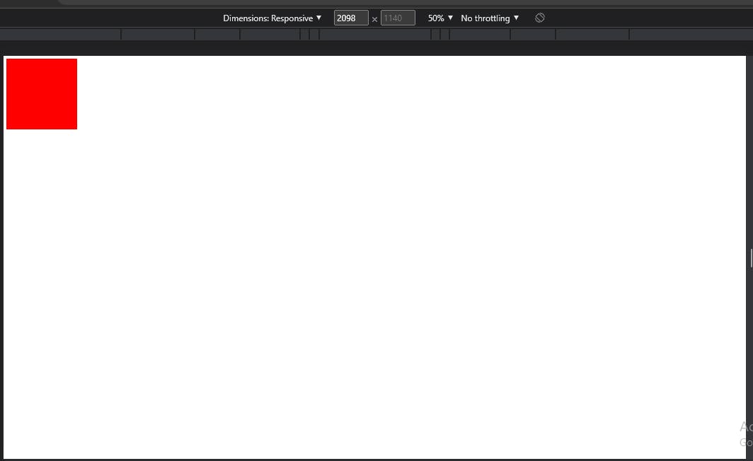
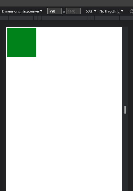
The image above is a desktop screen size with the global CSS where the div has the background color of Red. The image below shows the screen size when the screen is in tablet mode at 800px, and below, the background color changes to green.
But notice that at 350px, where the mobile screen styles are supposed to be applied, and the background color is supposed to change to yellow, unfortunately, this style could not be added.
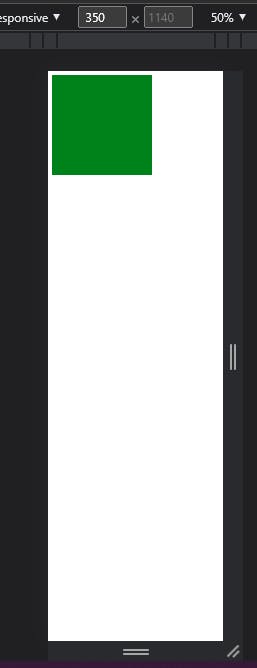
Because we arranged our media queries in ascending order, the styles on the media query with the largest screen width take precedence.
Rearranging the media queries and ensuring that when developing desktop-first, you have to start writing your media queries in descending order, from larger to smaller screen sizes.
Based on the current screen resolutions statistics from statcounter, these are considerable breakpoints you should use in your next web development project if you are going to be developing desktop-first;
Large screen ( max-width: 1080px)
Tablet screen ( max-width: 768px)
Mobile screen ( max-width: 360px)
You can decide to test your media queries between two values, which means that you will be setting your css styles just between two screen sizes, as shown below;
Large screen : @media screen and (min-width:769px) and max-width(1080px)
Tablet screen : @media screen and (min-width:481px) and (max-width:768px)
Mobile screen : @media screen and (min-width:360px) and (max-width:480px)
But with the introduction of Level CSS media query specification, the media queries written above can be written in a more concise and comprehensive form by using the keyword "width", discarding "max" and "min" as shown below:
/* without ranges*/
@media screen and (width <= 1080px){
/* code */
}
@media screen and (width <= 768px){
/* code */
}
@media screen and (width <= 360px){
/*  code */
}
The format above simplifies the use of max-width because it simply means the styles in those media queries will be functional for screen sizes less than or equal to any of the values above(1080px, 768px, or 360px). Styles in the media queries above will not work for screen sizes greater than the values above.
/* In a range */
@media screen and (width >= 769px) and (width <= 1080px){
/* code */
}
The media query above will work for screen sizes greater than or equal to 769px and less than or equal to 1080px, which is the same as the previous min-max approach.
Furthermore, the code above can be modified to be written this way;
@media screen and ( 769px <=  width <= 1080px){
/* code */
}
Open Source Session Replay
OpenReplay is an open-source, session replay suite that lets you see what users do on your web app, helping you troubleshoot issues faster. OpenReplay is self-hosted for full control over your data.
Start enjoying your debugging experience - start using OpenReplay for free.
Choosing Breakpoints from small to Large Screens
The previous section focused on developers who like to use the desktop-first approach. This section will focus on developers who like to use the mobile-first approach and eventually scale up their websites to fit perfectly on a desktop screen.
When writing media queries, for the mobile-first approach, you should be aware that you're moving up a ladder, which means your media queries will be in ascending order, meaning that you would scale up from smaller screen sizes to larger screen sizes. Instead of making use of max-width, you will make use of min-width. Min-width, in this case, means that the styles will only affect screen sizes at the min-width and above.
Based on the current screen resolutions statistics from statcounter, these are considerable breakpoints you should use in your next web development project if you are going to be developing mobile-first;
Mini-tablet screen ( min-width: 480px)
Tablet screen ( min-width: 800px)
Desktop screen ( min-width: 1080px)
As stated above in this article, using the level 4 CSS specifications for writing media queries, the breakpoints could be written in this way:
@media screen and (width >= 480px){
/* code */
}
@media screen and (width >= 800px){
/* code */
}
@media screen and (width >= 1080px){
/* code */
}
The Advantage of writing Range Type Media queries
You must have noticed from the examples above that media query values can be written with a single breakpoint, and they can also be written in a range between two breakpoints.
You could eventually settle to writing your media queries to your absolute preference, but writing your media queries in a range gives us a key advantage.
Notice how you need to be mindful of the order in which you write down your media query breakpoints?
When developing desktop-first, you need to write your media queries in descending order
When developing mobile-first, you must write your media queries in ascending order.
Even when you successfully arrange your media queries in the proper order, you end up with styles that are not specific to particular screen sizes. For instance, you may want a different feature for a website on screen sizes just between ( 468px - 768px). You do not, for any reason, want this feature to be inherited by a screen size much smaller, say 360px and below. In a situation like this, if you're building desktop-first, there are bound to be inherited styles at the different breakpoints.
The range method of writing media queries helps to fix that, it helps developers to be more specific, and it scrapes out the need to have the descending and ascending ordering of media queries because the developer knows the range of screen sizes he wants to target specifically.
Therefore, the range method of writing media queries, coupled with the new level 4 media queries specification, is a more convenient and comprehensive way to write media queries for your project, just as written below:
@media screen and (360px <= width <= 480px){
/* code */
}
@media screen and (480 < width <=768px){
/* code */
}
@media screen and ( 768px <  width <= 1080px){
/* code */
}
An extensive introduction on the new CSS Level 4nmedia query specification can be found in this MDN Documentation https://developer.mozilla.org/en-US/docs/Web/CSS/Media_Queries/Using_media_queries
Alternatives to Media Queries
This is not to rule out that developers should never use media Queries, but the best practice requires that you use as few media queries as possible in your project the better.
Since the introduction of flexbox into CSS, it is possible to make your layouts responsive without writing any media queries by using:
.container{
    flex-wrap: wrap;
}
This flexbox property automatically makes your layouts responsive when the screen size is no longer accommodating.
Since the introduction of CSS frameworks such as Tailwind, the writing of many media queries has been reduced. Tailwind's utility classes can all be applied conditionally at various breakpoints, making it simple to create sophisticated responsive interfaces.
Furthermore, using relative CSS units like em, rem, and % rather than absolute units like pixels(px) also makes it easy to get your website responsive while reducing how many styles you change in your media Queries.
Conclusion
Being able to build a fully responsive website is not going to happen in the blink of an eye. It takes time and patience to build responsive websites like a pro. You may not get it on your first try, but with consistent practice and applying the above methods, you should be building responsive websites in no time.
A TIP FROM THE EDITOR: For a closely related topic, don't fail to read CSS Container Style Queries.