When it comes to web development, there are responsive designs and amazing web platforms available. These days, the best websites feature a responsive layout and an engaging design. Currently, two popular tools are used to create the best website design possible, namely, Tailwind CSS and Bootstrap.
CSS in web development is used for styling HTML. There are a lot of ways to use CSS, as well as numerous tools to choose from. Another CSS framework that's popular nowadays is Bootstrap. It's extensible, powerful, and feature-packed. Both could help speed up production time. However, which of these two should you choose? Let's find out.
Tailwind CSS
Basically, Tailwind CSS is a utility-first CSS framework to build custom user interfaces fast. As a low-level framework, it's highly customizable, providing all the building blocks you need to create bespoke designs minus the annoying opinionated styles you struggle to override. The tool makes it faster to write and maintain code.
With Tailwind CSS, you need not write custom CSS to style your app. Instead, utility classes could be used to control the margin, padding, font, color, shadow, and more on your app. With Tailwind CSS, you only have to bring together tiny components to build a unique user interface.
Tailwind CSS Features
- Colored box shadows - To add glowing and reflection type effects
Illustration

- Play CDN - To use Tailwind directly in the browser
<!doctype html>
<html>
<head>
  <meta charset="UTF-8">
  <meta name="viewport" content="width=device-width, initial-scale=1.0">
  <script src="https://cdn.tailwindcss.com"></script>
</head>
<body>
  <h1 class="text-3xl font-bold underline">
    Hello world!
  </h1>
</body>
</html>
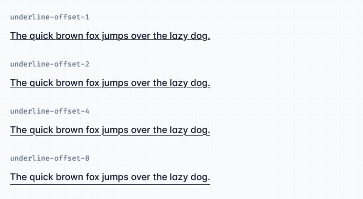
- Fancy underline styles - To change the colors, styles of Underlines
Illustration
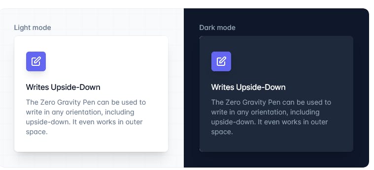
- Dark mode and Light Mode feature - Funtionality to select display theme
Illustration
- Mouse hover Transition Duration - Set the custom transition duration of mouse hover on the button
Illustration

Find out more Tailwind CSS features here tailwindcss.com/docs/installation
Further Illustrative Example
Output
Advantages of Tailwind CSS
Small CSS files: Without Tailwind, you must keep writing CSS when adding new components and features. Thus, the CSS files will continue to grow and will become heavier. By using utilities such as padding and flexbox, most styles could be used again, so you need not write new CSS often.

Single Side Padding
Less custom CSS to write: Elements in Tailwind could be styled by directly applying pre-existing classes into the HTML. Using utility classes, you could create custom designs without writing CSS.
Safer changes could be made: Changing CSS in a traditional approach could break something across the website. Utility classes in HTML, unlike CSS, are local, meaning you could change them without worrying about breaking something else on the website.
You need not invent class names: With Tailwind, you choose classes from a predefined design system. Thus, you need not agonize over choosing the 'perfect' class names for certain components and styles or remember complex ones, such as a sidebar-inner-wrapper.
Open Source Session Replay
OpenReplay is an open-source, session replay suite that lets you see what users do on your web app, helping you troubleshoot issues faster. OpenReplay is self-hosted for full control over your data.
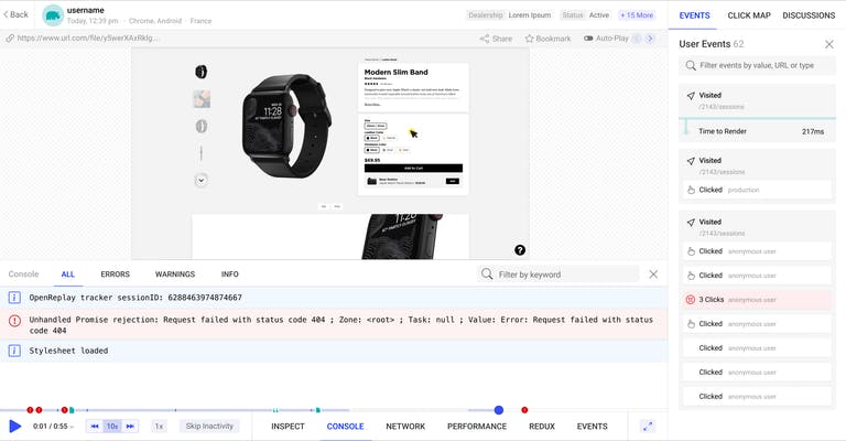
Start enjoying your debugging experience - start using OpenReplay for free.
Bootstrap
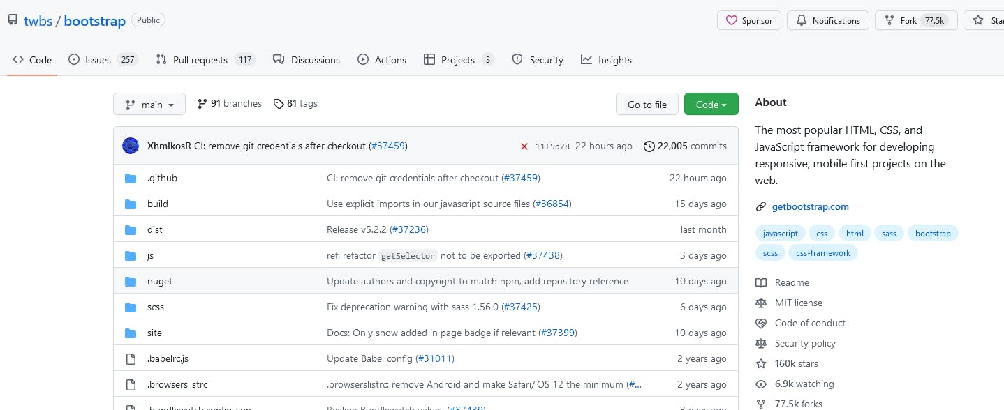
Bootstrap started as a branch of the internal design tools of Twitter in 2010 and became an open-source framework in 2011. Based on object-oriented CSS, it's a semantic/component-based framework that helps to rapidly design and develop web templates. Moreover, Bootstrap is easy to learn and maintains consistency across different devices and browsers.
The responsive 12-column grid system, layouts, and components are only a matter of a few minor changes. Columns offsetting and nesting could be done in fluid-width and fixed layouts. Responsive utility classes could display or hide certain content on a specific screen size only.
Bootstrap Features
- It also provides quickly customizable components
Example
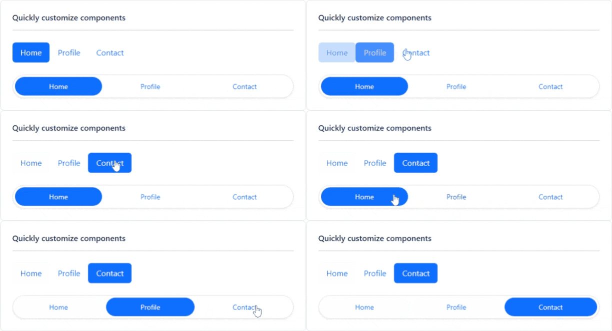
It has an easy learning curve
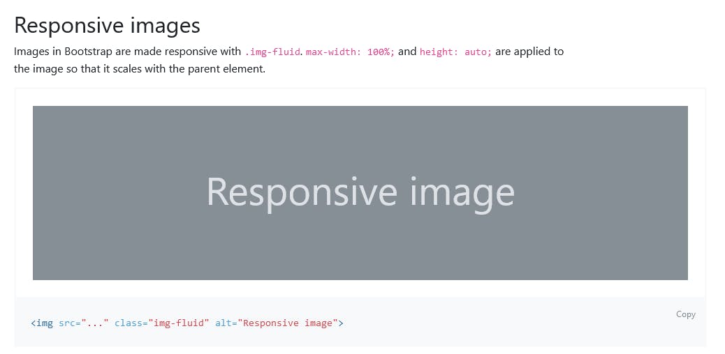
It has responsive Utility classes
It offers a set of Bootstrap icons for personalization
Further Example
<div class="mb-3">
  <label for="exampleFormControlInput1" class="form-label">Email address</label>
  <input type="email" class="form-control" id="exampleFormControlInput1" placeholder="name@example.com">
</div>
<div class="mb-3">
  <label for="exampleFormControlTextarea1" class="form-label">Example textarea</label>
  <textarea class="form-control" id="exampleFormControlTextarea1" rows="3"></textarea>
</div>
Output

Advantages of Bootstrap
- Responsiveness: A mobile-responsive website has become a prerequisite due to the extensive demand. This is a piece of cake for Bootstrap with its fluid grid layout that could adapt as per the screen solution.
Seamless initiation: Bootstrap makes coding hassle-free and takes care of everything for you. Moreover, the integration process of Bootstrap is easy on new and existing websites.
Extremely customizable: There are numerous Bootstrap templates. Customization could be blended with the existing code and boost the functionality.
Extremely user-centric: Landing pages could be designed to complement the audience's requirements. Furthermore, it could come up with suggestions about elements, such as call-to-actions, photos, and more.
Top-notch support: Bootstrap has a huge support community, which could be a blessing when using any technology. You get answers to any query, and you can share it, and the community will help you solve it proactively.
Comparison Report between Tailwind CSS and Bootstrap
Performance
The Tailwind configuration default comes with 36.4KB and is minified and gzipped. Tailwind, compared to Bootstrap at 22.1KB, is 14.3KB heavier. This is because Tailwind is prepacked with many styles and options and all variations to minimize the tendency to write one's own CSS.
Fortunately, Tailwind has a few strategies to keep the CSS generated small and performant. Since Bootstrap is a component-based framework, it provides in-built components and different tools for spacing, stacking displays, etc. Tailwind, on the other hand, is a CSS utility-first framework. Thus, building standard CSS is the same as using Tailwind CSS.
Since Bootstrap comes with prebuilt components, there isn't much CSS to write. Thus, minute modifications to the design could cause issues. Elements could be styled from scratch using Tailwind CSS using the styling syntax. Modifications are simpler to implement with Tailwind CSS since you only have to delete a few CSS classes.
Bootstrap is much bigger than Tailwind and requires several files to access the full functionality. Because of this, using it could mean a significantly bigger file size compared to Tailwind CSS. Furthermore, Bootstrap offers responsive, mobile-first pre-style components to build flawless web pages.
Learning Curve
Tailwind gets some getting used to if you're coming from Bootstrap. At first, you may even hate it, but give it some time. Bootstrap is more component-based and comes with a whole gamut of components.
There are also the utilities you need to do for styling elements. Tailwind has more similarities in how you write regular CSS than Bootstrap usage. Indeed, Bootstrap is quite powerful if you're looking to use the prebuilt components.
Furthermore, since it's all made to keep the final output in mind, you don't have to make customized changes to the design. There's minimal CSS to write. When using Tailwind, on the other hand, since you're styling elements from scratch, it's more intuitive, easier, and naturally organic to customize and change how the final design should come about.
Components
Tailwind CSS Tailwind CSS is not having any component classes. To use UI components, you can either create your component classes or use a component library or a UI kit like daisyUI, Mamba UI, and some more.
daisyUI Illustrative Example with the help of Countdown component

Bootstrap Bootstrap has predefined components that you can use. Components like cards, modals, carousels, buttons, spinners, tooltips, and many more components of Bootstrap are available.
Carousel Component example
<div id="carouselExampleSlidesOnly" class="carousel slide" data-bs-ride="carousel">
  <div class="carousel-inner">
    <div class= "carousel-item active">
      <img src="..." class="d-block w-100" alt="...">
    </div>
    <div class="carousel-item">
      <img src="..." class="d-block w-100" alt="...">
    </div>
    <div class="carousel-item">
      <img src="..." class="d-block w-100" alt="...">
    </div>
  </div>
</div>
Utilities
Tailwind CSS The framework's core offers utility classes only. If you want to style an HTML component, you must use the utility classes and apply them to the various HTML elements. It's much the same as inline styling at one glance.
Utility class md:flex-row – could be used in changing flex-direction from column to row on a screen of medium size or bigger.
Bootstrap Bootstrap has many utility classes that are small and minimal; thus, you need not write your own. Spacing utility classes could add margin or padding to HTML elements fast. Furthermore, utility classes could control text alignment weight, wrapping, and more. Text-center could be used to quickly center text or increase the font size to Heading 1 tag using fs-1, or increase the weight using fw-bold.
Conclusion
Should you choose Tailwind CSS or Bootstrap? As always, it depends on your situation. If your project is not much different from some of the more common layouts, or you are more of a full-stack developer or backend developer, Bootstrap may be the better framework for you.
If a project requires a lot of front-end customization, does not follow a common layout, or if you're more used to CSS, Tailwind could be the better choice. Keep in mind that there's much more to Tailwind CSS and Bootstrap.
A TIP FROM THE EDITOR: Even using tools such as the ones compared in this article, you may end up having to debug your code -- check out our Using The CSS Background-Color Property To Debug Web Pages article for good suggestions!
