

Responsive navbars are among the bread and butter of front-end development. A common practice is a navbar on desktop and a sidebar on mobile. This is probably very easy to implement with your favorite CSS frameworks. Still, it turns out to be either quite tricky or downright difficult when using the semantic-UI-react framework(which, except for this little quirk, is an amazing framework). With little to no readily available solutions at the time of writing, this article is a demo of how to build a responsive navbar with react, semantic-UI-react, and react-responsive.
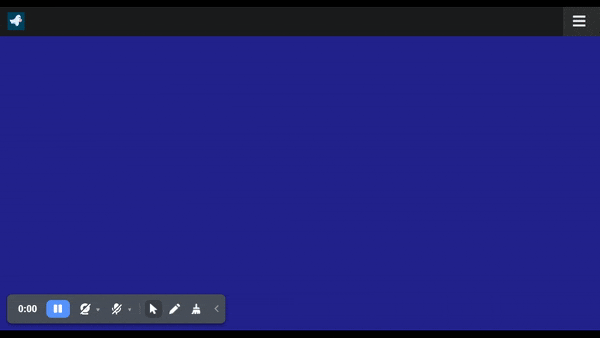
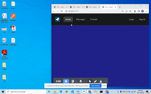
The recording above is a sample of the navbar we will build throughout the article.
At the end of this article, you will know how to:
make a responsive Navbar with the
semantic-UI-reactCSS frameworkuse the
react-responsivepackage
What is Semantic-UI-react?
Semantic UI is one of the many popular CSS frameworks that supposedly make building websites faster by providing us with already-made CSS components. It prides itself in being "semantic", which it does basically by using thoughtful and meaningful class names. Now, after using frameworks like bootstrap and tailwind, I must admit that clear, thoughtful class names become quite appreciated!
The semantic-UI-react framework is an extension of the semantic-UI CSS framework that is optimized to work with react and take advantage of the react prop system (Just like we have bootstrap and react-bootstrap). And it works like a charm until you have to create a responsive navbar.
What is React-Responsive?
React-responsive is a package that allows us to dynamically inject and remove the content currently displayed by React on the screen based on the viewport size. Using this package, we can mimic CSS-screen media queries directly in the react code. This is my tool of choice for responsive design in react. Feel free to use any alternative package that can replicate the same functionality.
Setup
To get started:
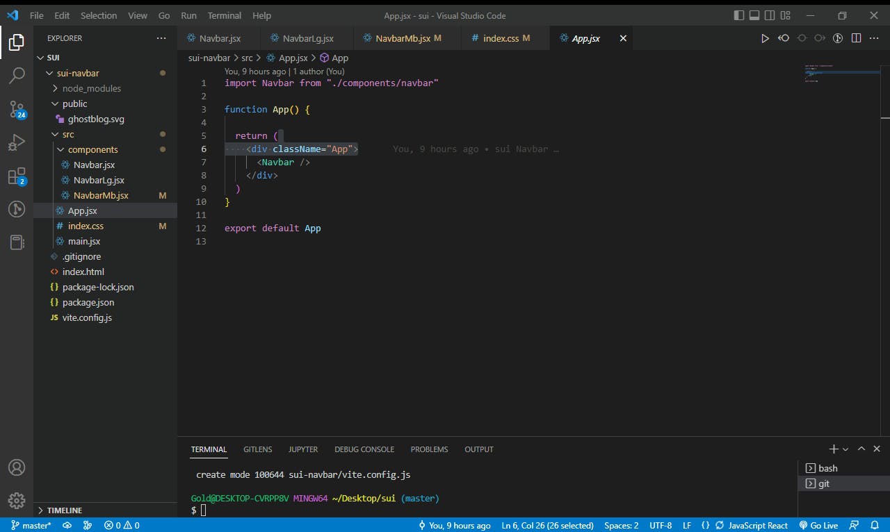
spin up a React app ( This demo uses
vite-react)clean up the app to follow the file structure in the picture below
Install semantic-UI-react, semantic-UI-CSS, and react-responsive packages using NPM
Add any logo image of your choice to the public folder
Import
semantic.min.cssintomain.jsx. This import should be aboveindex.cssso we can useindex.cssto overwrite some of the built-in semantic-UI-react stylings if necessary.Add the following lines of code in the specified components
  /*index.css*/
  body {
      background-color: rgb(35, 35, 141)
  }


  //app.jsx
  import Navbar from "./components/navbar"
  function App() {
    return (
      <div className="App">
        <Navbar />
      </div>
    )
  }
  export default App


  //Main.jsx
  import React from 'react'
  import ReactDOM from 'react-dom/client'
  import App from './App'
  import 'semantic-ui-css/semantic.min.css'
  import './index.css'

  ReactDOM.createRoot(document.getElementById('root')).render(
    <React.StrictMode>
      <App />
    </React.StrictMode>
  )
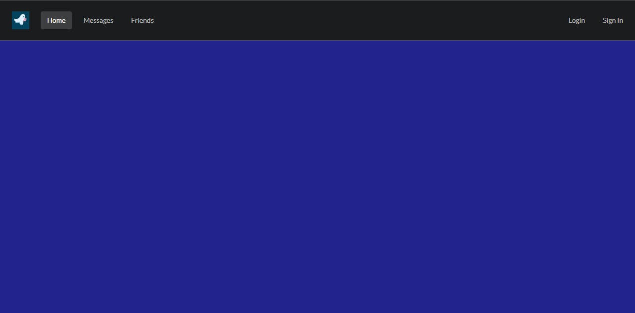
NavbarLg component
We will use a menu component for the navbar on large screens. To do this, visit the semantic-UI-react docs and select your preferred menu component type. This demo will be using the inverted menu type.
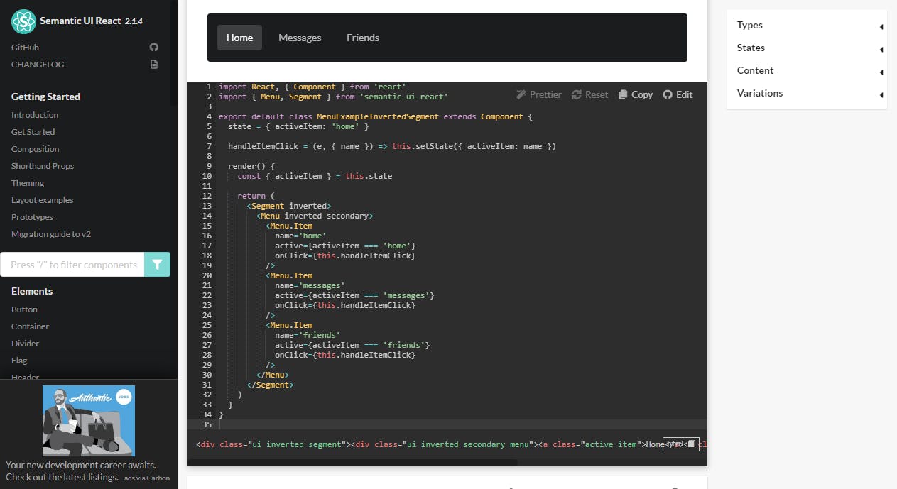
The docs are written with React class components, but it's pretty simple code, so I will convert it to a functional component.
We will also go ahead and add a sign-up and login link on the right edge of the navbar
import { useState} from 'react'
import { Menu, Segment } from 'semantic-ui-react'
export default function NavbarLg() {
  const [activeItem,setactiveItem]=useState("home")
  const handleItemClick = (e, { name }) => setactiveItem(name)
    return (
      <Segment inverted attached size='mini'>
        <Menu inverted secondary>
          <Menu.Item
            name='logo'
            active={activeItem === 'logo'}
            onClick={handleItemClick}
          >
            <img src="ghostblog.svg"  alt="" />
          </Menu.Item>
          <Menu.Item
            name='home'
            active={activeItem === 'home'}
            onClick={handleItemClick}
          />
          <Menu.Item
            name='messages'
            active={activeItem === 'messages'}
            onClick={handleItemClick}
          />
          <Menu.Item
            name='friends'
            active={activeItem === 'friends'}
            onClick={handleItemClick}
          />

          <Menu.Item
            name='login'
            active={activeItem === 'login'}
            onClick={handleItemClick}
            position="right"
          />
          <Menu.Item
            name='sign_in'
            active={activeItem === 'sign_in'}
            onClick={handleItemClick}
          />
          {/* section */}
        </Menu>
      </Segment>
    )
  }


//navbar.jsx
import NavbarLg from "./NavbarLg"
export default function Navbar() {
  return (
    <div>
        <NavbarLg/>
    </div>
  )
}
NavbarMb component
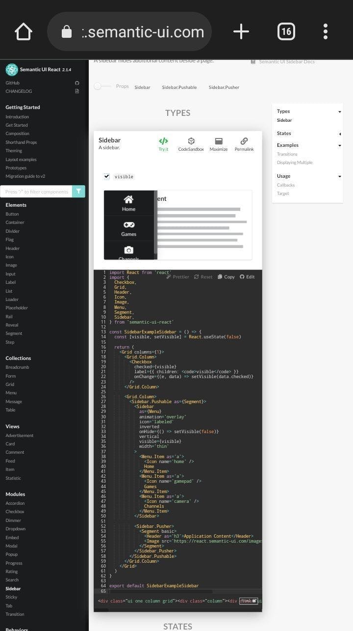
Moving on to the mobile navbar, we will use a semantic-UI-react sidebar (see react.semantic-ui.com/modules/sidebar ), but we will make some major changes to it.
The issue is how the overlay was added by semantic-UI, which forces all other content on the page to be within the sidebar.pusher component. This is inefficient, considering we would not want to nest all the content in our application within this component. Also, the sidebar controls need work, as a hamburger icon would be much preferred to the tick. To fix all these, we will add three custom components.
A tinted overlay component
A hamburger icon to open the sidebar
A close icon to close the sidebar
Note: we will use inbuilt semantic-UI icons.
The hamburger icon will be toggled based on the state of the sidebar to either open or close the icon.
//NavbarMb.jsx
import { useState } from 'react'
import { Menu, Sidebar } from 'semantic-ui-react'
function Overlay() {
  return (
    <div style={{
      backgroundColor: "rgba(0, 0, 0, 0.795)",
      position: "fixed",
      height: "110vh",
      width: "100%",
    }} />
  )
}

function HamIcon() {
  return (<i className="big bars icon inverted" />)
}

function CloseIcon() {
  return (<i className="big close red icon" />)
}
function NavbarMb({renderLinks}) {
  const [visible, setVisible] = useState(false)
  const [icon, setIcon] = useState(HamIcon)
  const [activeItem, setactiveItem] = useState("home")
  const handleItemClick = (e, { name }) => setactiveItem(name)
  const hideSidebar = () => {
    setIcon(HamIcon)
    setVisible(false)
  }
  const showSidebar = () => {
    setIcon(CloseIcon)
    setVisible(true)
  }
  const toggleSidebar = () => {
    visible ? hideSidebar() : showSidebar()
  }
  return (
    <>
      {visible && <Overlay />}
      <Menu inverted
        size="tiny"
        borderless
        attached
      >
        <Menu.Item>
          <img src="ghostblog.svg" width="35px" height="35px" alt="" />
        </Menu.Item>
        <Menu.Menu position='right'>
          <Menu.Item onClick={toggleSidebar}>
            {icon}
          </Menu.Item>
        </Menu.Menu>
      </Menu>
      <Sidebar as={Menu}
        animation='overlay'
        icon='labeled'
        inverted
        vertical
        visible={visible}
        width='thin'
      >
        <Menu.Item>
          <img src="ghostblog.svg" width="35px" height="35px" style={{ margin: "0 auto" }} alt="" />
        </Menu.Item>
        <Menu.Item
          name='home'
          active={activeItem === 'home'}
          onClick={handleItemClick}
        />
        <Menu.Item
          name='messages'
          active={activeItem === 'messages'}
          onClick={handleItemClick}
        />
        <Menu.Item
          name='friends'
          active={activeItem === 'friends'}
          onClick={handleItemClick}
        />
        <Menu.Item
          name='login'
          active={activeItem === 'login'}
          onClick={handleItemClick}
          position="right"
        />
        <Menu.Item
          name='sign_in'
          active={activeItem === 'sign_in'}
          onClick={handleItemClick}
        />
      </Sidebar>
    </>
  )
}

export default NavbarMb


//navbar.jsx
import NavbarMb from "./NavbarMb"
import NavbarLg from "./NavbarLg"
export default function Navbar() {
  return (
    <div>
        {/*<NavbarLg/>*/}
        <NavbarMb/>
    </div>
  )
}
Open Source Session Replay
OpenReplay is an open-source, session replay suite that lets you see what users do on your web app, helping you troubleshoot issues faster. OpenReplay is self-hosted for full control over your data.
Start enjoying your debugging experience - start using OpenReplay for free.
Making the navbar responsive with React-responsive
We have a navbar for the large screen and one for the mobile screen. Let's work with react-responsive to make the navbar responsive by switching from navbar-large to navbar-mobile and vice versa based on screen size.
We will do this in the navbar component using responsive react.
Import the
NavbarLgandNavbarMbto theNavbarcomponentFollowing the responsive react docs, declare multiple breakpoints as variables using the
useMediaQueryhookCreate an object of screen sizes from the breakpoints
Display the
NavbarLgorNavbarMbcomponent conditionally based on whether the screen size exceeds the breakpoint or not
Note: This package(react-responsive) is quite easy to use, and the documentation is very clear on how to use it.
//navbar.jsx
import { useMediaQuery } from 'react-responsive'
import NavbarMb from "./NavbarMb"
import NavbarLg from "./NavbarLg"
export default function Navbar() {

  const none =useMediaQuery({ query: "(max-width:576px)" })
  const sm = useMediaQuery({ query: "(min-width:576px)" })
  const md = useMediaQuery({ query: "(min-width:768px)" })
  const lg = useMediaQuery({ query: "(min-width:992px)" })
  const xl = useMediaQuery({ query: "(min-width:1200px)" })
  const xxl = useMediaQuery({ query: "(min-width:1400px)" })
  const size = {none,sm,md,lg,xl,xxl}
  return (
    <div>
        {size.sm ? <NavbarLg /> : <NavbarMb /> }
    </div>
  )
}
It looks like we are all done, but not quite. If you observe closely enough, you will notice that the state is not maintained after the shift from the large navbar to the mobile navbar. This is evident by observing the highlighted nav-link, which changes back to home once we switch from a large navbar to a mobile navbar and vice versa.
Now imagine it was a multipage React application. It would likely lead to confusion since if someone on the login page minimized their screen, the navigation bar would go back to highlighting home even while the application remains on the login page.
To fix this,
we will lift the state of the
nav-linksto the main Navbar component and handle the clicks from there.The
nav-linkscan then be passed to theNavbarLgorNavbarMbas props. Doing this will maintain the state since thenav-linksare part of theNavbarcomponent, and theNavbarcomponent will always be present in our UI on large and small screens.
//navbar.jsx
import { useState} from 'react'
import { useMediaQuery } from 'react-responsive'
import { Menu } from 'semantic-ui-react'
import NavbarMb from "./NavbarMb"
import NavbarLg from "./NavbarLg"
export default function Navbar() {
  const [activeItem,setactiveItem]=useState("home")
  const handleItemClick = (e, { name }) => setactiveItem(name)
  const renderLinks=()=>{
    return <><Menu.Item
    name='logo'
    active={activeItem === 'logo'}
    onClick={handleItemClick}
  >
    <img src="ghostblog.svg"  width="35px" height="35px" style={{ margin: "0 auto" }}  alt="" />
  </Menu.Item>
  <Menu.Item
    name='home'
    active={activeItem === 'home'}
    onClick={handleItemClick}
  />
  <Menu.Item
    name='messages'
    active={activeItem === 'messages'}
    onClick={handleItemClick}
  />
  <Menu.Item
    name='friends'
    active={activeItem === 'friends'}
    onClick={handleItemClick}
  />
  <Menu.Item
    name='login'
    active={activeItem === 'login'}
    onClick={handleItemClick}
    position="right"
  />
  <Menu.Item
    name='sign_in'
    active={activeItem === 'sign_in'}
    onClick={handleItemClick}
  />
  </>
  }

  const none =useMediaQuery({ query: "(max-width:576px)" })
  const sm = useMediaQuery({ query: "(min-width:576px)" })
  const md = useMediaQuery({ query: "(min-width:768px)" })
  const lg = useMediaQuery({ query: "(min-width:992px)" })
  const xl = useMediaQuery({ query: "(min-width:1200px)" })
  const xxl = useMediaQuery({ query: "(min-width:1400px)" })
  const size = {none,sm,md,lg,xl,xxl}
  return (
    <div>
        {size.sm ? <NavbarLg renderLinks={renderLinks}/> : <NavbarMb renderLinks={renderLinks}/> }
    </div>
  )
}


//NavbarLg.jsx
import { Menu, Segment } from 'semantic-ui-react'
export default function NavbarLg({renderLinks}) {
    return (
      <Segment inverted attached size='mini'>
        <Menu inverted secondary>
        {renderLinks()}
        </Menu>
      </Segment>
    )
  }


//Navbar.Mb
import { useState } from 'react'
import { Menu, Sidebar } from 'semantic-ui-react'
function Overlay() {
  return (
    <div style={{
      backgroundColor: "rgba(0, 0, 0, 0.795)",
      position: "fixed",
      height: "110vh",
      width: "100%",
    }} />
  )
}
function HamIcon() {
  return (<i className="big bars icon inverted" />)
}
function CloseIcon() {
  return (<i className="big close red icon" />)
}
function NavbarMb({renderLinks}) {
  const [visible, setVisible] = useState(false)
  const [icon, setIcon] = useState(HamIcon)
  const hideSidebar = () => {
    setIcon(HamIcon)
    setVisible(false)
  }
  const showSidebar = () => {
    setIcon(CloseIcon)
    setVisible(true)
  }
  const toggleSidebar = () => {
    visible ? hideSidebar() : showSidebar()
  }
  return (
    <>
      {visible && <Overlay />}
      <Menu inverted
        size="tiny"
        borderless
        attached
      >
        <Menu.Item>
          <img src="ghostblog.svg" width="35px" height="35px" alt="" />
        </Menu.Item>
        <Menu.Menu position='right'>
          <Menu.Item onClick={toggleSidebar}>
            {icon}
          </Menu.Item>
        </Menu.Menu>
      </Menu>
      <Sidebar as={Menu}
        animation='overlay'
        icon='labeled'
        inverted
        vertical
        visible={visible}
        width='thin'
      >
      {renderLinks()}
      </Sidebar>
    </>
  )
}

export default NavbarMb
Summary
This demo is lengthy, but if you ever meet the hurdle of having to work a responsive navbar with Semantic-UI or Semantic-UI-react it should be of help.
Also, thanks to the fact that react components are easily reusable, the navbar component can be re-used across multiple projects. With the semantic-UI-react prop styling, we can make appropriate tweaks and design changes, so it suits any particular project.
Resources